NewDay:
Direct Debit Adjustment Notification
A Request for a Feature Became a System-wide Component for the Future.

Introduction & Background
The current Direct Debit system presents significant usability challenges for JLP customers when they attempt to make manual payments, leading to widespread user confusion regarding the interaction with their scheduled debits. This confusion directly translates into an increased volume of customer service complaints, operational inefficiencies, and a notable erosion of customer confidence in managing their JLP accounts effectively.
Hypothesis
We believe that by improving how Direct Debit information is displayed, JLP customers will be better informed and able to act on their tasks appropriately, thereby reducing current confusion and complaints.
Product Requirements
Improve JLP's Direct Debit feature with clearer payment information to cut customer confusion, complaints, and associated service costs. This will boost customer satisfaction and loyalty, leading to better retention and a positive impact on profitability.
The system must provide JLP customers with clear, accurate, and context-sensitive information detailing the precise consequences of making a manual payment on their active Direct Debit. This information must be prominently displayed to the user before they confirm the manual payment and must explicitly state:
1.Whether the scheduled Direct Debit will still be collected as planned, be adjusted, or be cancelled.
2. If the Direct Debit amount or date is adjusted, the new amount and/or date.
3. The final impact on their account balance and upcoming scheduled payments, considering both the manual payment and any changes to the Direct Debit.
This information must be dynamically tailored to the specific status of the Direct Debit, including its due date proximity (e.g., differentiating the outcome and messaging for Direct Debits due in less than 3 days versus those due in more than 3 days).
Success Metric
1. Decrease in Payment Errors & Unintended Outcomes
Measure: A noticeable reduction (e.g., 50% decrease) in instances of payment errors directly attributable to DD/manual payment confusion, such as unintended overpayments followed by refund requests or customer-reported unexpected DD amounts.
2. Increase in Customer Satisfaction in JLP customer satisfaction survey
Measure: An uplift in customer satisfaction scores, particularly from JLP customers who have recently made a manual payment while having an active Direct Debit, or on survey questions specifically addressing the ease and clarity of payment management.
Direct Debit Adjustment
Short Presentation Deck


Design Exploration, Ideation & Execution
Areas I explored in:
Understanding the Current System
User Scenarios
Design Goal
Solution Exploration
User Test: Message Clarity & Placement
Design Handoff
Final Alignment & Rollout phase
1
2
3
4
Understanding the Current System
The design system currently does not offer a central messaging or banner component, presenting a clear area for improvement. This enhancement would provide a significant system-wide benefit by ensuring consistent and efficient communication of important information to users, and would add to the design system's capabilities and its effectiveness in creating unified user interfaces.
(a) Warning banner at the bottom at select amount page
(b) Pop up after select amount page
(c) Warning banner at Confirm payment details
(d) Warning banner at the top at select amount page
The solution exploration phase revealed two significant design challenges. The first was a challenge of timing and placement: determining the precise moment to display the warning without it being too late to be useful or so early it gets ignored. We discovered that an alert on the final confirmation page was ineffective, while a disruptive element like a pop-up risked frustrating users and causing them to abandon the process entirely.
The second challenge was one of message clarity versus subtlety. The alert needed to be clear enough to convey a serious warning about potential double payments, yet subtle enough not to create undue alarm or visually overshadow the primary goal of completing a payment. Finding the right balance between these competing priorities—being helpful without being intrusive—was the most critical and complex part of the design process.
Accessibility & Color Exploration
Accessibility was a primary consideration in the design of the Alert Banner. Our solution exploration focused on finding the optimal balance between visual prominence and user comfort, ensuring the component is effective for all users.
Color & Contrast: Our exploration focused on finding the optimal balance between visibility and subtlety. We experimented with multiple color palettes and contrast ratios to meet accessibility requirements (WCAG AA) and ensure the banner stood out sufficiently without overshadowing the primary workflow, thereby preventing user drop-off. This guarantees readability for users with low vision while finding hues that are noticeable but not distracting.
Iconography as a Visual Cue: The use of distinct icons for each variant is a deliberate accessibility feature. It provides an immediate visual indicator of the message's nature, which is critical for users with color vision deficiencies who may not be able to distinguish between the banner colors alone.
By following these guidelines, we ensure our alerts are not just seen, but are clearly understood by all users, fostering trust and a more seamless product journey.
User Scenarios
To effectively introduce this feature, we must first understand the current user experience. The following scenarios map out the existing payment flows based on a customer's Direct Debit status.

Scenario 0: The Baseline User (No Direct Debit Setup)
Current Journey: A customer without an active Direct Debit arrangement enters the payment flow. They see their outstanding balance and proceed through the standard payment steps without interruption.
Analysis: This flow is simple and effective for this user segment. It serves as the baseline experience, confirming that no changes are needed for these users.
Scenario 2: The Non-Imminent DD User (Due > 3 Days)
Current Journey: A customer with an active Direct Debit that is not due within the next three days enters the payment flow. Their experience is identical to the baseline user; they see their balance and can proceed with a manual payment without any DD-related information.
Analysis: While introducing a prominent warning alert here would be premature and could lead to notification fatigue, there is an opportunity for improved transparency. It would be valuable for users to know that any manual amount paid now will automatically adjust their future Direct Debit amount accordingly.
Scenario 1: The At-Risk User (DD Due < 3 Days) ⚠️
Current Journey: This is the critical scenario. A customer whose DD is due within three days enters the payment flow. Currently, their experience is also identical to the baseline user. They are presented with the option to pay manually, but there is no in-app indicator that a scheduled payment is about to be automatically deducted.
Analysis: This scenario poses a significant financial risk. Because the upcoming Direct Debit is unadjusted, a manual payment can lead to a double payment, potentially causing an unexpected negative balance in the customer's funding account. This situation not only creates financial distress but is a direct cause of customer complaints. The proposed alert must serve as a clear warning for the user to proceed with caution, thereby avoiding these negative outcomes. This is the core problem our project aims to solve.
Design goal
Create a simple and intuitive Direct Debit interface for JLP customers that clearly communicates their payment status and the consequences of their actions through context-specific information and alerts, ultimately eliminating confusion and enabling them to act confidently.
The success of this intervention is heavily dependent on effective communication. Therefore, this project will involve a significant user testing phase focused on two critical areas: message clarity and placement. It is crucial to validate that the wording of the alert is unambiguous and clearly conveys the potential for a double payment. Furthermore, testing will determine the optimal placement of the banner to ensure it is immediately noticeable to the user without disrupting their primary task of making a payment.
Solution Exploration
During the solution exploration phase, our primary goal was to determine the most effective method for presenting the Direct Debit warning to the user. We evaluated four distinct approaches, each with its own trade-offs regarding timing, visibility, and intrusiveness. This exploration allowed us to weigh the benefits of early, upfront communication against less disruptive, late-stage interventions, with the ultimate aim of finding the optimal solution that effectively alerts the user without causing frustration or drop-off in the payment flow.
5
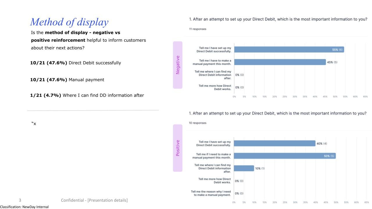
User Test: Message Clarity & Placement
An unmoderated remote test was conducted with 10 participants to gather insights on Direct Debit Adjustment messaging. Participants were instructed to verbalise their thoughts by thinking aloud as they navigated through paying online journey. A questionnaire was administered to specifically test their comprehension of the messaging.

Objective
Quickly assess JLP customer comprehension of the Direct Debit adjustment message when shown at "Step 2: Select Amount."
Validate if "Step 2" is an effective and noticeable placement for this critical information.
Key Research Questions
Do users understand the main implication of the DD adjustment message presented at Step 2?
Is the message easily noticed and perceived as timely/helpful at this placement?
Does the message help users understand the immediate consequences of their payment on their Direct Debit?

Optimal time in place to help them in their decision
Key Findings
Message Comprehension (Generally Good):
DD due < 3 days message (e.g., "DD will still be taken"): 8 out of 10 participants correctly understood that their scheduled Direct Debit would still be collected for the full amount even if they made a manual payment now. Some minor confusion arose for 2 participants regarding whether their manual payment was in addition to or part of a total due if not paying the full statement.
DD due > 3 days message (e.g., "DD will be updated"): 9 out of 10 participants understood that their upcoming Direct Debit amount would adjust based on their manual payment. A common suggestion was to more explicitly state the new adjusted DD amount directly within the message or an immediate summary.
Clarity Rating: Average clarity rating for the messages was 3.9/5.
Message Placement & Noticeability (Effective at Step 2):
Placement: 7 out of 10 participants preferred messaging as they are selecting amount for the payment.
Timeliness & Helpfulness: The placement at Step 2 was generally perceived as timely and helpful, allowing users to consider the DD impact before proceeding to payment confirmation. Average helpfulness rating for placement was 4.3/5.
Feedback: A few participants (4/10) the colour of the banner seemed dull and needs to be more prominent on the screen.
Impact on User Understanding & Confidence
Participants who clearly understood the message expressed increased confidence in making their manual payment decision.
The messages successfully guided users to understand the immediate consequences, with several participants verbally (in think-aloud where available, or in comments) or through their task choices indicating they would adjust their manual payment based on the message. For example, some reconsidered making a partial payment when the DD <3 days message appeared.


6
7
Design Handoff
To translate the final, validated designs into a buildable product, a comprehensive handoff package was prepared for the development team.
Design system full asset documentation: A key challenge for this project was addressing two undocumented legacy flows in production: 'Pay Online' and 'Pay by Card.'
To ensure a successful developer handover, I took the initiative to recreate these screens and adding them into the design system in Figma. This formed the foundation of my handover document, which provides a detailed breakdown of the updated user journeys for all three key scenarios, giving the development team the clarity and context needed to build the new experience accurately.

Integration flow chart: Chart shows the outline of the entire ‘Pay online’ and ‘Pay by card’ flows including all interactions, decision points, and the various edge cases and error states that were designed.

Components: Designed and built all required page components, utilizing auto layout for flexibility and incorporating all essential interactive states. Also adding the new banners into the system.

Design specification: Newly designed message banner that other designers would potentially adopt system-wide, detailing all visual elements, typography, color codes, spacing, and component states. This provided developers with a precise blueprint for the UI. This also includes small screen sizes to ensure that all bases are covered.
Final Alignment
Following the initial ideation, design explorations, and research validation, the design underwent multiple stakeholder alignment and feedback sessions and in-depth design critiques. As a direct result of this comprehensive evaluation process, the initial feature scope was simplified to focus on core functionality, which enabled us to formulate the high-level, phased release plan based on these clarified priorities.
To accurately depict the real user process, I developed a high-fidelity interactive prototype that simulates the complete end-to-end experience. This prototype goes beyond static screens by incorporating key user flows, realistic screen transitions, interactive component states, and the conditional logic detailed in our system flowchart. The goal was to create a tangible representation of the final product, allowing stakeholders to visualize the solution and enabling us to conduct realistic user testing to validate the design's usability and clarity before committing to development resources.


Final Thoughts
This project's journey began with a clear, tactical request: to solve a critical user pain point with a warning banner. However, as an experienced product designer, my role is to see beyond the immediate task and identify opportunities for larger, more strategic contributions. It became apparent that designing a one-off solution would be a short-sighted fix. Instead, I was able to advocate for a systemic approach, transforming the initial request into a foundational project for our design system. By focusing on creating a versatile and reusable banner framework, we not only solved the immediate problem but also equipped the entire team with a scalable tool for all future contextual messaging. This demonstrates the value of experience: the ability to look at the bigger picture and turn a single feature request into a lasting asset that enhances product consistency and development efficiency.