Foodpanda:
Redemption on Checkout
To address the significant underutilization of our loyalty program—where over 80% of customers have never redeemed points—this project introduces a direct and seamless way for users to redeem their points at the point of purchase.
The core problem stems from a high-friction user journey that separates the rewards shop from the checkout process, making the program's value nearly invisible. As the product designer, I led the UX strategy, conducting benchmark research that informed our phased approach and translating business goals into the final, seamless user flow designed to boost redemption rates and enhance customer loyalty.

Redemption on Checkout
Presentation Deck


The Context and Challenges from the Project Journey
Understanding the context in which it unfolds is key to appreciating its complexities. In this deep dive, we explore the unique challenges faced throughout the project journey—highlighting obstacles, decision points, and lessons learned that shaped the outcome. By dissecting these details, we gain valuable insights that can guide future initiatives toward greater success.
Understanding the Current Challenge
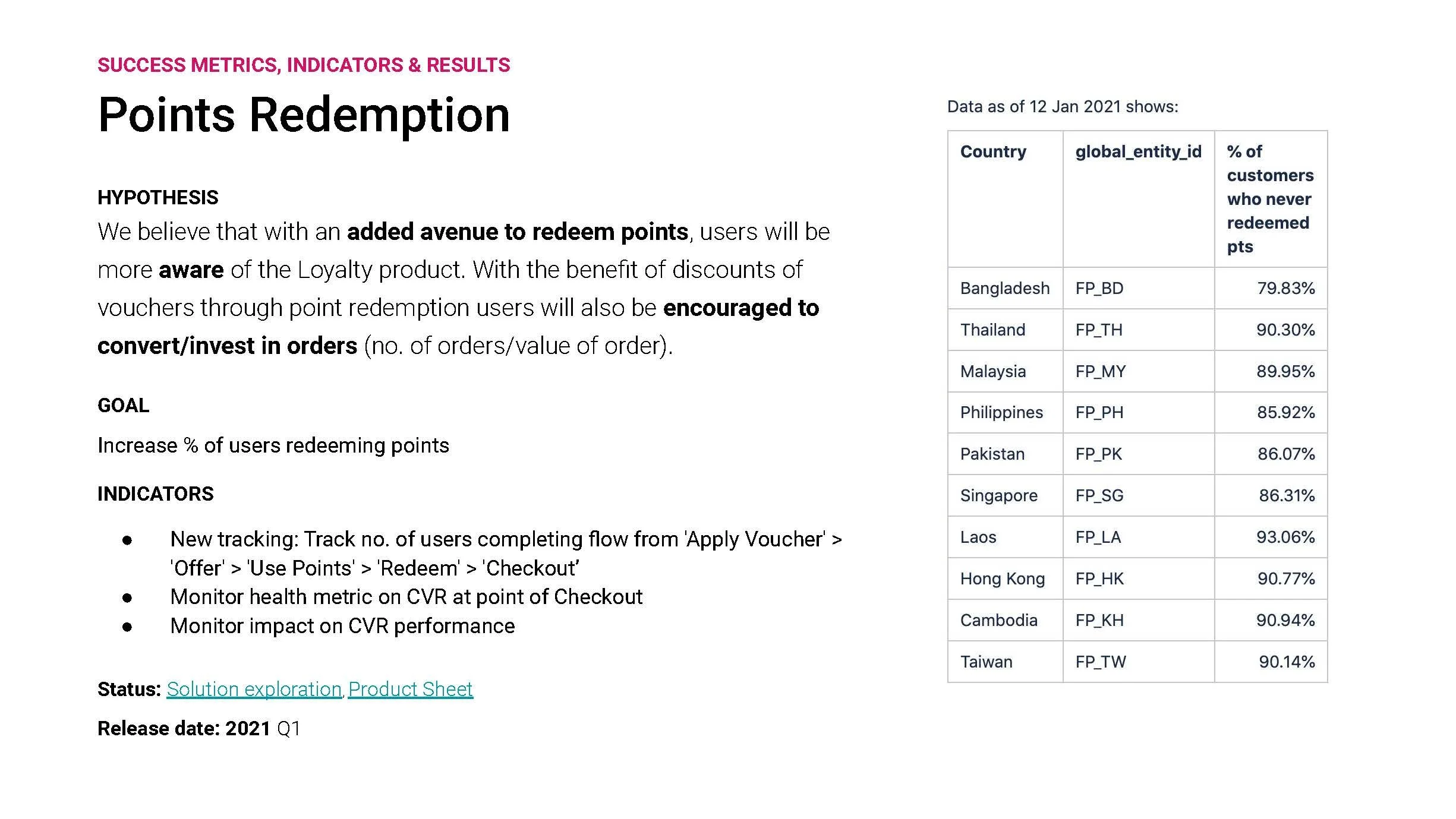
Our loyalty program is significantly underutilized, with data showing that an overwhelming majority of our customers—between 80% and 93% across key markets—have never redeemed their points. The root cause is a disjointed and high-friction user experience. Currently, a customer must proactively navigate to the "Rewards shop" before placing an order, redeem points for a voucher (often via a scratch card mechanic), and then remember to apply that voucher at checkout. This convoluted process creates a major barrier, making the loyalty program feel separate from the core ordering journey and causing its value to be almost invisible at the critical moment of purchase.
The current flow for redeeming loyalty points is disconnected from the main purchasing journey, demanding significant proactive effort from the user. A customer must first navigate away from their order to the 'Loyalty > Rewards shop' section. Here, they redeem their points, often through a scratch card mechanic, to win a voucher. Later, during the checkout process, the user must remember they have this voucher, tap 'Apply a voucher,' select it from a list, and then apply it to their cart. This convoluted, multi-step process creates considerable friction, making it easy for users to forget they have rewards or to abandon the effort altogether, which directly contributes to the low redemption rates.
Hypothesis
We believe that with an added avenue to redeem points, users will be more aware of the Loyalty product. With the benefit of discounts through point redemption, users will also be encouraged to convert/invest in orders (no. of orders/value of order).
Product Requirements
(Phase 1: Shared Entry Point)
The core requirement is to integrate the point redemption process directly into the checkout flow to create a seamless experience. This involves:
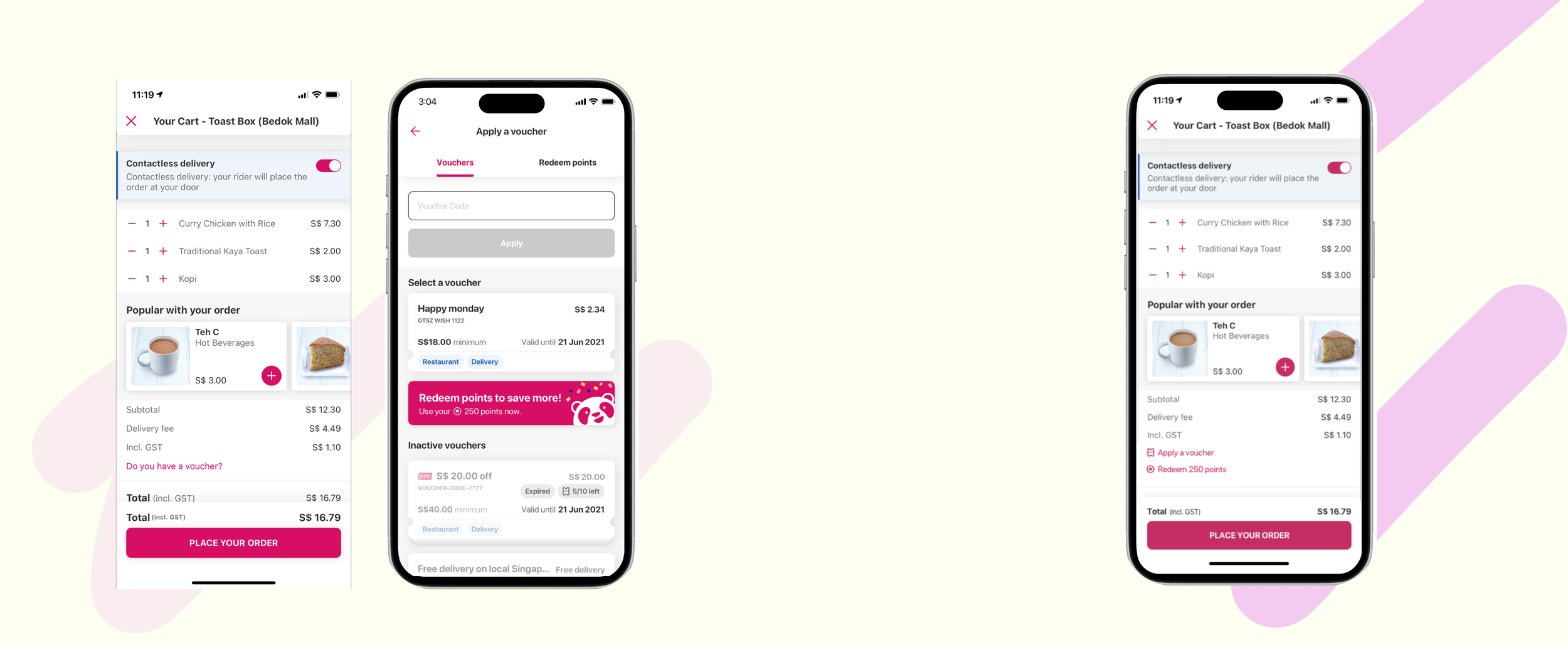
Shared Entry Point: Introduce a new option to "Redeem points" within the existing "Apply a voucher" section on the checkout screen.
Integrated Redemption Flow: When a user opts to redeem points, they should be taken through the redemption process (e.g., scratch card) within the checkout flow, without having to leave and restart their order.
Automatic Voucher Application: The voucher obtained from the point redemption must be automatically applied to the user's current cart.
Clear User Guidance: The interface must clearly show the user how to navigate between applying an existing voucher and redeeming points for a new one.
Business Impact and Goal
The primary goal is to increase the percentage of users redeeming loyalty points. By making point redemption visible and accessible at the moment of purchase, we aim to increase awareness and utilization of our loyalty program. This will enhance the perceived value of earning points, directly incentivizing customers to complete their orders and potentially increase their order frequency or value. The long-term business impact is stronger customer engagement, improved retention, and a more effective loyalty program that drives repeat business.
Success Metrics & Indicators
The success of this initiative will be measured by the following:
Primary Metric: A significant increase in the percentage of active users who redeem loyalty points.
New Tracking Indicator: Track the number of users who successfully complete the new redemption flow: from checkout, through 'Apply Voucher' and 'Redeem Points,' to placing an order.
Health Metrics:
Monitor the conversion rate (CVR) at the point of checkout to ensure the new flow does not introduce friction.
Monitor the overall impact on CVR performance.
Design Exploration, Ideation & Execution
Areas I led in:
Design Impact: Dependencies and Constraints
Benchmarking & Market Analysis
Design Exploration
Strategic Phasing & Rationale
Stakeholder Alignment
Design Impact: Dependencies and Constraints
To arrive at the proposed solution, a thorough design process was undertaken, focusing on competitive benchmarking and a strategic evaluation of different user experience models to find the optimal balance between user impact, technical feasibility, and speed to market.
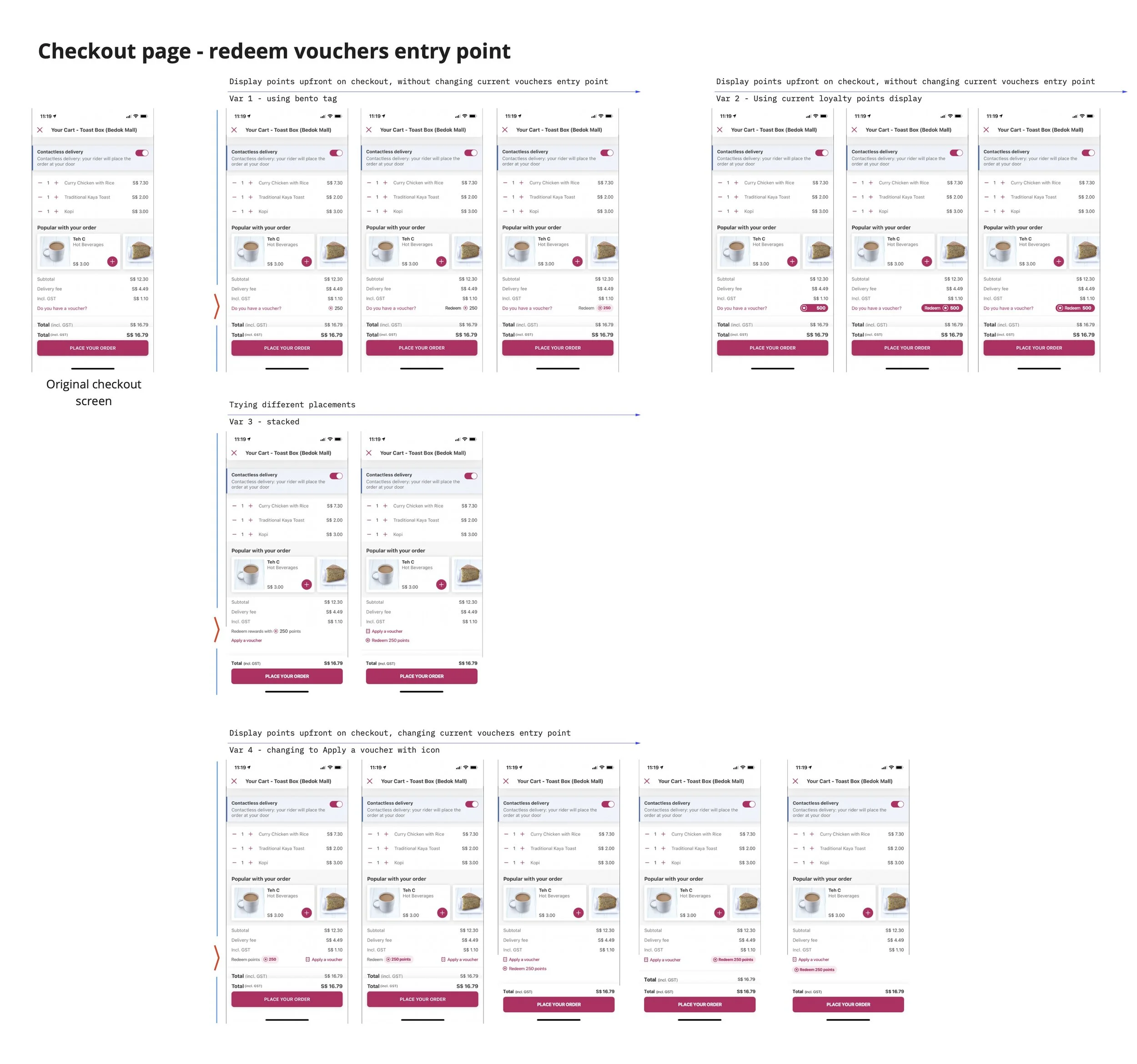
A key consideration for the Phase 1 MVP was that we were building on another squad's existing real estate—the checkout and vouchers pages. This required us to be highly mindful of the changes we introduced. We carefully considered how much space our new redemption banner would occupy and how any changes would impact the existing voucher application flow. This also meant navigating technical dependencies with the other squad to ensure our solution could be integrated smoothly without disrupting their ongoing work or future plans.
Benchmarking & Market Analysis
Our initial research identified three prevalent models for loyalty point redemption in the e-commerce and delivery landscape:
Unified Offers (e.g., Grab): This model consolidates all savings opportunities—vouchers and points—into a single "Offers" entry point. Its primary benefit is simplifying the user's mental model to one destination for "saving money," creating a clear and straightforward experience.
Automatic Redemption (e.g., Shopee, Klook): This model presents an automatic point-to-dollar conversion directly at checkout, offering the lowest possible friction for the user. However, this approach provides less user control over when and how they use their accumulated points.
Separate Entry Points (e.g., Sephora, Watsons): This approach, similar to our existing Rewards Shop, features a distinct rewards catalog. While it provides more exposure to the full breadth of the loyalty program, it risks feeling disconnected from the immediate purchase journey and adds friction.
Design Exploration
Our design exploration focused on how to best introduce the "Redeem points" option within the existing vouchers page. A key component was the design of a redemption banner that would be noticeable, engaging, and aligned with our brand identity.
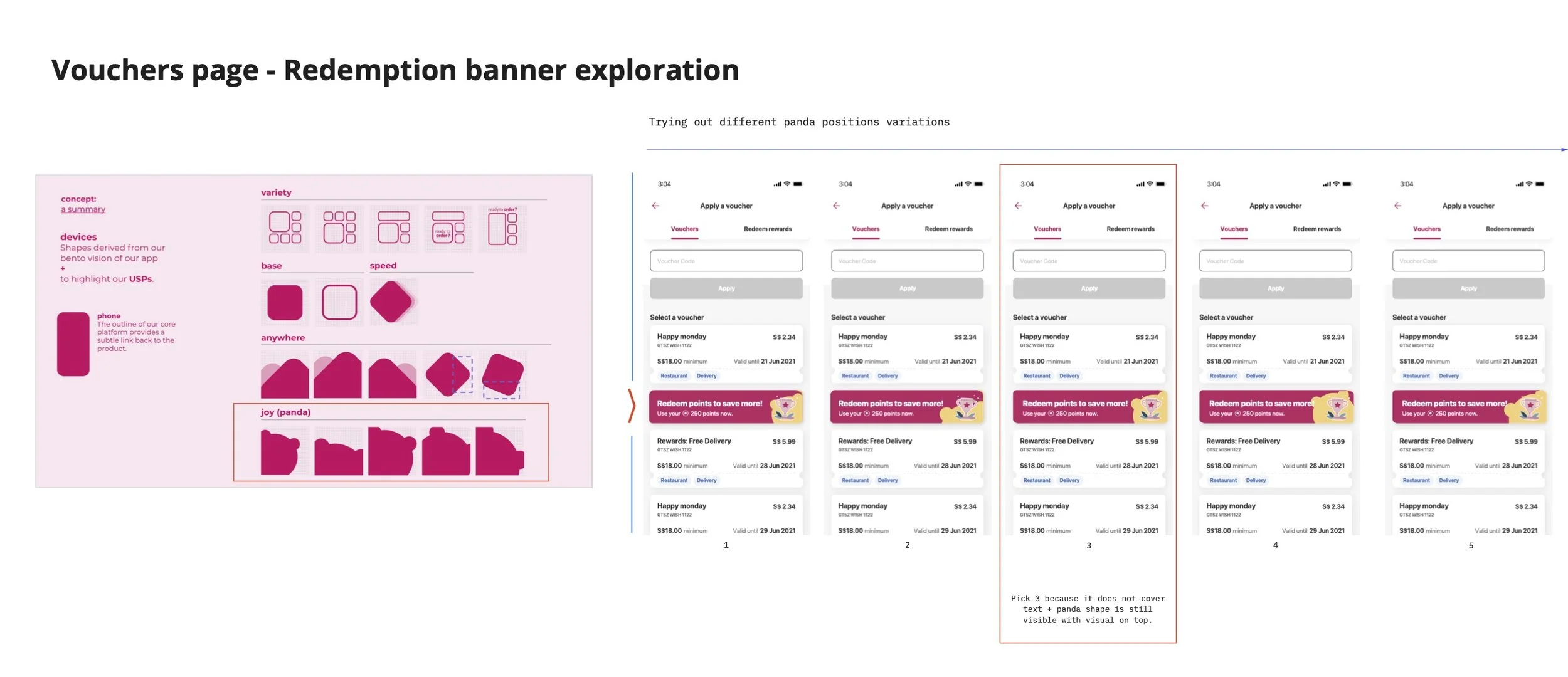
1. Banner Placement & Visual Concept
My initial exploration focused on banner placement and integrating our unique 'Joy (panda)' shapes. This concept was derived from the 'Devices' section of our brand guidelines, ensuring the visual language was consistent and making the banner feel distinctly like a part of our app experience.
2. Color & Composition
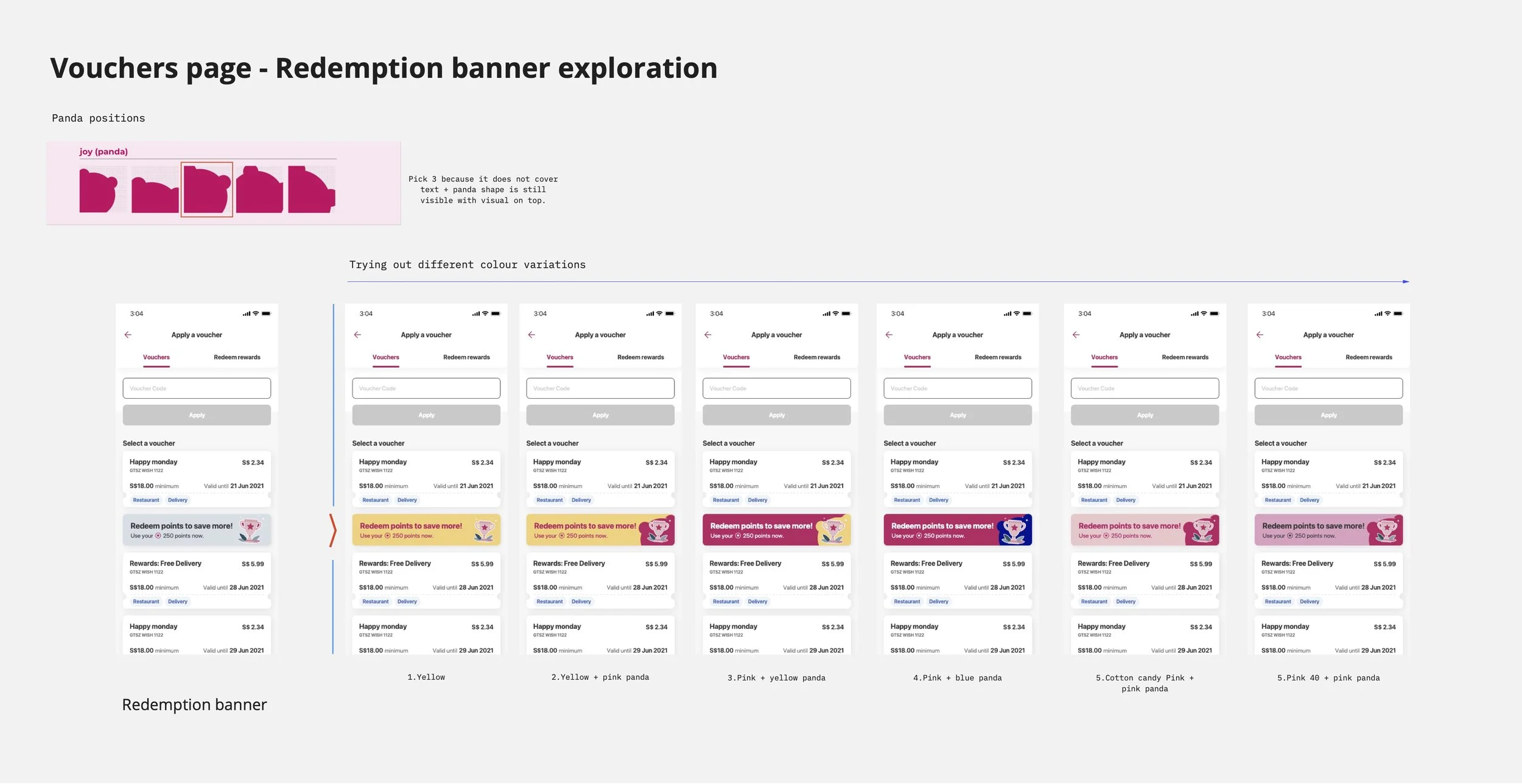
To further refine the banner, I explored numerous color variations, testing different combinations of yellow, pink, and blue against our brand palette to find the most visually appealing and attention-grabbing option. I also experimented with the composition and positioning of the panda graphic within the banner, ensuring that the panda shape remained clear and tappable even when overlaid with text, which was a key consideration for usability.
3. Edge Case Scenarios
A critical part of the exploration was designing for edge cases to ensure a robust user experience. This included:
Users with Zero Points: I explored two options for users who have no points to redeem. Option 1 involved displaying the banner with a clear "You have 0 points" message and a "Top up points" CTA to encourage future engagement. Option 2 was to remove the banner entirely for these users to create a cleaner interface.
Used Vouchers: I designed specific error message displays for scenarios where a user attempts to apply a voucher that has already been redeemed by another user, has already been applied, or if their cart total does not meet the voucher's minimum spend requirement.
These iterative explorations allowed us to refine the banner's visual treatment and define clear communication for various scenarios, leading to a final design that was user-friendly, on-brand, and optimized for visibility.
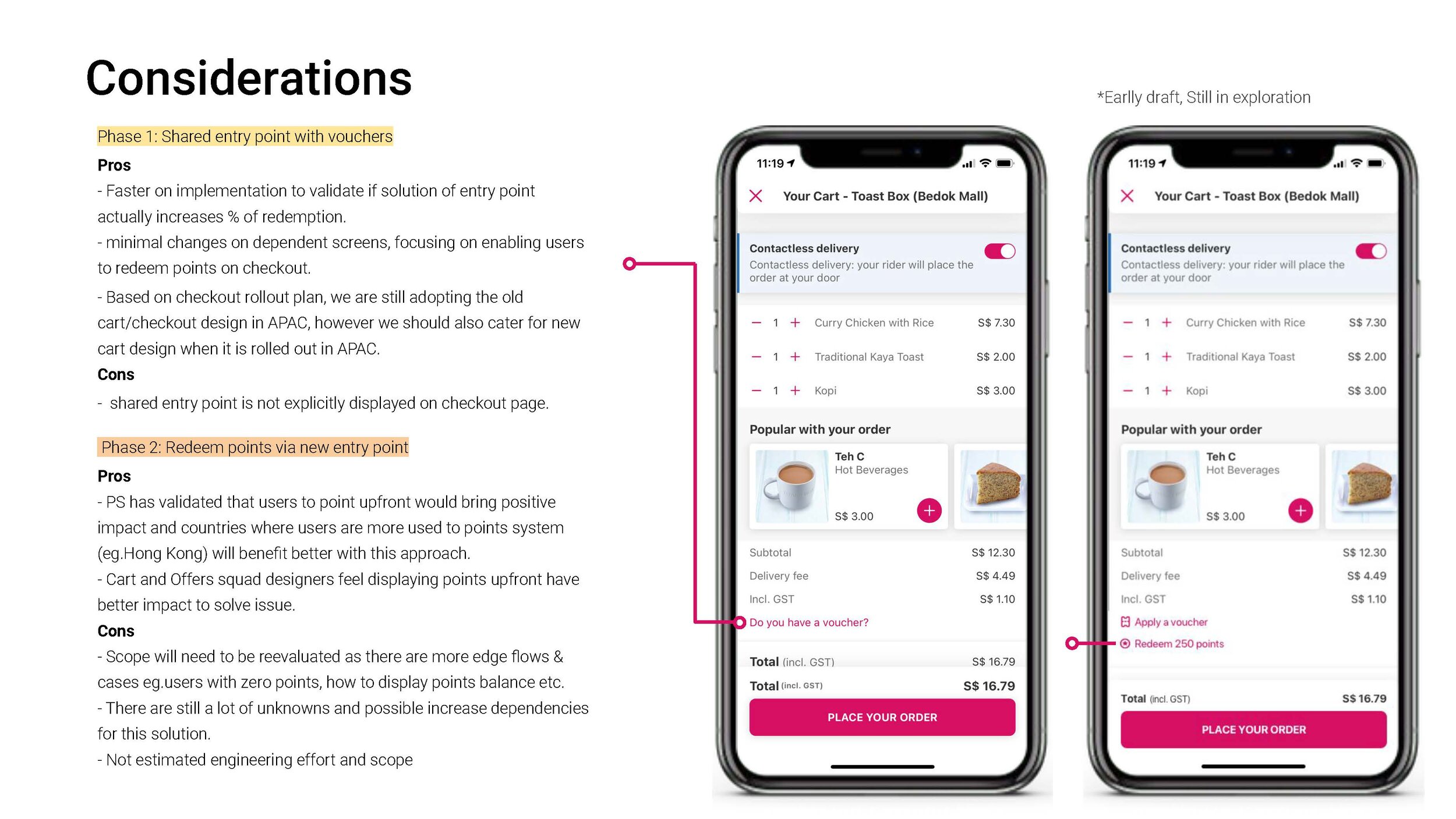
Strategic Phasing & Rationale
Based on this research, we made the strategic decision to tackle this problem in two distinct phases to de-risk the project and validate our core hypothesis efficiently.
Phase 1 (Proposed MVP):
Shared Entry Point with Vouchers
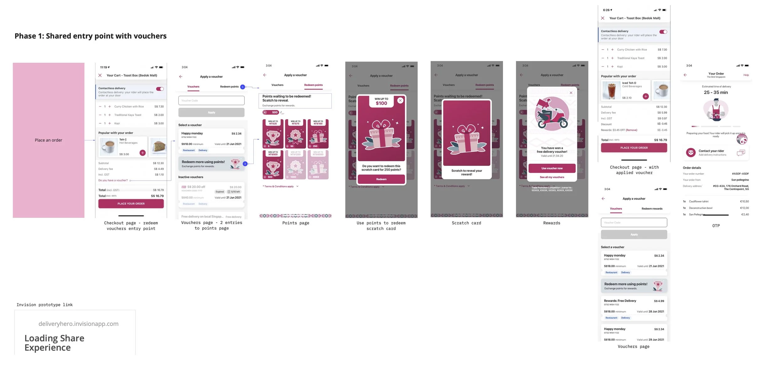
Rationale: We selected this model for the initial release due to its significant advantages in speed and validation. By placing the point redemption option within the existing "Apply a voucher" flow at checkout, we can leverage current infrastructure with minimal changes to dependent systems.
Pros: This allows for a faster implementation, enabling us to quickly test and validate our core hypothesis: that simply having a redemption opportunity at checkout will increase usage. It also aligns with the existing cart/checkout design in APAC, ensuring a consistent experience during the rollout.
Cons: The primary trade-off is discoverability. The shared entry point is not explicitly displayed on the main checkout page, requiring users to first tap into the "Apply a voucher" section to find it.
Phase 2 (Future Exploration):
New, Dedicated Entry Point
Rationale: This future phase envisions a more prominent and integrated redemption experience directly on the checkout screen.
Pros: This approach would offer far greater visibility and a superior user experience, a direction validated by previous P-S research in markets like Hong Kong. It also aligns with the long-term vision of our Cart and Offers squads.
Cons: The scope for this phase is significantly larger. It introduces numerous complexities and edge cases (e.g., how to handle users with zero points, how to display the points balance, etc.) and requires a substantial re-evaluation of engineering effort, dependencies, and timelines.
By opting for the "Shared Entry Point" for Phase 1, we are choosing a pragmatic, low-risk path to test our hypothesis and deliver immediate value, while laying the groundwork for a more integrated and prominent solution in the future.
Stakeholder Alignment
Following the design explorations, a crucial part of my role was to ensure all stakeholders were aligned on the proposed direction for the MVP. I presented the chosen design solution, the rationale behind the phased approach, and the pros and cons of each phase to key decision-makers, including the CEO. This involved clearly communicating the strategic value of starting with a less disruptive, shared entry point to quickly validate our hypothesis while acknowledging the dependencies on other squads. This process was vital for gaining buy-in, managing expectations, and creating a shared understanding of the project's immediate goals and long-term vision.

Final Thoughts
This project, while appearing as a straightforward enhancement, presented significant underlying complexity. The primary challenge was navigating the technical and strategic constraints of building a new feature on another squad's existing real estate—the checkout and vouchers pages. As the product designer, my central role was to de-risk this initiative by creating a design solution that was both impactful for the user and minimally disruptive to the existing infrastructure. Through careful benchmarking, phased strategic planning, and detailed design explorations, I proposed a pragmatic MVP that respects these dependencies. This approach ensures we can test our core hypothesis and deliver value quickly, paving the way for a more ambitious, fully integrated loyalty experience in the future.