foodpanda; Marketing Management Tool (MMT)
Creating a standardise tool for our internal users across squads

Problem
With a product diverse with many squads, individual squads have resulted in building their own CRM tool to ship their feature as fast as possible. It is certainly a hotfix for a more complex problem, having an individual tool for each squad, for a similar pool of internal users. Imagine a new hire having to learn 5 different tools to contribute on the same app, that would not be ideal when the company grows with new teams and hires.
Objectives
Squads coming together to standardise individual internal tools into one for our internal users, across different functions.
Research, Assumptions, and Ideation
Asking questions — What is the current process of our internal users? How can we better improve it? What are we improving on?
Understanding the Current Ecosystem
Before designing anything, first we’ll always need to have a clear understand what the current flows are in detail. Mapping it out helps the us and the user better identify and understand terminology, pages, workflow etc. as one thing can mean another to someone else.

User interviews
Interviewing users in different countries can help us understand their pain points holistically, from different perspectives.
Mapping pain points

Key functions for MMT users
Allow users to
Add badges / challenges for every new wave (every 2 weeks) in at least 5 countries
Have a summary preview to prevent language / spelling errors before publication
Success metrics
Enable users to work across different squad functions in one single platform.
Standardise UI, terminology, and use cases across all squads.
Simplify workflow to be easily adoptable by new hires.
Address current UX pain points that block users’ workflow.


Examples of user comments
Deciphering current UI
Key UI discrepancies
Table: each page was not carefully thought out, displaying data points that are not relevant to users at a high-level table view.
Table column: fields are named differently for similar items, lacking consistency across all pages.
Filtering information: displaying inactive and active items by default, filtering needed each time to view active badges or challenges, which can cause annoyance to users.
Information: information is displayed in terms that developers use, not readable and friendly to users.
Input page: page layout is displayed differently between different pages, one showing fields while another showing up in tabs.
Badges page
Table
Challenges page
Table
Input
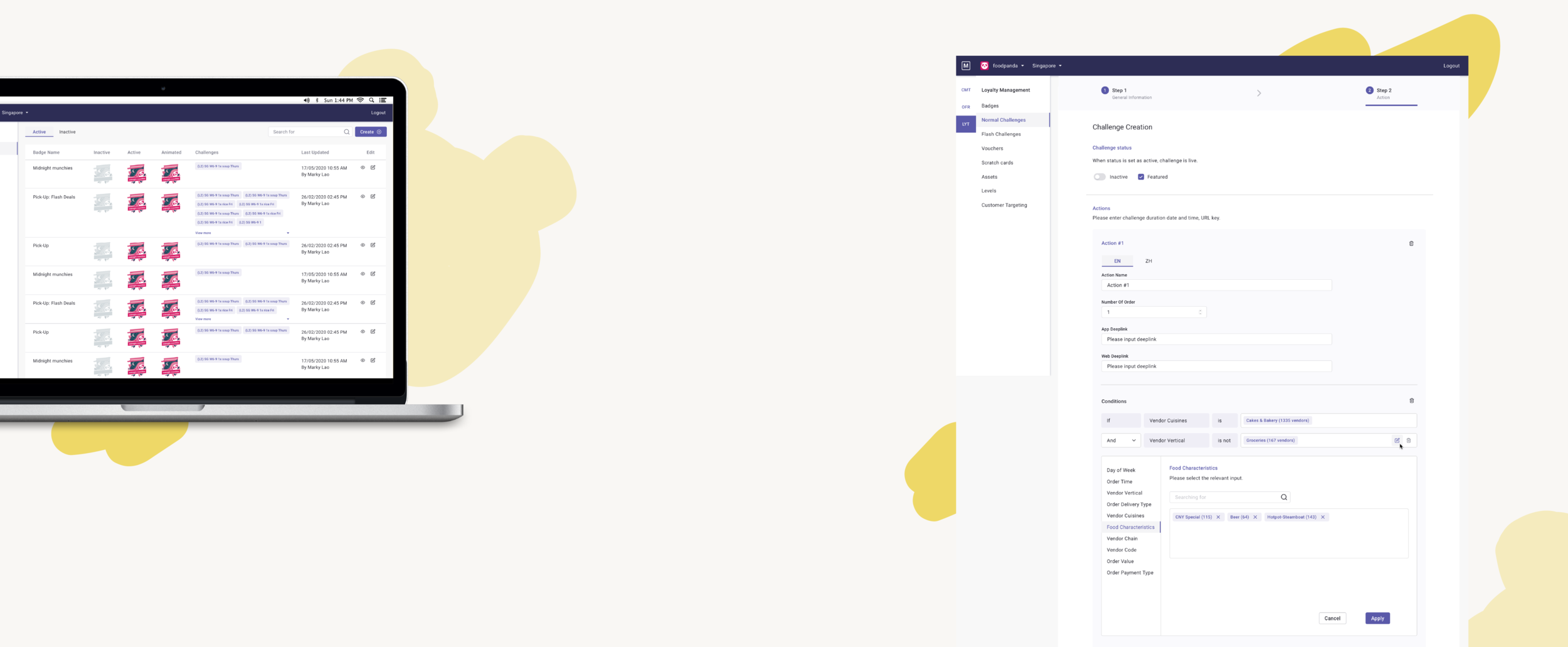
Proposed solution
Table
Key UI improvements
Table: each page now displays data points that are only relevant to users at a high-level table view.
Table column: fields now standardised with a similar system (eg. starting with “name” and ending with “created”) providing consistency across all pages.
Information: displaying inactive and active lists in tabs, filtering is no longer needed which can help users reduce cognitive load.
Spill content: displaying content in dropdown accordion.
Badges page
Before
Challenges page
Before
Current
Input
Key UI improvements
Page layout: layout is now similar between different pages, having a component library for text fields, tabs, and more complex functions eg. rules.
Tabs: splitting fields into 3 steps to reduce confusion by sectioning inputs.
Rules: we spent a good amount of time figuring how rules logic applies for different squads and markets, not easy but we manage to build for MVP and plan for future iterations.
Input
——— Badges page
Before
Current
——— Challenges page
Working together
Communication with front-end devs
I regularly update the Figma links and miroboard so that developers can see the latest updates on their own time. Major changes are also mentioned in the weekly squad meetings for feedback and visibility. UI specifications, prioritization, and functionality requirements are also well documented.
Communication with product designers of other squads
We come together to build on the design system of the tool, lots of communication and clarification are needed on the basic function of UI as we all have similar but different workflows to reach standardization. Figma and miroboard links are also shared so that we can have references and visibility to one another’s progress.
Communication with product manager
As this is mainly a UI/UX improvement, prioritisations are up to me and the devs to decide. Not only do we need to meet the agreed deadline and we are also required not to delay other feature shipments within the agreed timeline.