Empowering Users to Earn: A Clearer Path to Foodpanda Rewards
Improving the user experience with a strategic onboarding flow was key to demystifying a core feature, boosting user confidence, and driving engagement with the loyalty program.
This project was driven by a core user problem: customers felt confused by Foodpanda's "Challenges & Rewards" feature and were consequently missing out on its benefits. As the lead Product Designer, my focus was to transform this user frustration into an experience of clarity and empowerment. I led the end-to-end design of an intuitive onboarding flow, navigating the additional challenge of a feature with concurrent releases. Through a process of user research, internal collaboration, and iterative design, we created a simple, step-by-step guide that was validated directly with users. The final solution gives customers the confidence to understand the program, earn rewards, and get the most value from their loyalty, directly addressing their initial pain points and making loyalty fun and easy as intended.

Introducing
Loyalty’s New Onboarding
Presentation Deck


The Context and Challenges from the Project Journey
Understanding the context in which it unfolds is key to appreciating its complexities. In this deep dive, we explore the unique challenges faced throughout the project journey—highlighting obstacles, decision points, and lessons learned that shaped the outcome. By dissecting these details, we gain valuable insights that can guide future initiatives toward greater success.

Understanding the Current Challenge
This project began with a fundamental question: "How might we convey loyalty program mechanics in an easy-to-understand manner?"
Foodpanda's "Challenges & Rewards" program, a key feature for fostering customer loyalty, was underperforming. Despite high traffic, we saw low click-through rates and minimal interaction. This was compounded by an additional layer of complexity: the feature itself was a moving target, with multiple versions and new releases being developed concurrently. This meant our onboarding solution had to be flexible and adaptable.
The core problem, confirmed by analytics, was a critical disconnect: users were not engaging with the program because they didn't understand how it worked.
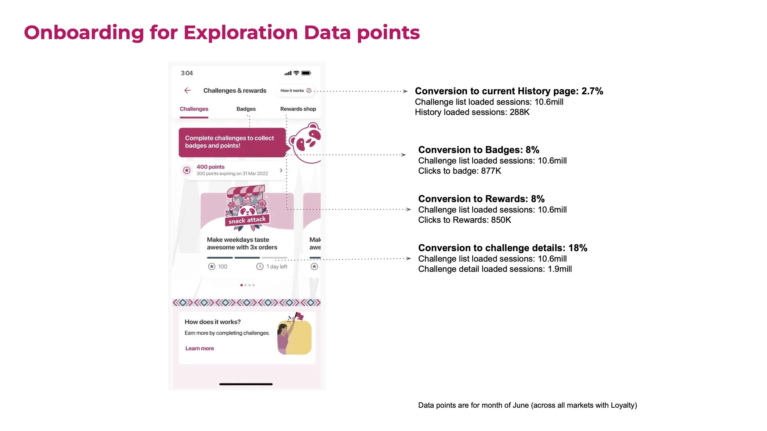
The Core Problem, Backed by Data: Initial data revealed a steep drop-off in the user journey. From the main "Challenges & Rewards" page, conversion to key areas was low:
18% proceeded to view Challenge Details.
8% explored the Badges page.
8% visited the Rewards shop.
Only 2.7% checked their History page.
The particularly low conversion to the History page also signaled a clear opportunity. We decided that this screen real estate could be better used for something more beneficial to the user's primary journey, such as the onboarding guide itself. My mission was to design an intervention that could bridge this knowledge gap and significantly improve these engagement metrics across all current and future versions of the feature.
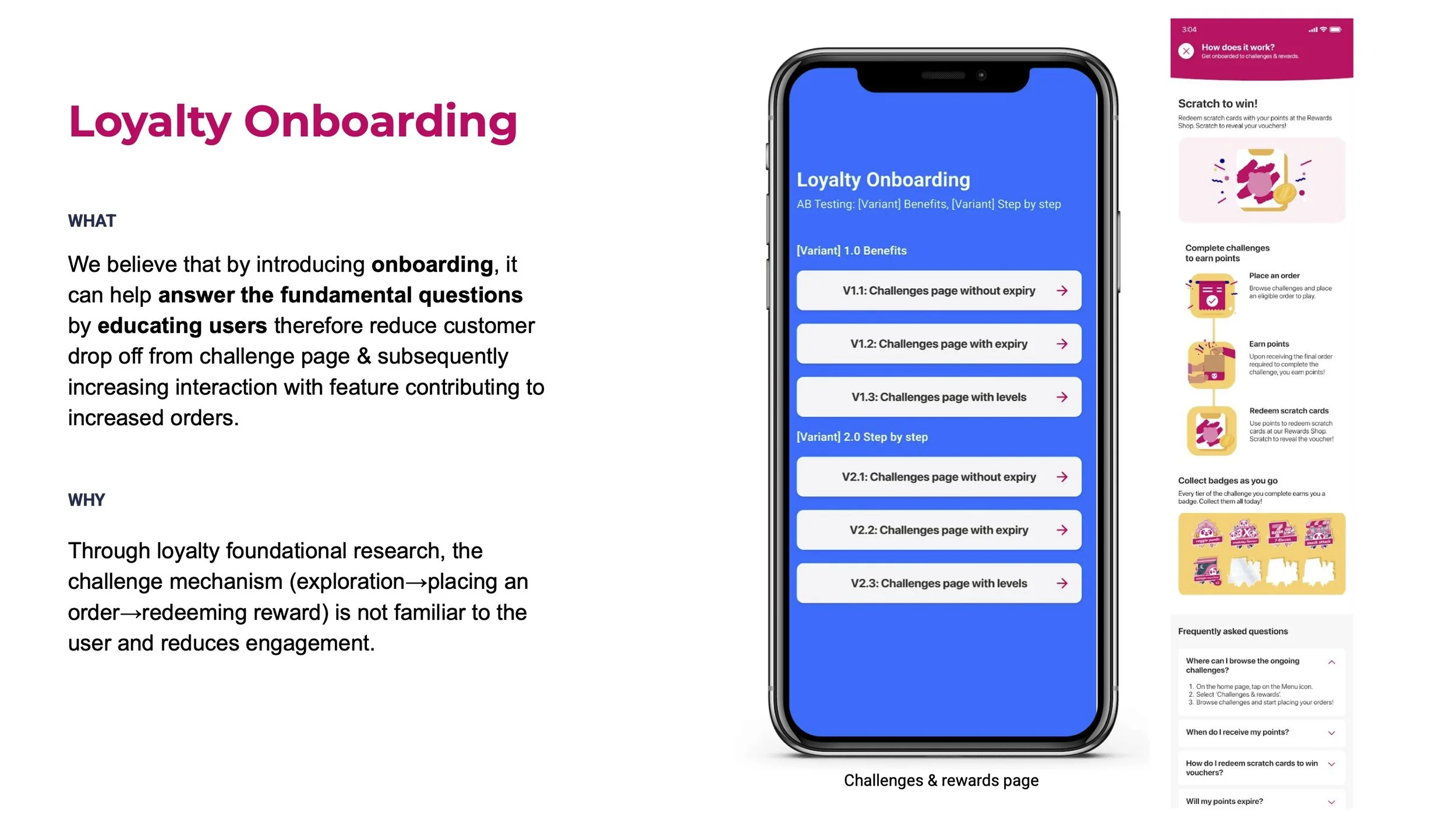
Hypothesis
We believe that introducing a dedicated onboarding flow will reduce the customer drop-off from the Challenges page. By clarifying the program mechanics, we will subsequently increase interaction with the feature, contributing to an increase in orders.
Product Requirements & Key Results
The following product requirements were established to guide the development of this initiative, framed around our core Objectives and Key Results (OKRs).
Objective: Improve user comprehension and adoption of the Challenges & Rewards feature to drive deeper engagement.
Key Result 1: Increase the Customer Return Rate to the Challenges page by 15%.
Key Result 2: Increase the average Orders per User for engaged loyalty members by 10%.
Key Result 3: Decrease the user drop-off rate from the main Challenges page by 20%.
Key Result 4: Maintain overall checkout conversion rate (mCVR2) at or above baseline to ensure no negative impact on the primary user journey.
Design Exploration, Ideation & Execution
Areas I led in:
Benchmarking & Market Analysis
Design Exploration
User Research: Visual Perception & Comprehension
Asset Request
Design Handoff
1
2
3
Benchmarking & Market Analysis
My research wasn't limited to external competitors. I analyzed various onboarding patterns used by other applications to establish a baseline for common interaction patterns. Crucially, I also initiated discussions with the internal Wallets team, who had recently launched their own onboarding feature. Learning from their challenges and design decisions provided invaluable internal context, helping us avoid potential pitfalls and align our approach with successful patterns already established within the Foodpanda ecosystem.
Understanding Our Users
Through foundational research, we identified distinct user segments based on their interaction with loyalty programs:
Avid Users: Loyalty programs actively influence their purchasing decisions. They are motivated by tiering systems and will go the extra mile to meet challenge requirements.
Casual Users: They are occasionally influenced by loyalty programs, especially when incentives are relevant or they are close to completing a goal. They often see rewards as a "surprise" benefit.
Non-users: They don't see the value in loyalty products, often due to a lack of immediate incentives or a fear of expiring points.
This research made it clear that a one-size-fits-all approach would be ineffective. Our solution needed to be simple enough for Non-users to grasp, while still being engaging for Avid users.
Design Exploration
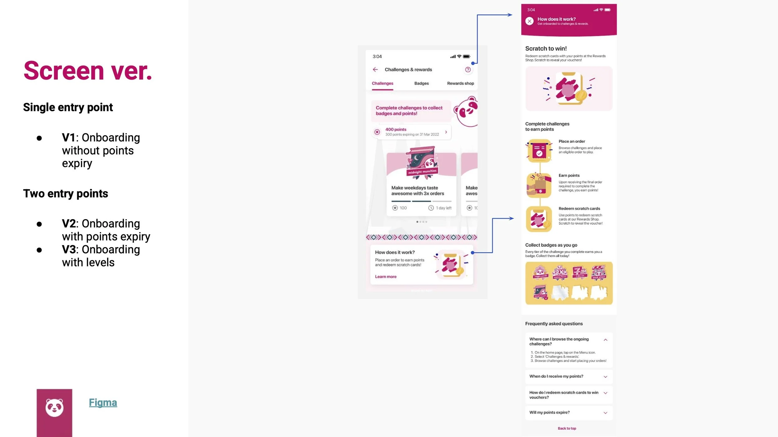
My design exploration was structured into a phased approach to address different user contexts. Phase 1 focused on solutions within the main "Challenges & Rewards" page itself, exploring various entry points and content presentations. Phase 2 considered a wider scope, exploring how we could introduce the program on other pages, such as the Order Tracking Page (OTP), to capture casual or unintentional users at different points in their journey. This allowed us to think both tactically about immediate improvements and strategically about future opportunities.
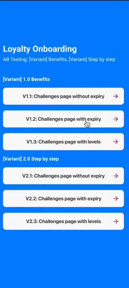
To ensure we launched the most effective solution for Phase 1, I designed several variations for user testing. These were grouped into two primary strategic approaches:
Variant 1.0 (Benefit-led): This concept focused on immediately showcasing the rewards and benefits of the program.
Variant 2.0 (Step-by-step): This concept was a more literal guide, walking the user sequentially through each action they needed to take.

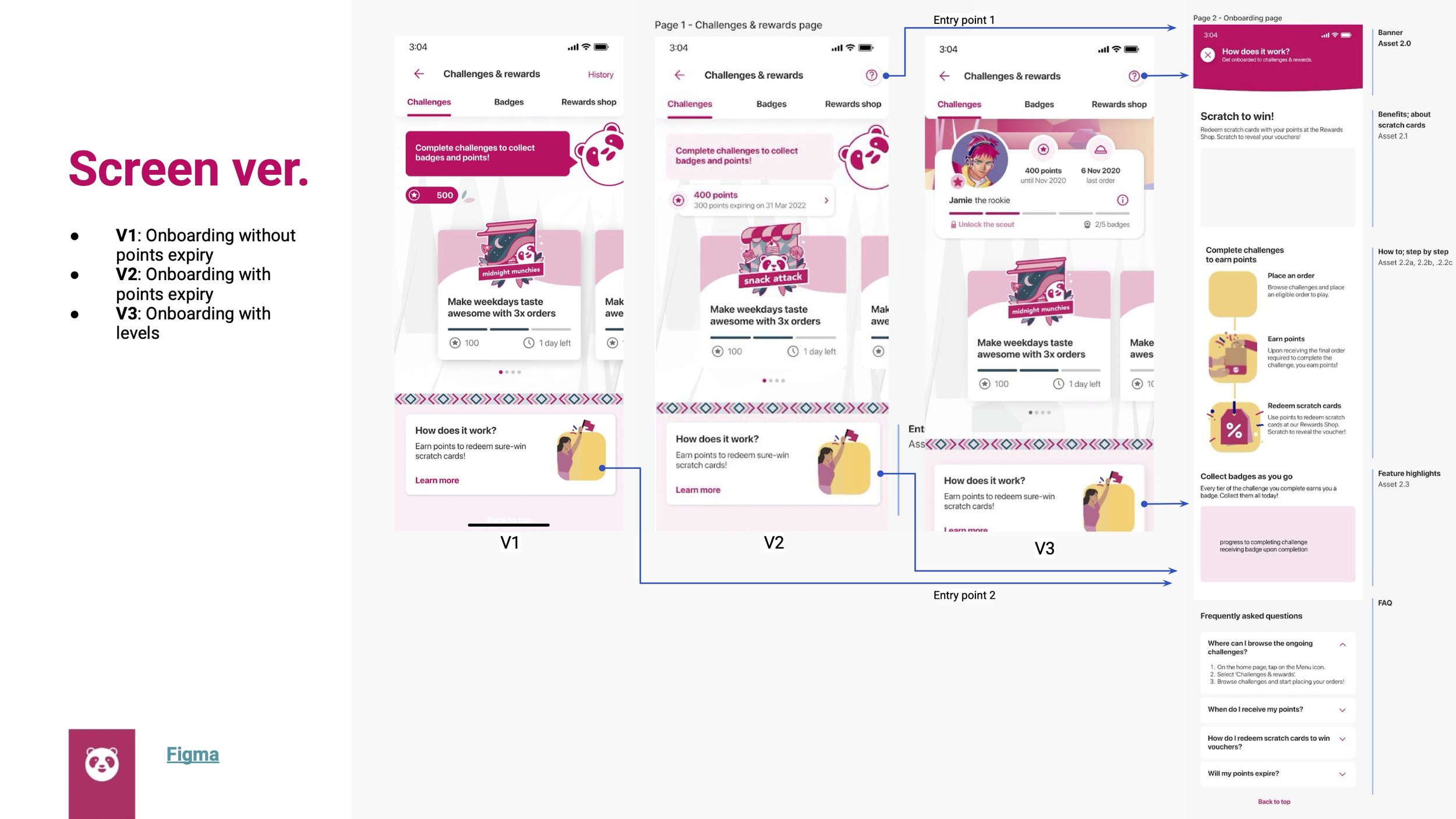
This process was made significantly more complex by the fact that several versions of the loyalty program were being developed concurrently. These different tracks included V1, a baseline version without points expiry; V2, which introduced the business rule of points expiry; and V3, a more advanced version that added a gamified "levels" system
User Research: Visual Perception & Comprehension
Before full implementation, it was critical to validate our design decisions. We conducted a round of User Experience Research (UXR) with two primary objectives:
Evaluate user comprehension: Could users understand the Challenges & Rewards program based on the new information structure?
Evaluate illustration clarity: Did the new illustrations help clarify the program's instructions, or did they introduce new confusion?
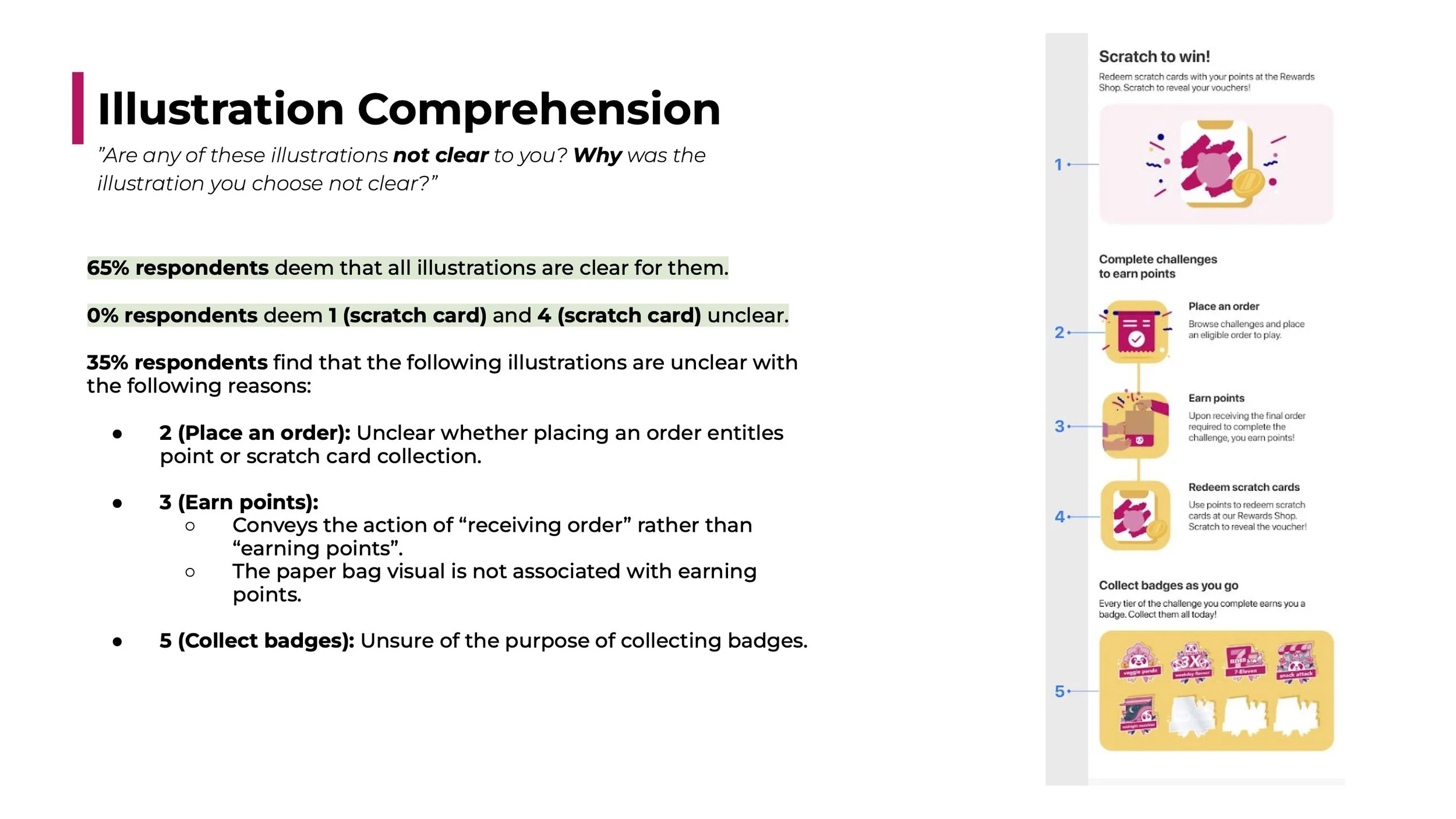
Key UXR Findings: The research provided crucial, actionable insights:
Overall Clarity was Good: 65% of respondents found all illustrations to be perfectly clear.
Critical Steps Were Clear: 0% of users found the "Scratch card" illustrations unclear, meaning the core reward was well-understood.
Points of Confusion Identified: However, 35% of respondents found some illustrations unclear, highlighting specific areas for improvement:
"Earn points": The illustration of a paper bag conveyed "receiving an order" rather than "earning points."
"Place an order": It was unclear if placing an order led directly to a scratch card or to points.
"Collect badges": The purpose and value of collecting badges were not immediately obvious.
4
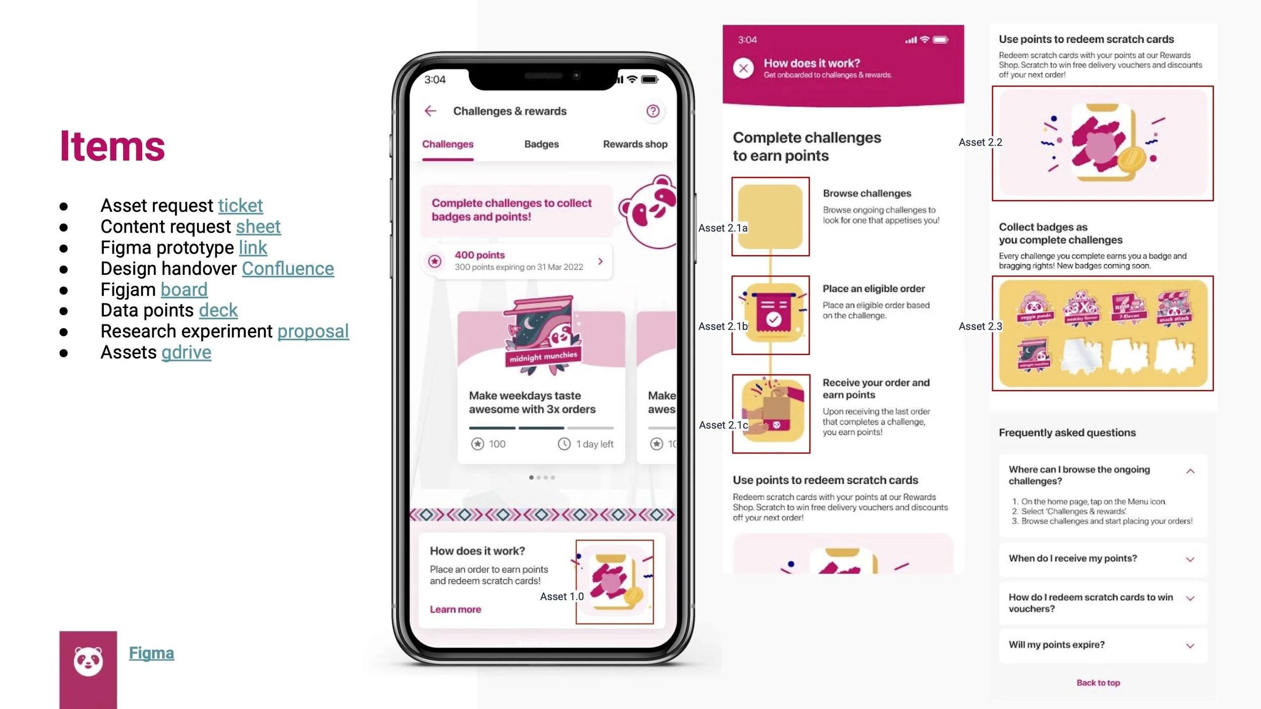
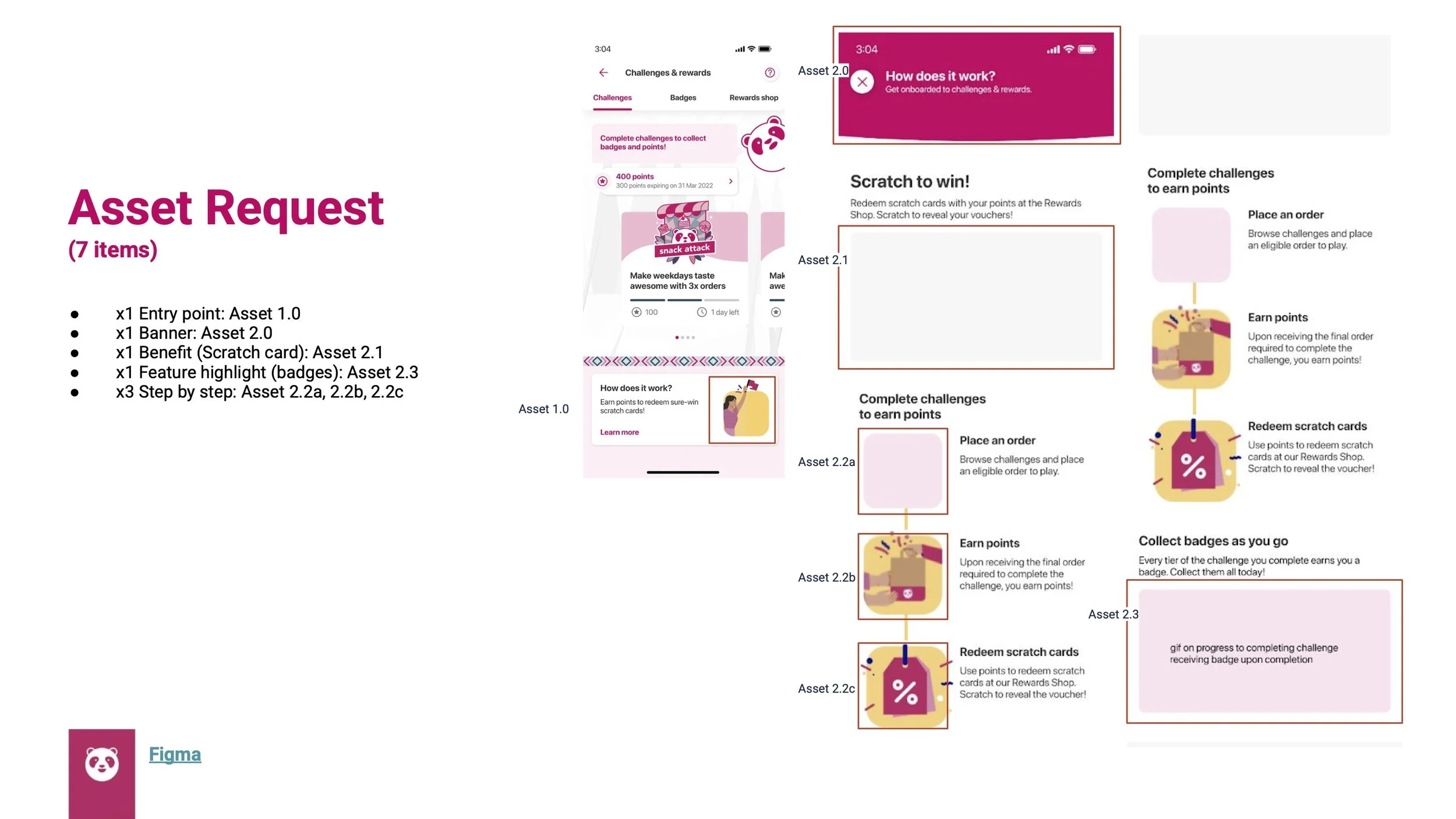
Asset Request
The final, implemented design was a clean, visually-rich guide that broke the loyalty program down into simple, digestible steps. Because this was a visually-heavy project, translating the UXR findings into effective illustrations was paramount. I created a detailed asset request proposal for the branding team, specifying not just what to illustrate, but also providing the research-backed why for each change—such as clarifying the 'earn points' visual. This data-informed approach ensured the final assets were not only on-brand but also solved the specific comprehension issues we had identified.
Asset Request Deck


5

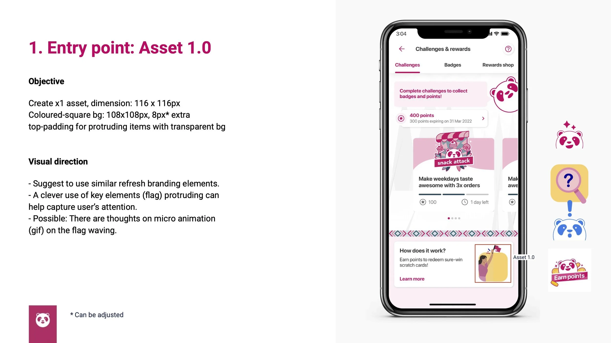
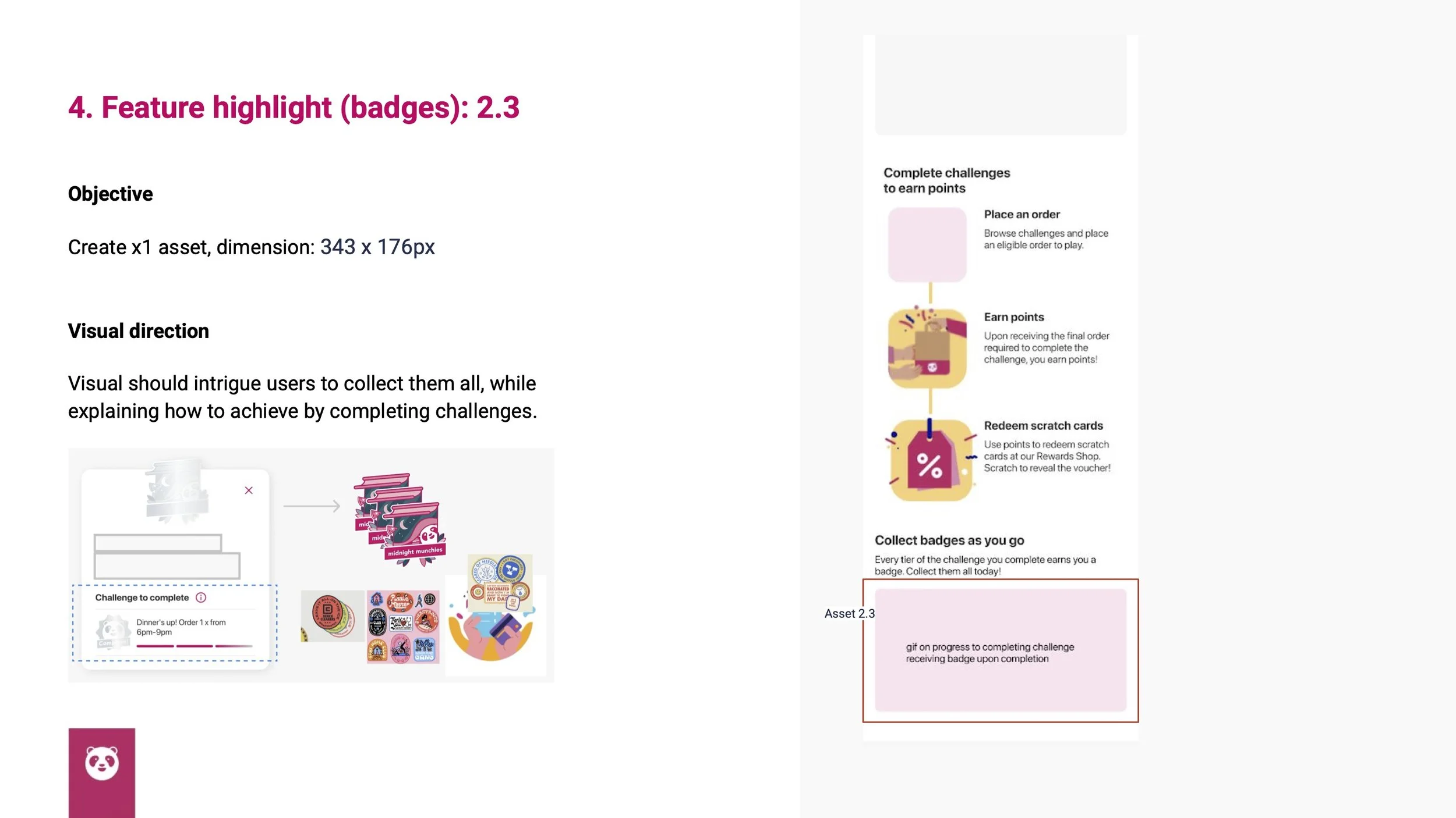
For each of the seven core assets—from the entry point icon to the step-by-step illustrations—I provided clear objectives, dimensions, and specific visual direction rooted in our user research. For example, the brief specified that the "Earn Points" visual should include confetti to create a sense of reward, a direct response to UXR findings. This detailed, data-informed proposal served as a clear brief, and through a collaborative process of feedback and iteration with the brand team, we refined their initial recommendations into a final set of visuals that were not only on-brand but also solved the specific comprehension issues we had identified.
Design Handoff
To ensure a smooth transition from design to development, I created a thorough design handoff package. This included detailed specification sheets that broke down each screen into its core components.
Screen Flow
Design Specification
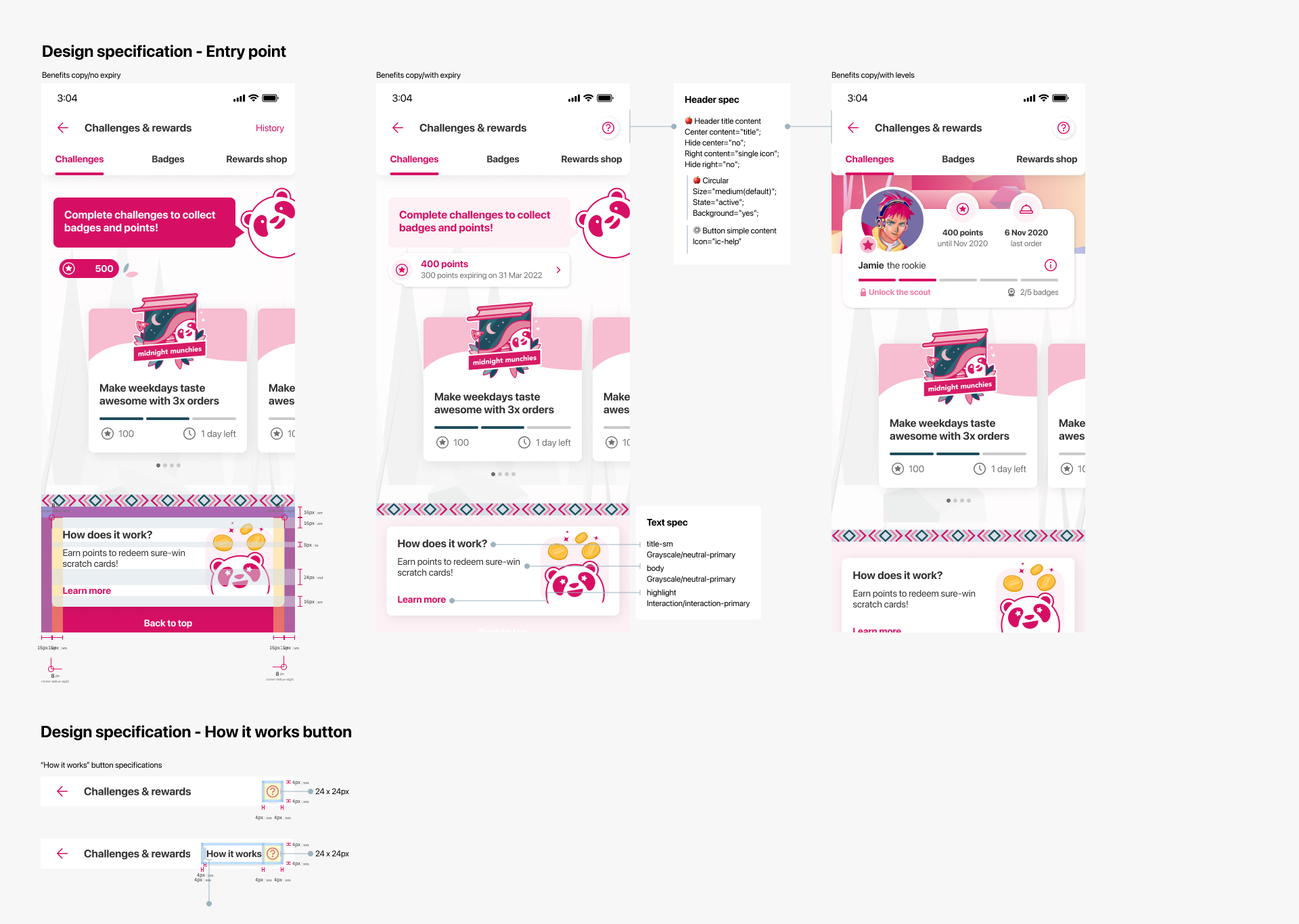
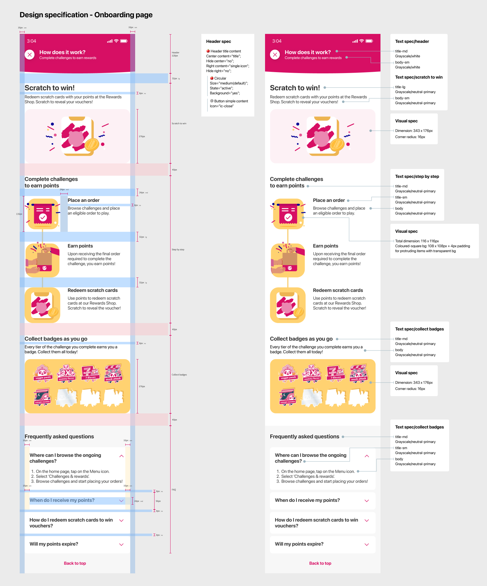
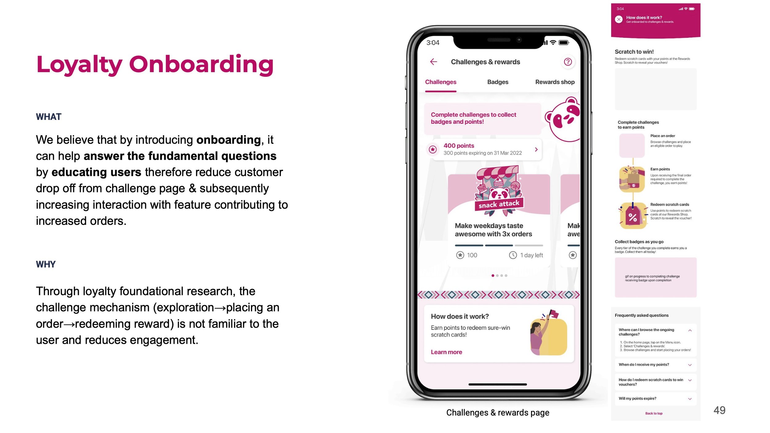
Key Components of the "How Does It Work?" Screen:
The Hook (Scratch to Win!): We led with the most exciting part—the reward.
The Core Loop (Complete, Place, Earn): This section clearly explains the primary actions required to earn points, with refined copy to explicitly link ordering to points.
The Payoff (Redeem Scratch Cards): This closes the loop, connecting the points earned directly back to the reward.
Gamification (Collect Badges): An element of collection was included to highlight progress and encourage repeat engagement, with clearer benefits explained.
For every element, from headers and buttons to individual text blocks and visual assets, I provided precise measurements for dimensions, spacing, and padding. I also specified all typographic details, including font families, weights, and sizes, to ensure visual consistency. This meticulous documentation served as a single source of truth for the engineering team, minimizing ambiguity and ensuring the final, implemented product was a pixel-perfect representation of the validated design.
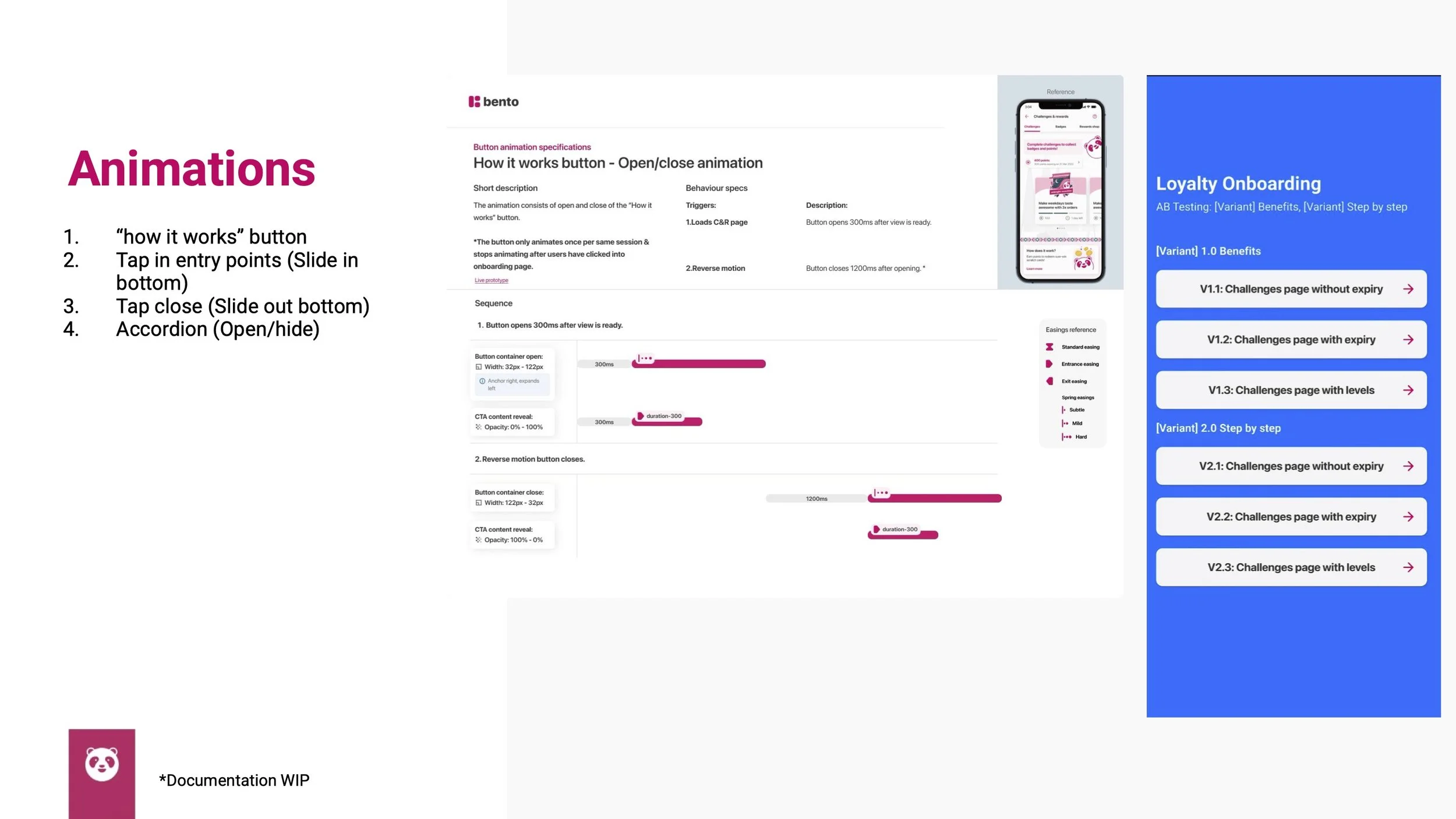
Animation & Micro-interactions Specification
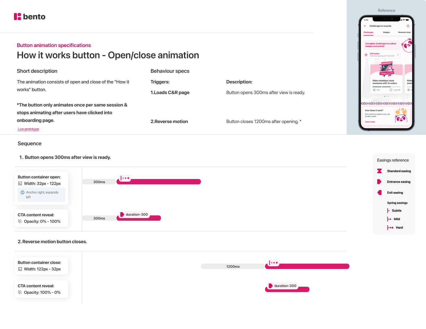
To elevate the experience, I designed several fluid animations:
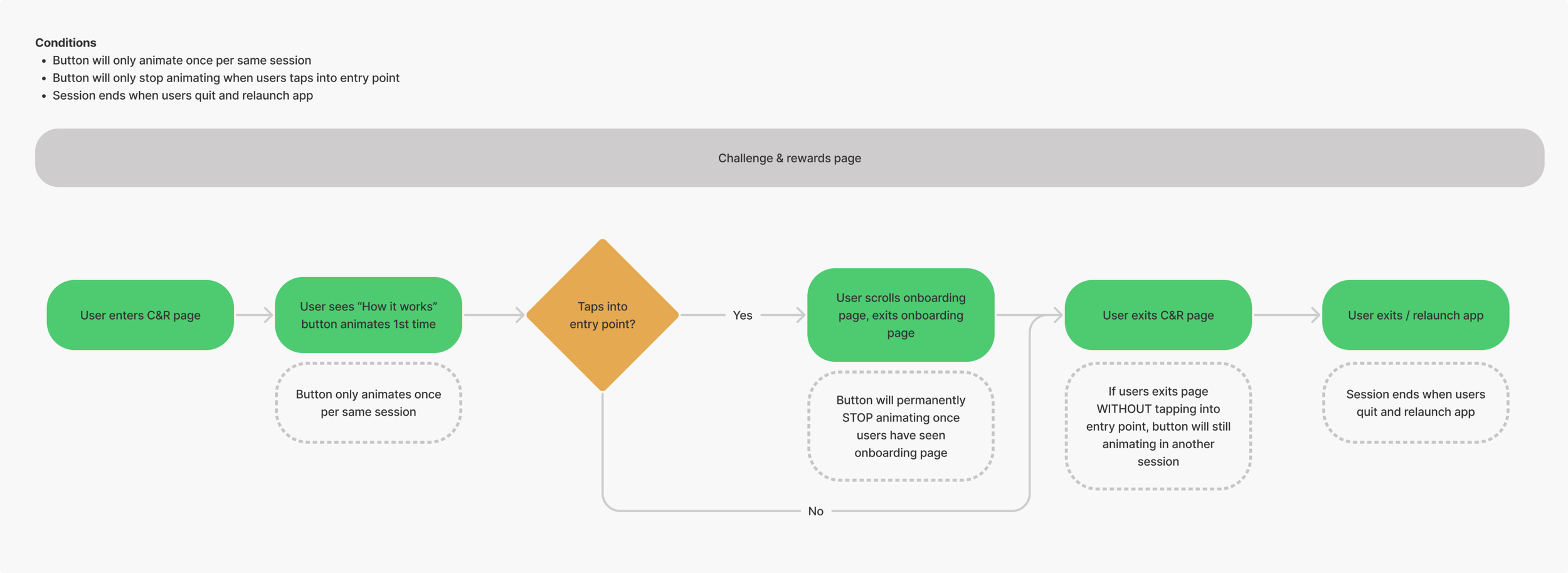
"How it works" Button Animation: To draw attention to the new educational entry point, I designed a subtle but engaging animation for the 'How it works' button. Upon loading the page, the button container smoothly expands from a compact icon to its full width over 300ms, revealing the text inside with a corresponding fade-in effect. After a brief pause, it reverses the motion to return to its compact state. This animation was designed to play only once per session, ensuring it would catch the user's eye on their first visit without becoming a persistent annoyance.
Slide-in Transition: The onboarding screen slides up from the bottom, creating a smooth, contextual overlay.
Accordion Animation: The "Frequently Asked Questions" section uses a clean open/hide animation, keeping the screen tidy while making extra information readily available.

Final Thoughts
As a product designer, this project was a fantastic reminder that sometimes the most impactful solutions aren't about reinventing the wheel, but about building a better bridge. We didn't need a radical new feature; we just needed to connect users to the value that was already there. It was incredibly rewarding to dive deep into the user's mindset, untangle their points of confusion, and translate those insights into a simple, clear guide. Experimenting with motion and micro-interactions, like the subtle animation on the 'How it works' button, was also a key part of making the experience feel more polished and intuitive. This project reinforced my belief that advocating for the user, collaborating closely with brand and engineering, and focusing on clarity—is the most direct path to creating products that people find useful.