The Evolution of Internal Tools: Marketing Management Tool (MMT)
From a tangle of confusing systems to one streamlined platform. Here’s how we transformed foodpanda's internal user experience.
This project addressed the significant operational inefficiencies at foodpanda caused by a fragmented ecosystem of internal marketing tools. By leading the end-to-end design of a new, unified Marketing Management Tool (MMT), we replaced a confusing collection of disparate systems with a single, streamlined platform. The new tool successfully standardized workflows, simplified the user experience, and eliminated key pain points for global teams. The result is a cohesive and intuitive platform that reduces onboarding time and empowers internal users to manage campaigns more efficiently across all squads.

The Context and Challenges from the Project Journey
Understanding the context in which it unfolds is key to appreciating its complexities. In this deep dive, we explore the unique challenges faced throughout the project journey—highlighting obstacles, decision points, and lessons learned that shaped the outcome. By dissecting these details, we gain valuable insights that can guide future initiatives toward greater success.
Current Challenge
With a product diverse with many squads, individual squads have resulted in building their own CRM tool to ship their feature as fast as possible. It is certainly a hotfix for a more complex problem, having an individual tool for each squad, for a similar pool of internal users. Imagine a new hire having to learn 5 different tools to contribute on the same app, that would not be ideal when the company grows with new teams and hires.
Objective
Squads coming together to standardise individual internal tools into one for our internal users, across different functions.
Define Goals & Plans
In Scope:
Unify Core Workflows: The primary goal was to standardize the process for creating and managing badges and challenges across all relevant squads.
Develop a Consistent UI/UX: This involved creating a shared component library and design system to ensure a cohesive look and feel.
Implement a Summary Preview: A crucial feature to allow users to review their work and catch errors before publishing.
Address Key UI Discrepancies: This included standardizing table layouts, field names, and filtering mechanisms to reduce user confusion.
Out of Scope:
Advanced Analytics and Reporting: While important, building a comprehensive analytics dashboard was deferred to a future phase.
Integration with All Internal Tools: The project focused exclusively on the marketing and CRM-related tools, not the entire suite of foodpanda's internal software.
Complete Backend Overhaul: The project prioritized front-end and user experience improvements, working within the existing backend architecture where possible.
Design Exploration, Ideation & Execution
Areas I led in:
Documenting Current System
User Interview
Design Exploration
User Research: Visual Perception & Comprehension
Asset Request
Design Handoff
1
Documenting Current System
The first step was to map out the current user flows in detail. This process allowed our team to visualize the complexity and fragmentation of the existing tools, revealing redundant steps, inconsistencies between different workflows, and a confusing overall user journey. This detailed mapping served as a foundational artifact, ensuring that everyone involved—from designers to stakeholders—had a shared understanding of the terminology, pages, and processes we were aiming to improve.
Screen Map
User Flow Map
By speaking with users from diverse markets, we gathered varied perspectives on their day-to-day workflows and identified the most critical functions the new tool needed to have. These key functions included allowing users to add badges and challenges for every new wave (every two weeks) in at least five countries, and providing a summary preview to prevent language or spelling errors before publication.
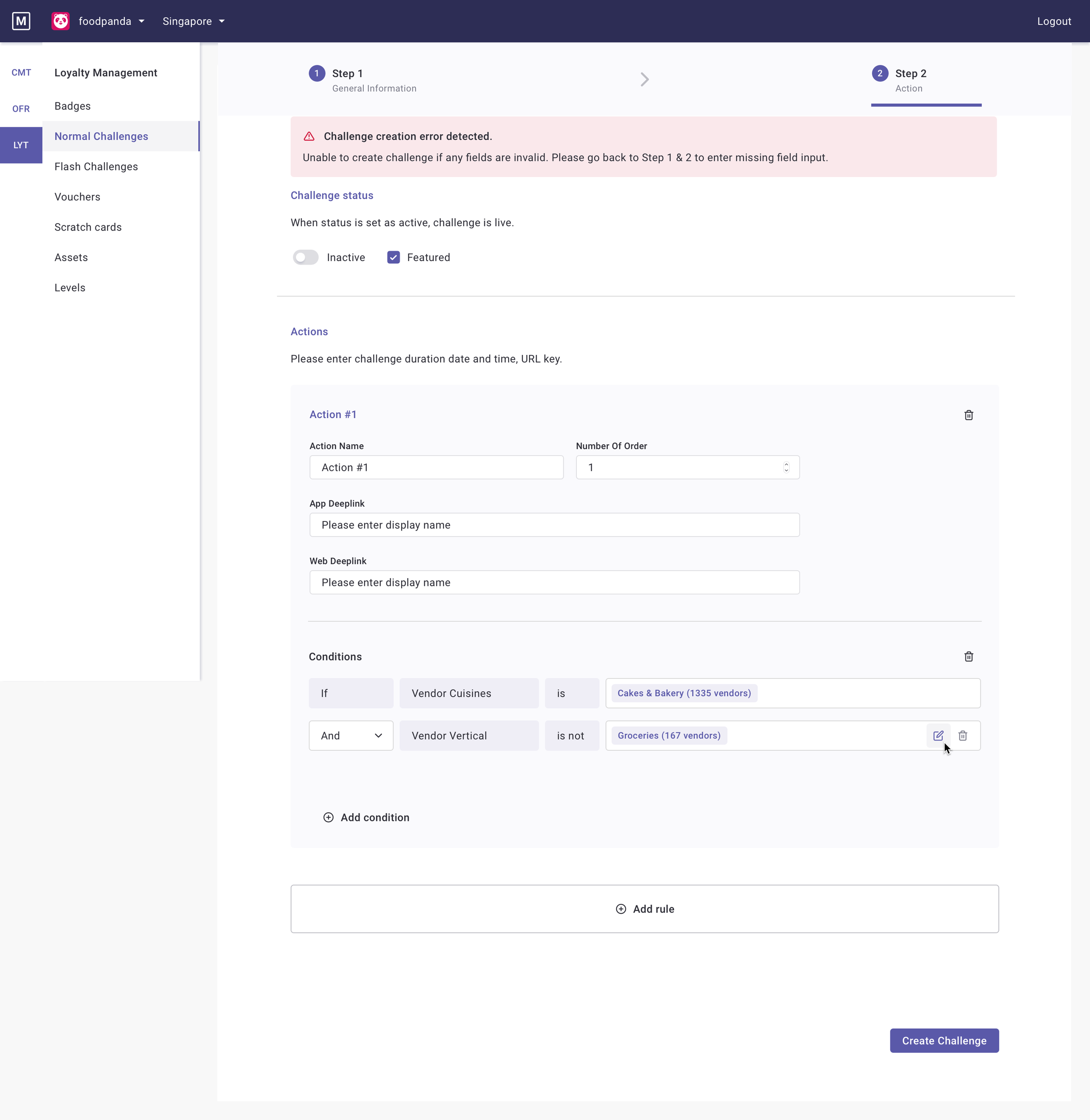
Our research revealed several critical pain points that plagued the daily workflows of our internal users. Simple tasks like assigning languages or rewards were prone to error; for instance, users would accidentally assign the wrong badge to a live challenge with no way to correct the mistake. The user interface itself was a source of constant frustration, with inconsistent terminology, confusing layouts that forced users to jump between different screens, and a lack of a clear quality control process before content was published. These issues combined to create a high-risk, high-cognitive-load environment where users had to manually double-check their work and were often blocked from making simple edits once a campaign was live.
User Interview
To fully grasp the current challenges, it was crucial to go directly to the source: our internal users. We conducted a series of in-depth user interviews with team members in different countries, including the APAC region, Hungary, and Romania. This global approach was essential to understanding their pain points holistically. By speaking with users from diverse markets, we gathered varied perspectives on their day-to-day workflows, identified common frustrations with the existing tools, and uncovered critical usability issues that a single, centralized solution needed to address.
Identifying Key Functions
4
Design Exploration
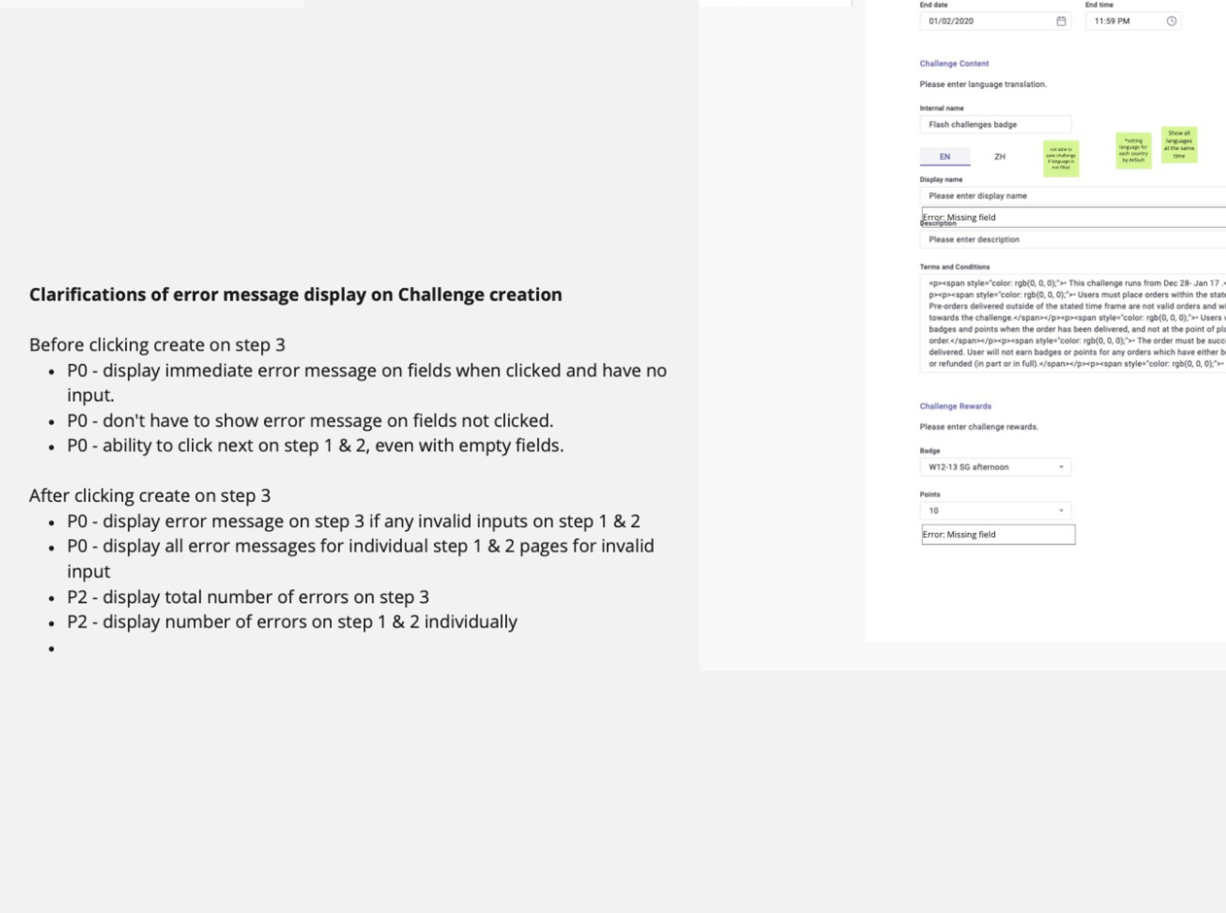
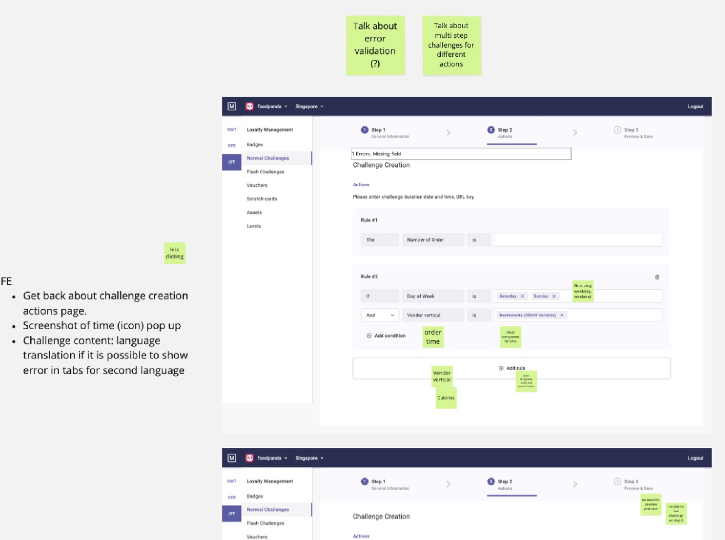
Identifying Key UI Discrepancies
Our deep dive into the existing tools revealed five major areas of UI inconsistency that were causing significant user frustration:
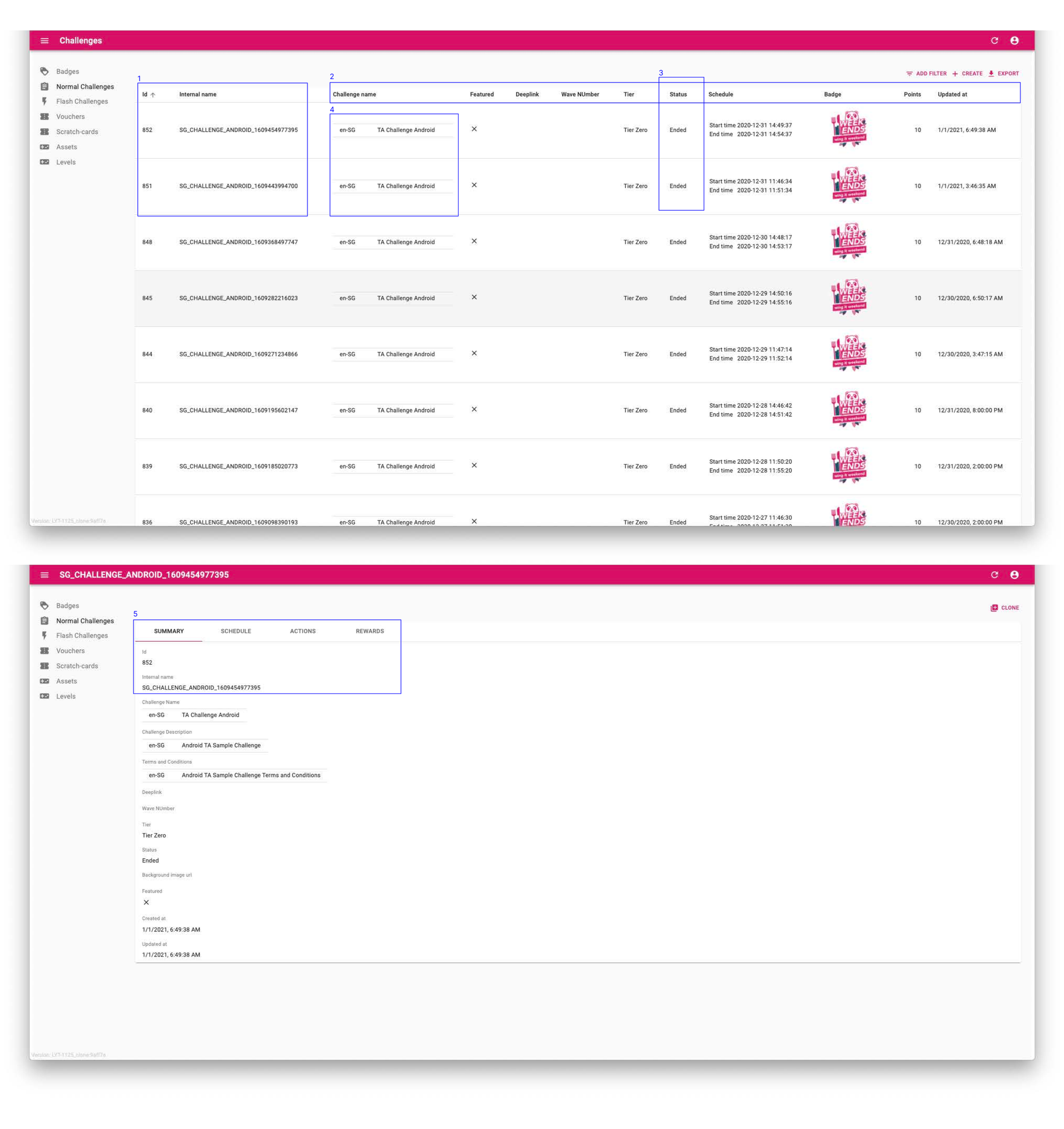

Table: Each page was not carefully thought out, displaying data points that were not relevant to users at a high-level table view.
Table column: Fields were named differently for similar items, lacking consistency across all pages.
Filtering information: Displaying inactive and active items by default, filtering was needed each time to view active badges or challenges, which caused annoyance to users.
Information: Information was displayed in terms that developers use, not readable and friendly to users.
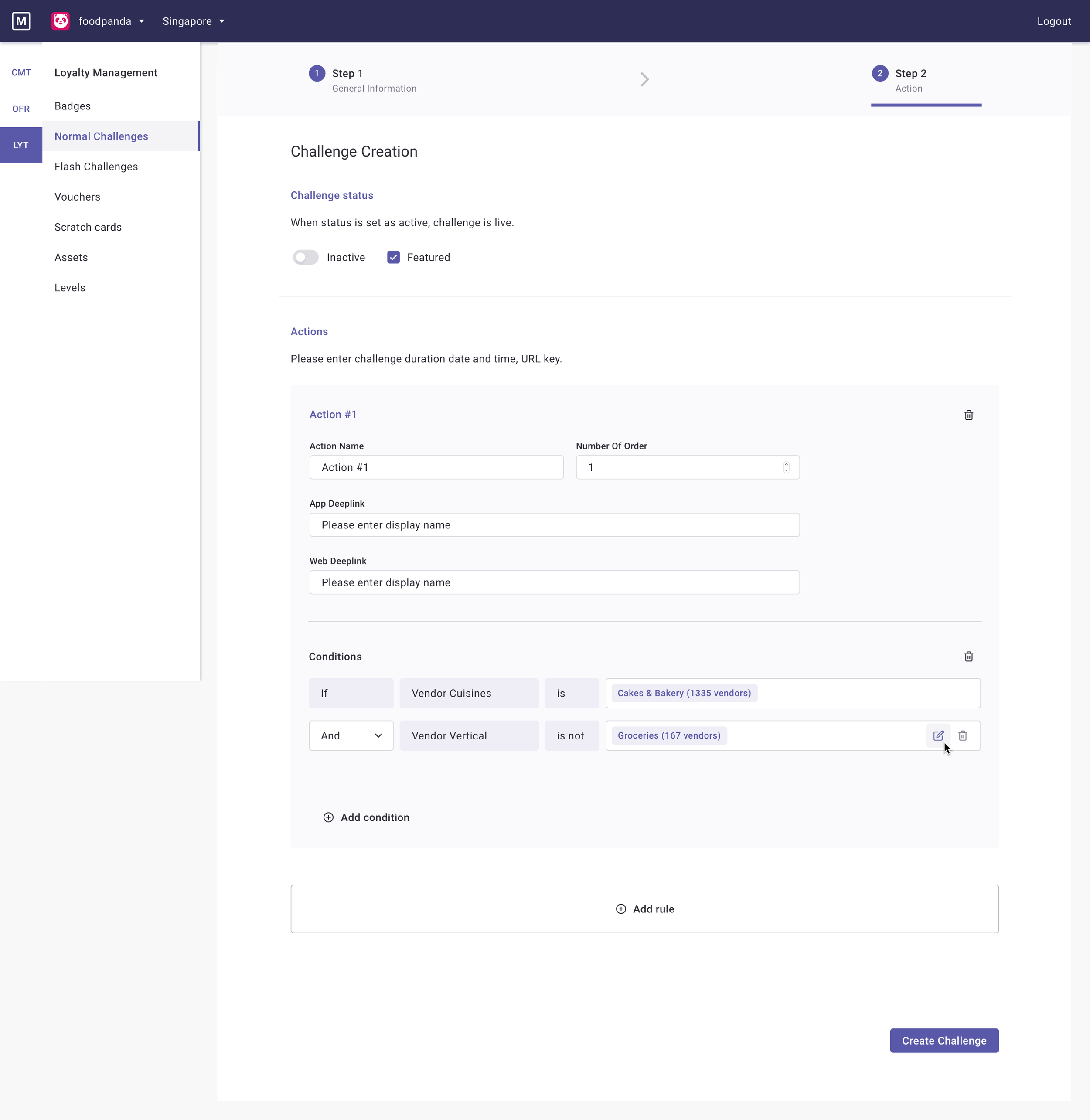
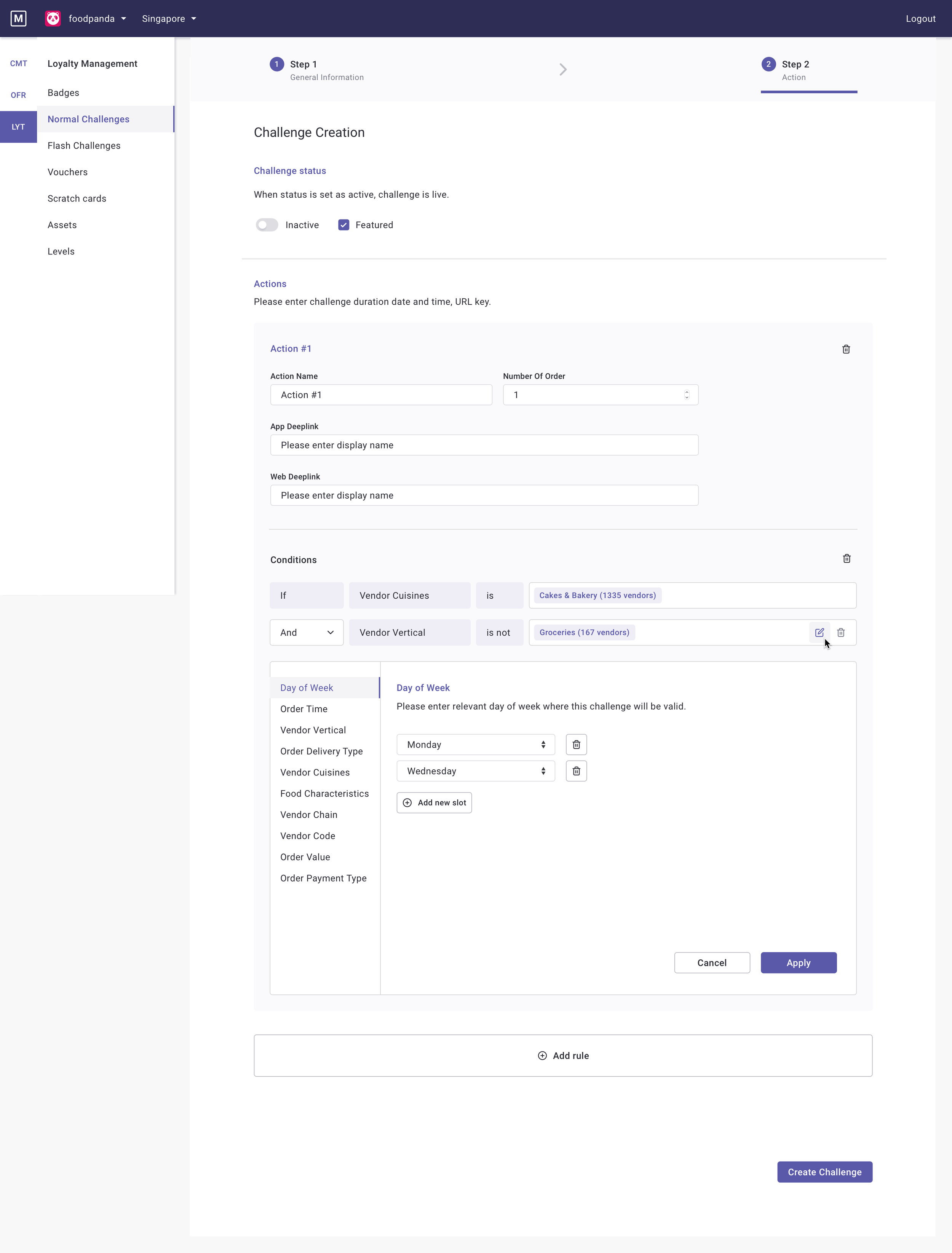
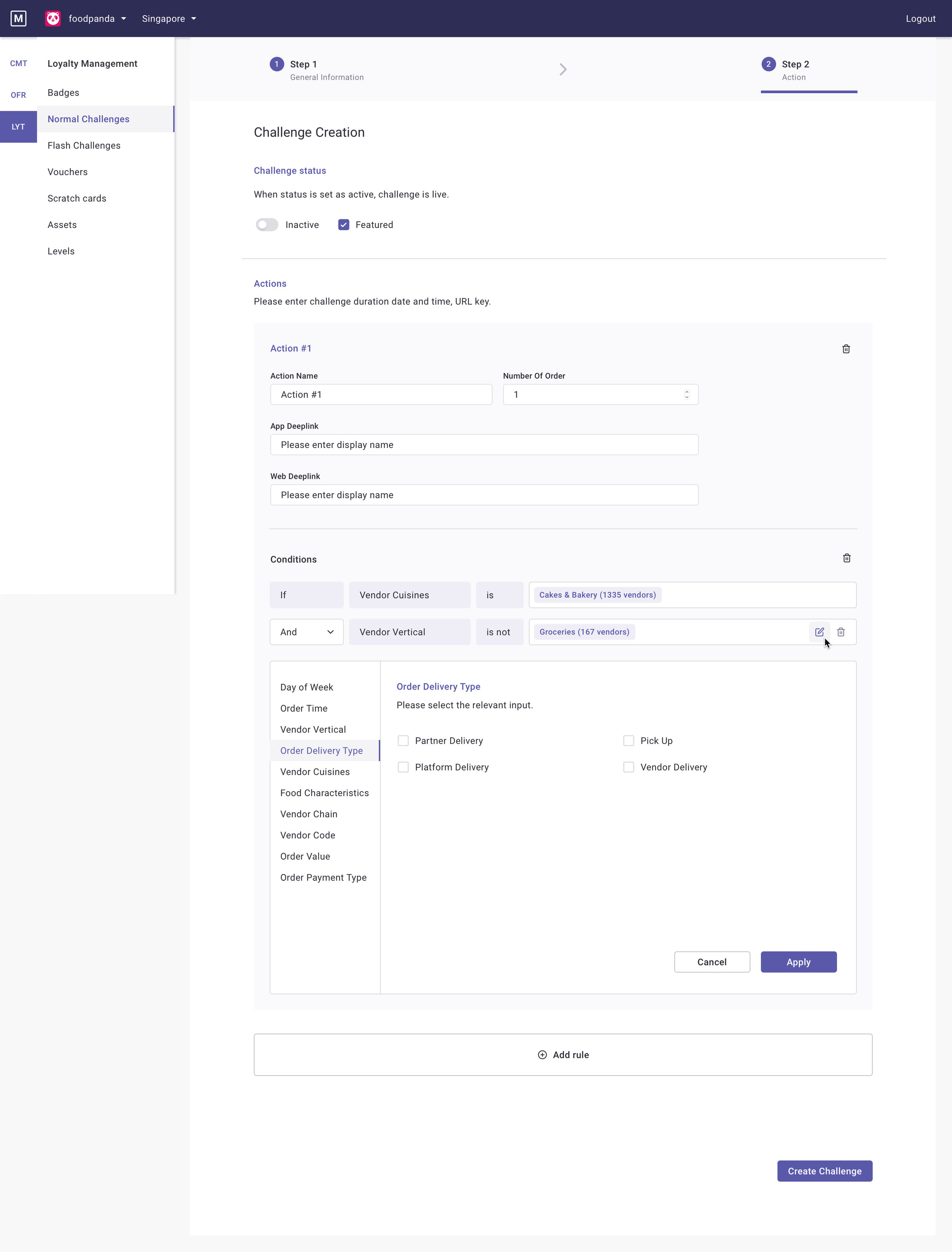
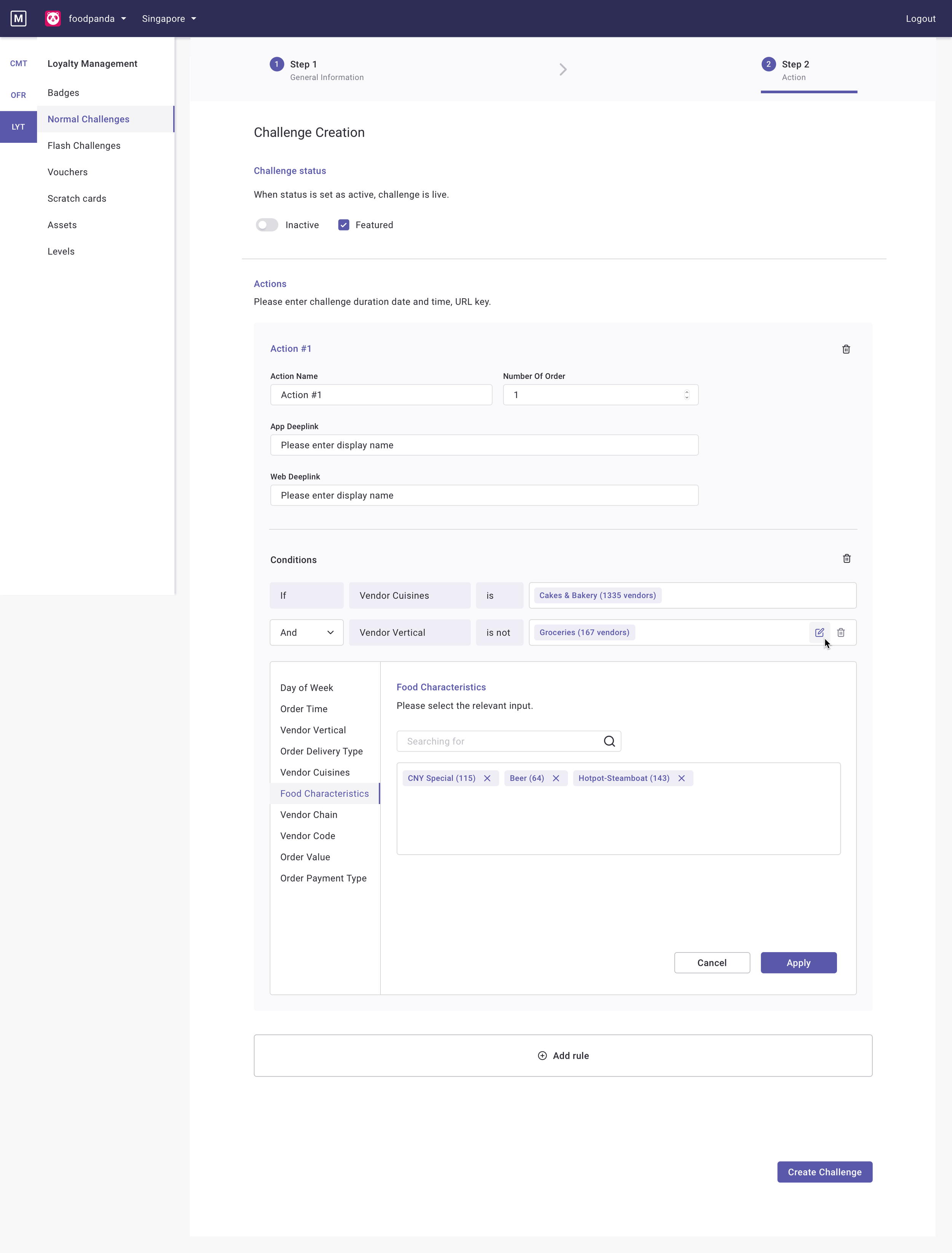
Input page: Page layout was displayed differently between different pages, one showing fields while another showing up in tabs.
Midfi Wireframe

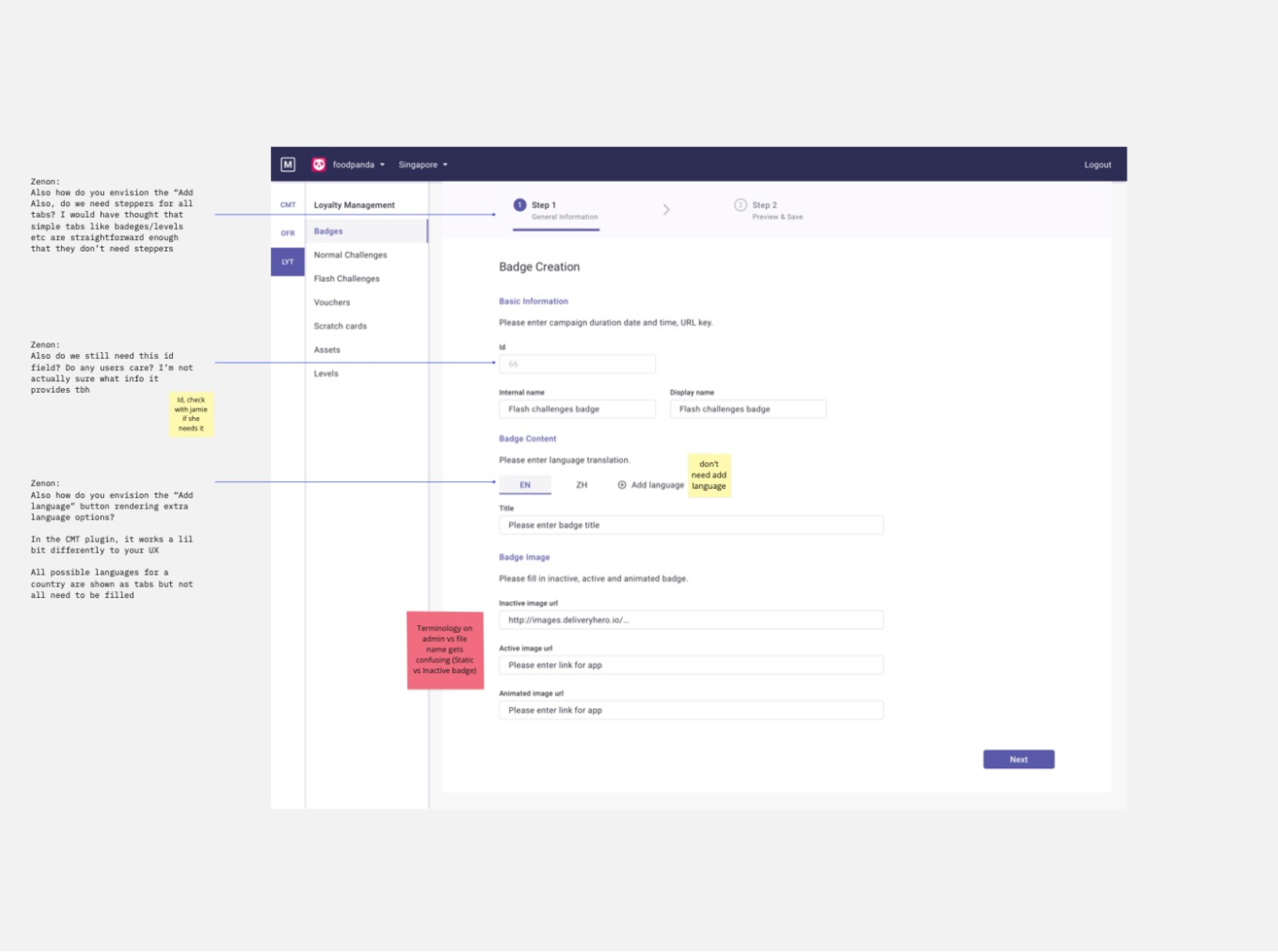
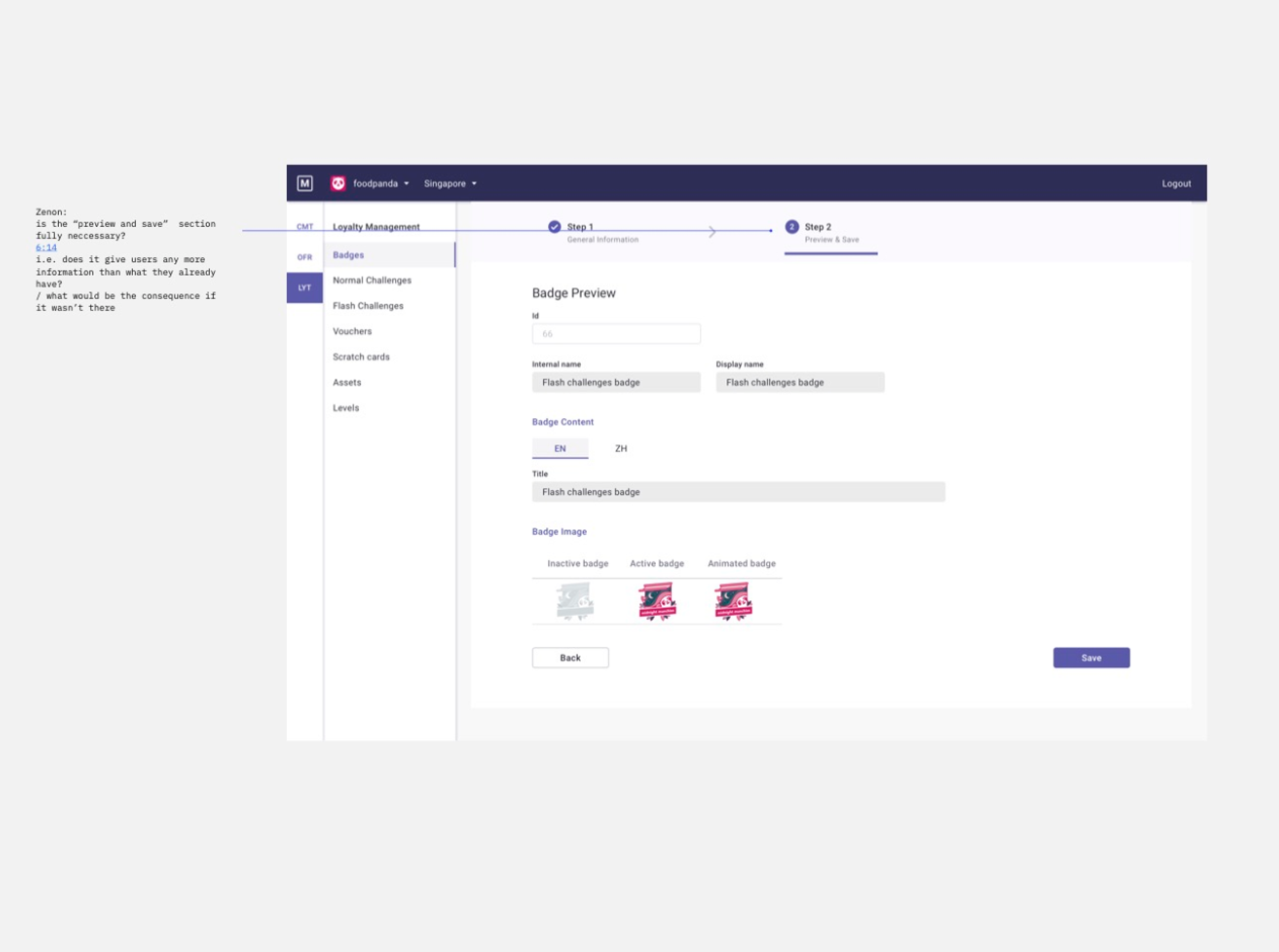

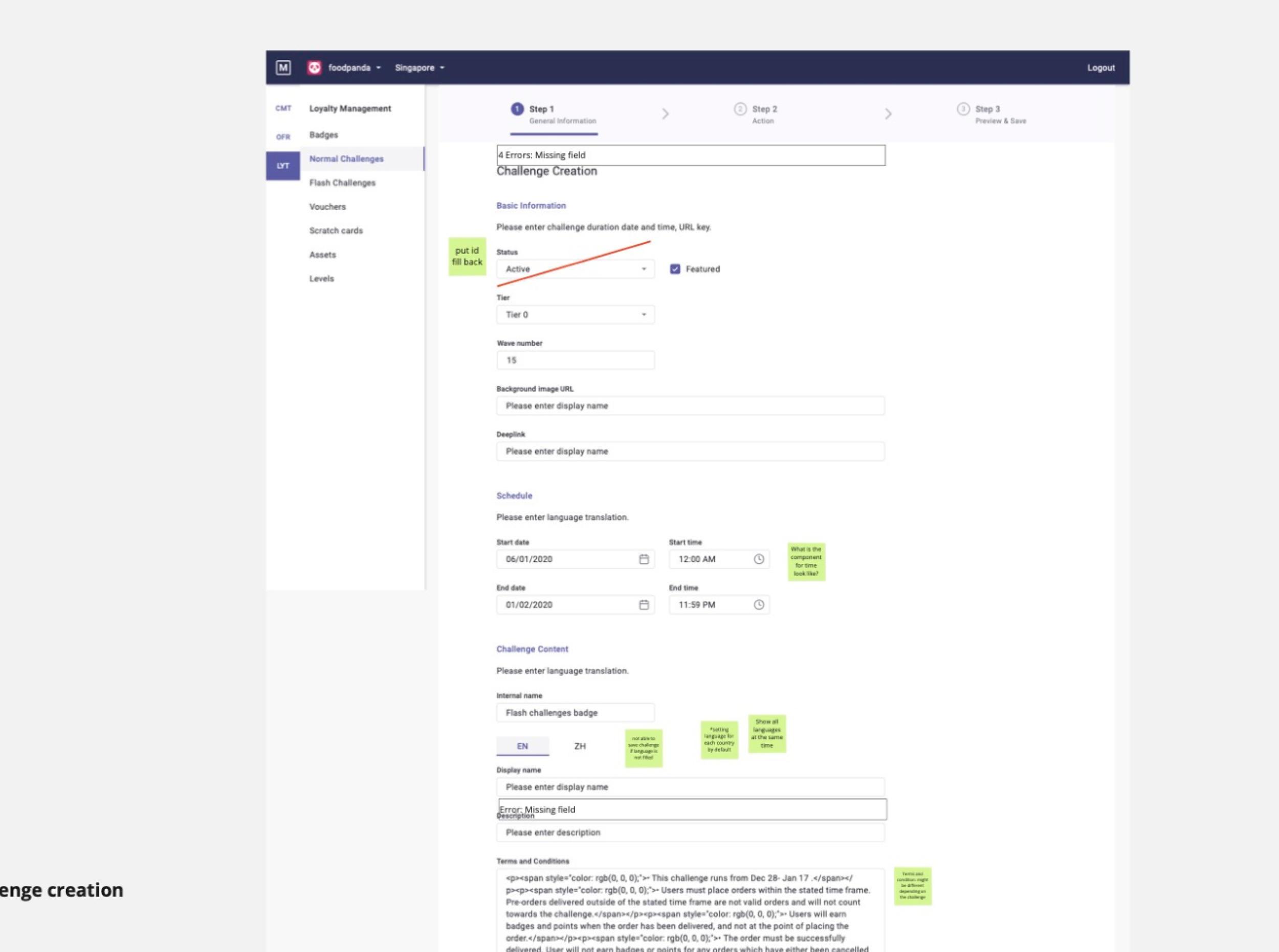
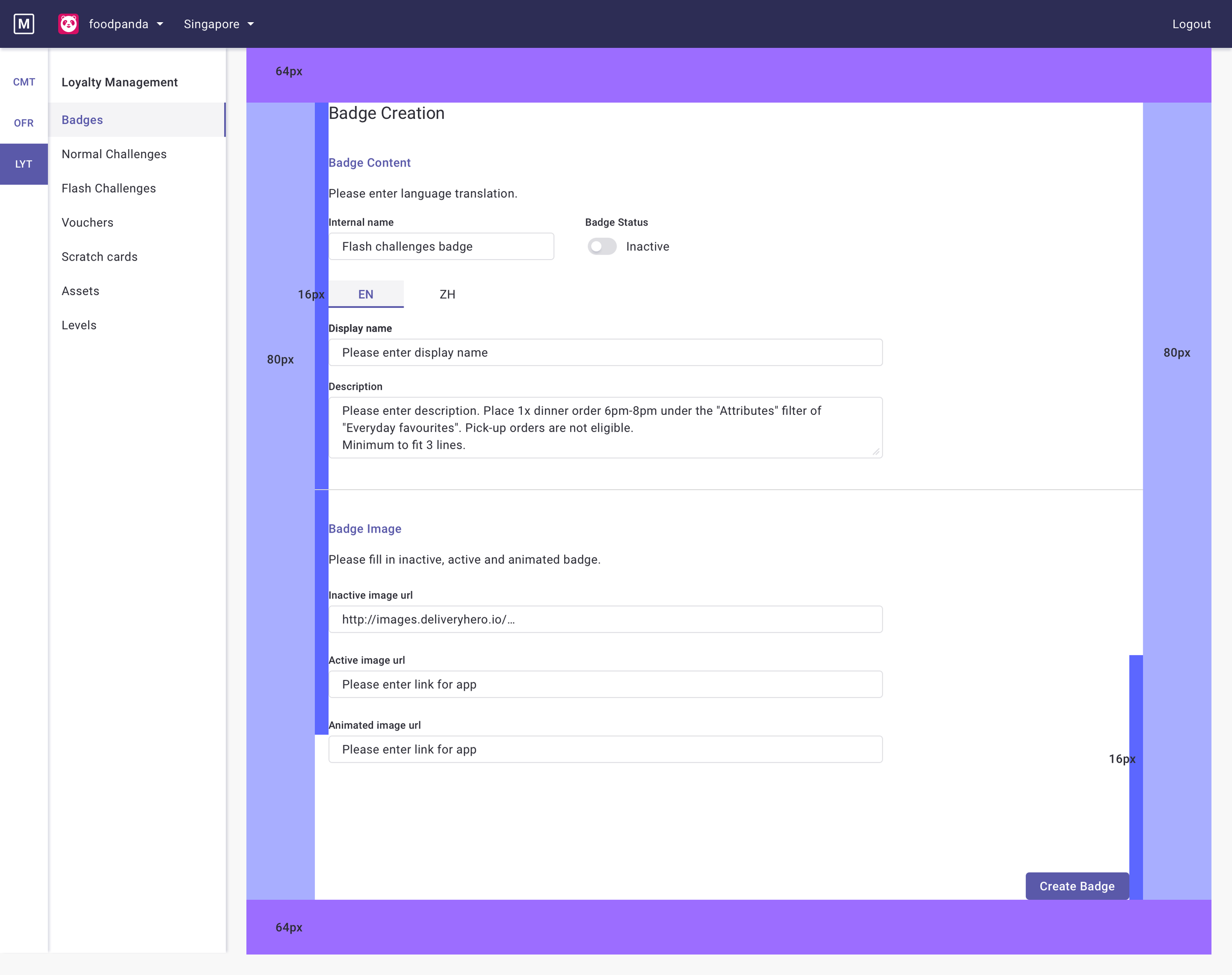
To bridge the gap between research and development, I created a series of mid-fidelity wireframes. This was a crucial step to provide the engineering team with a tangible blueprint of the proposed solution. These wireframes outlined the core components for the new Loyalty Management pages, including the main dashboard, input forms, and the badge page flow. By visualizing the structure and layout early on, we enabled the engineering team to begin working on their technical specifications and effort estimates, ensuring a smoother and more collaborative development process.
Loyalty MMT Screens
The solution was to design and build a single, standardized Marketing Management Tool (MMT) that would replace the various individual tools. The key improvements included:


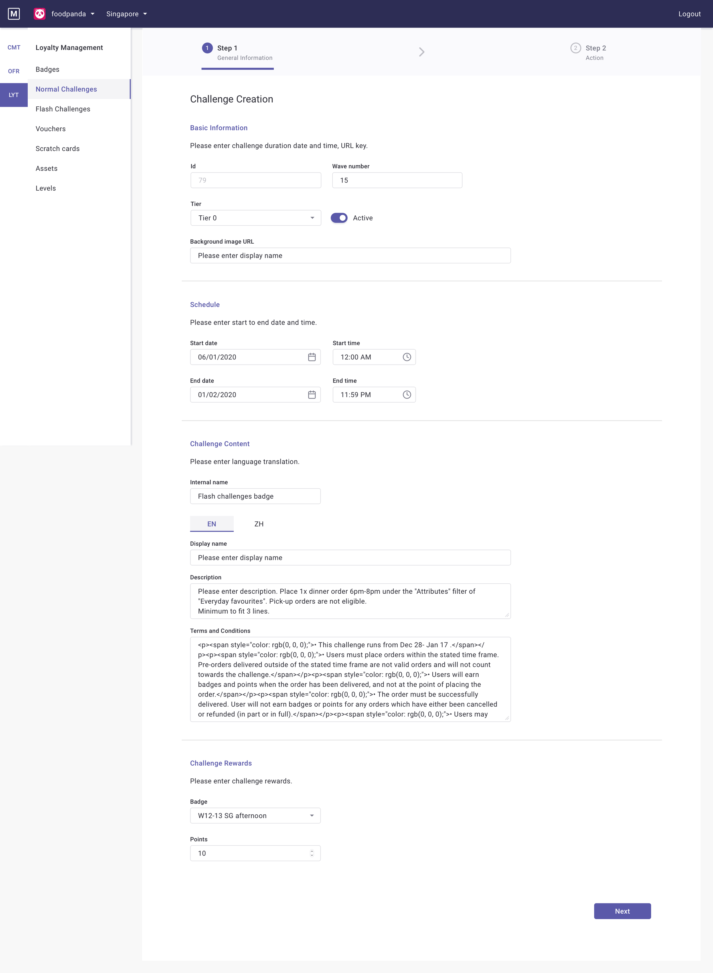


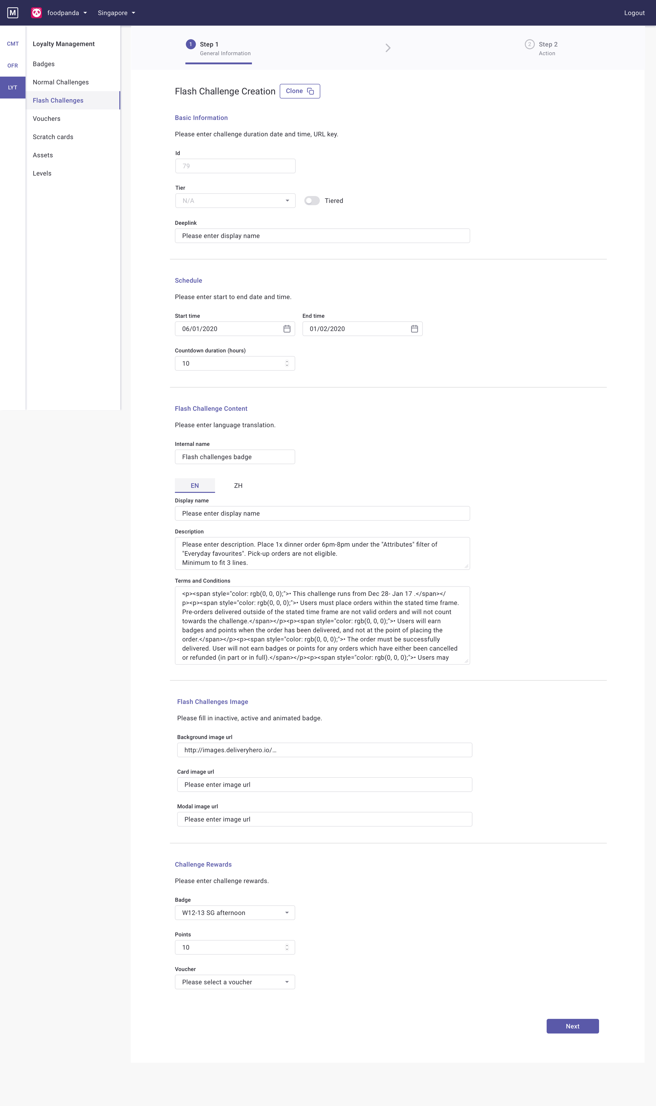


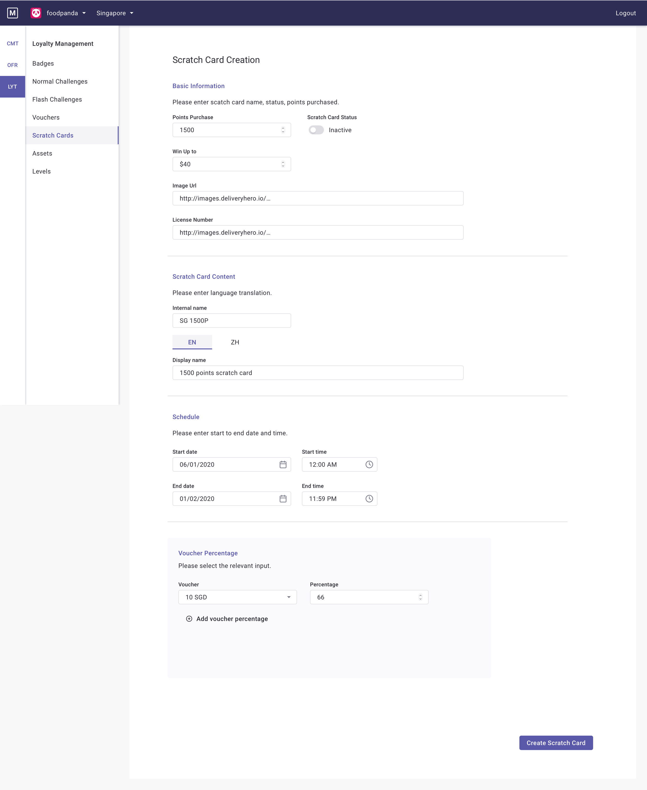

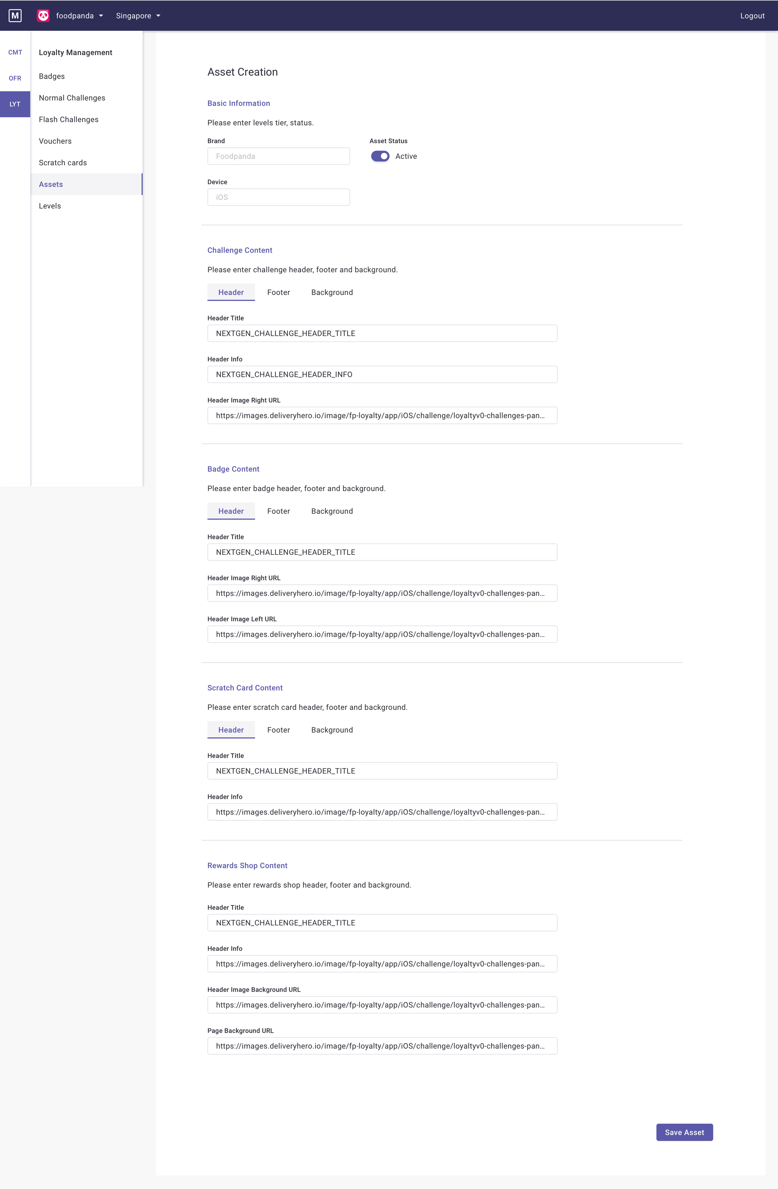

Standardized UI and Terminology: A consistent design system was created for the MMT, including standardized names for fields and a unified layout across all pages. This helps to reduce cognitive load for users.
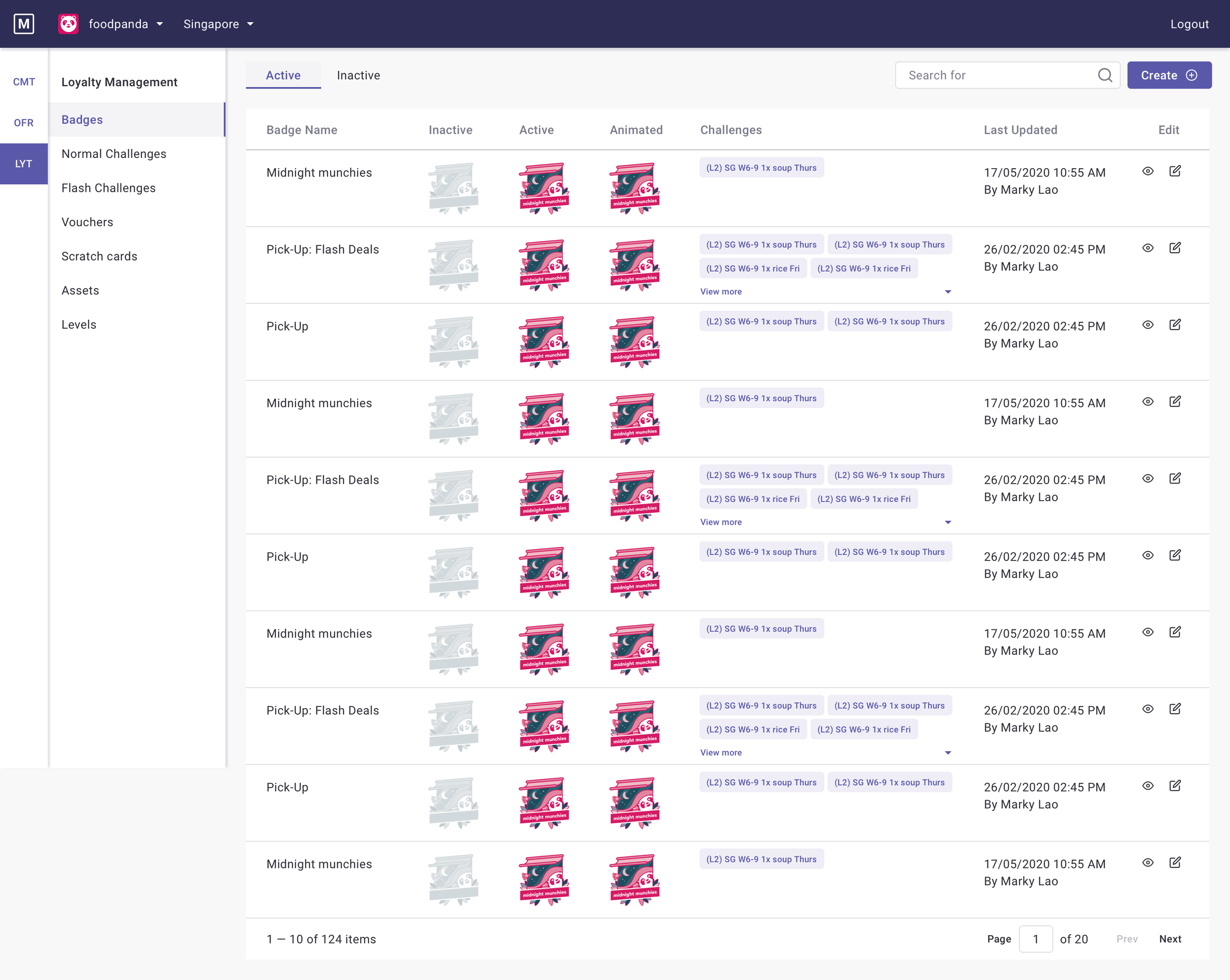
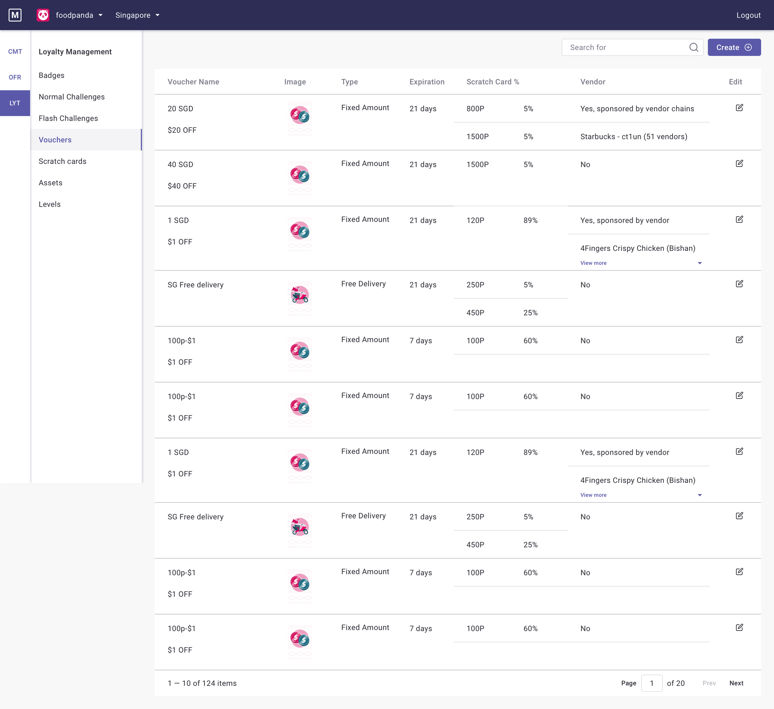
Improved Information Architecture: The table views were redesigned to display only the most relevant data at a high level. A tabbed system was introduced to separate active and inactive items, eliminating the need for constant filtering.
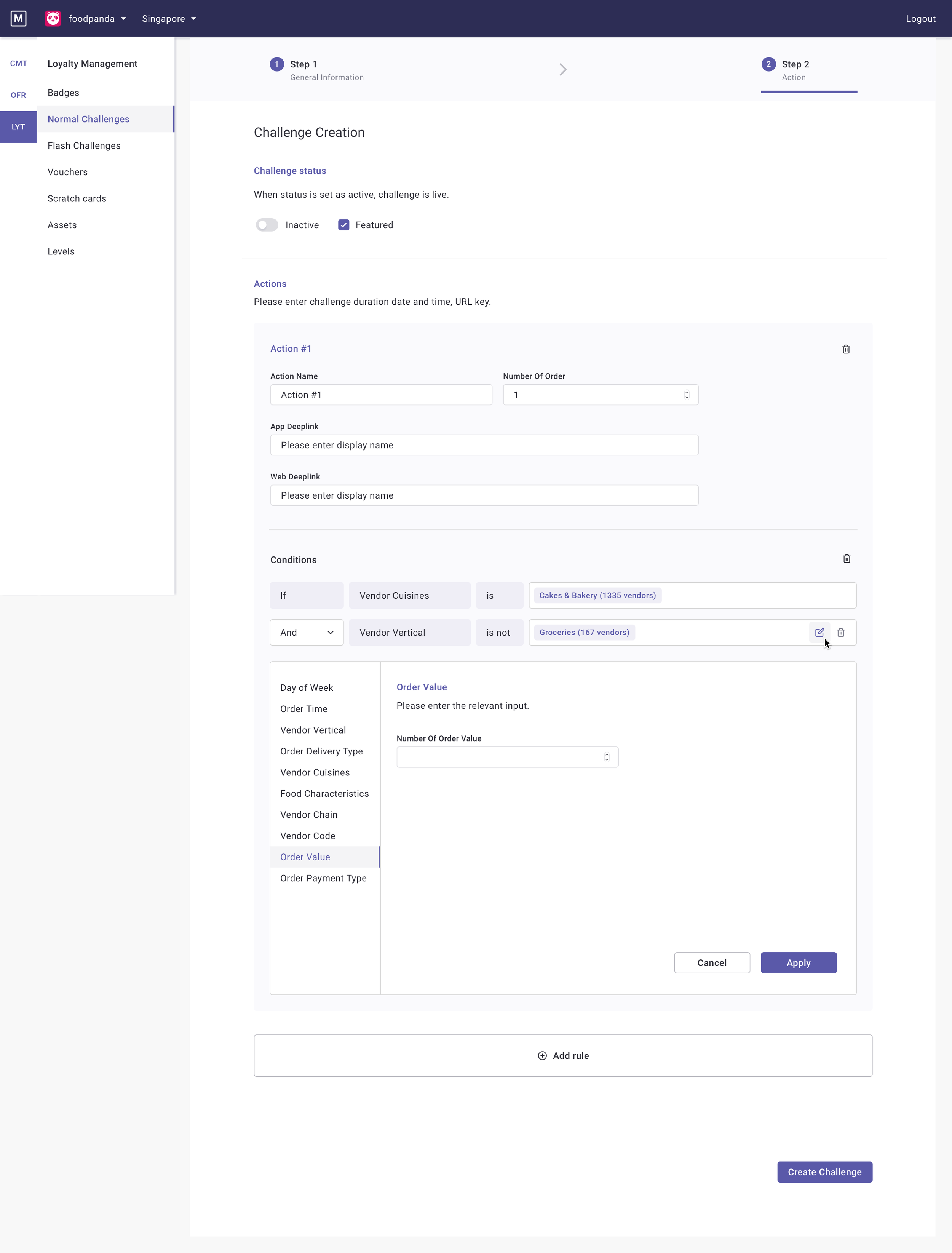
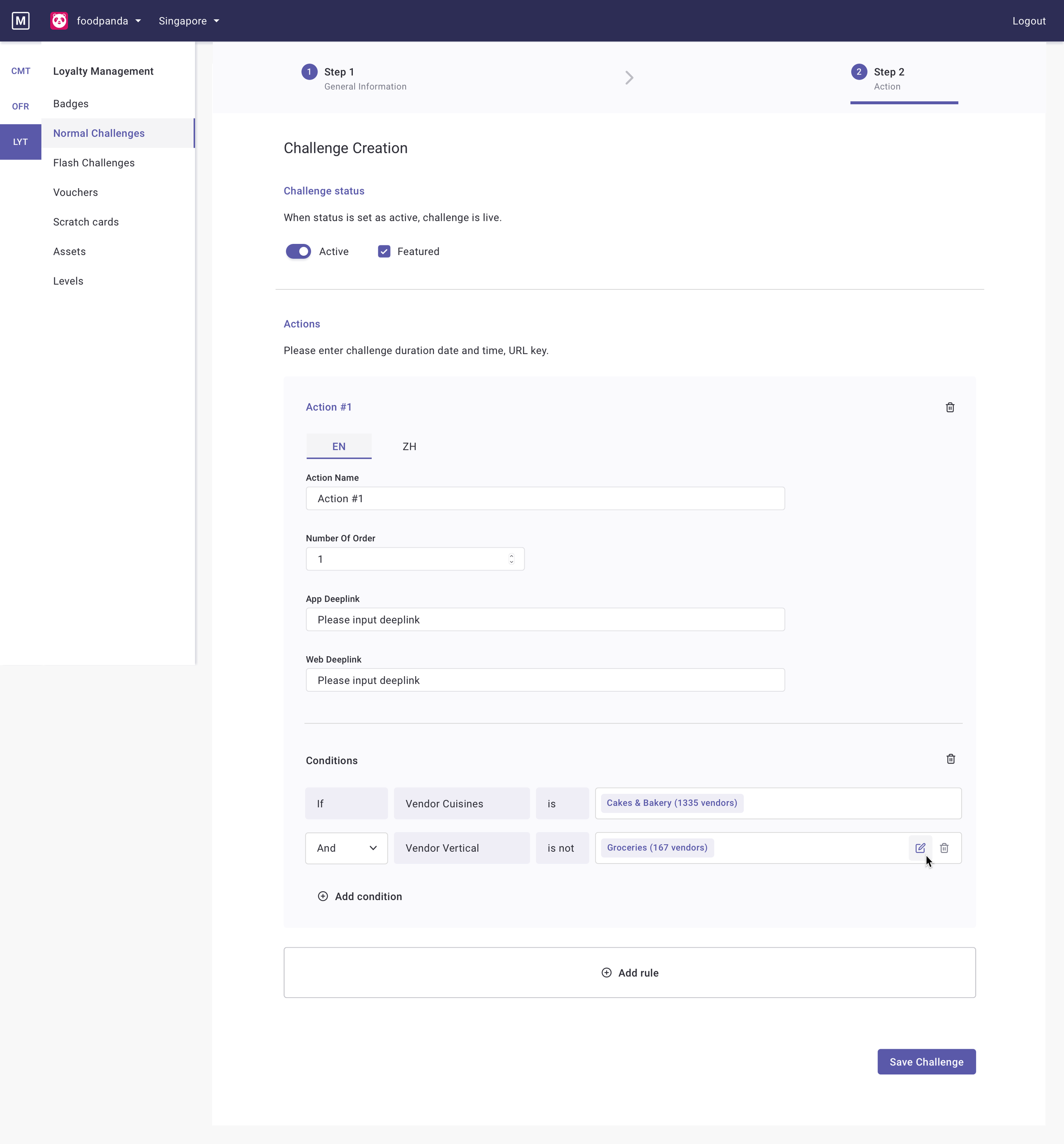
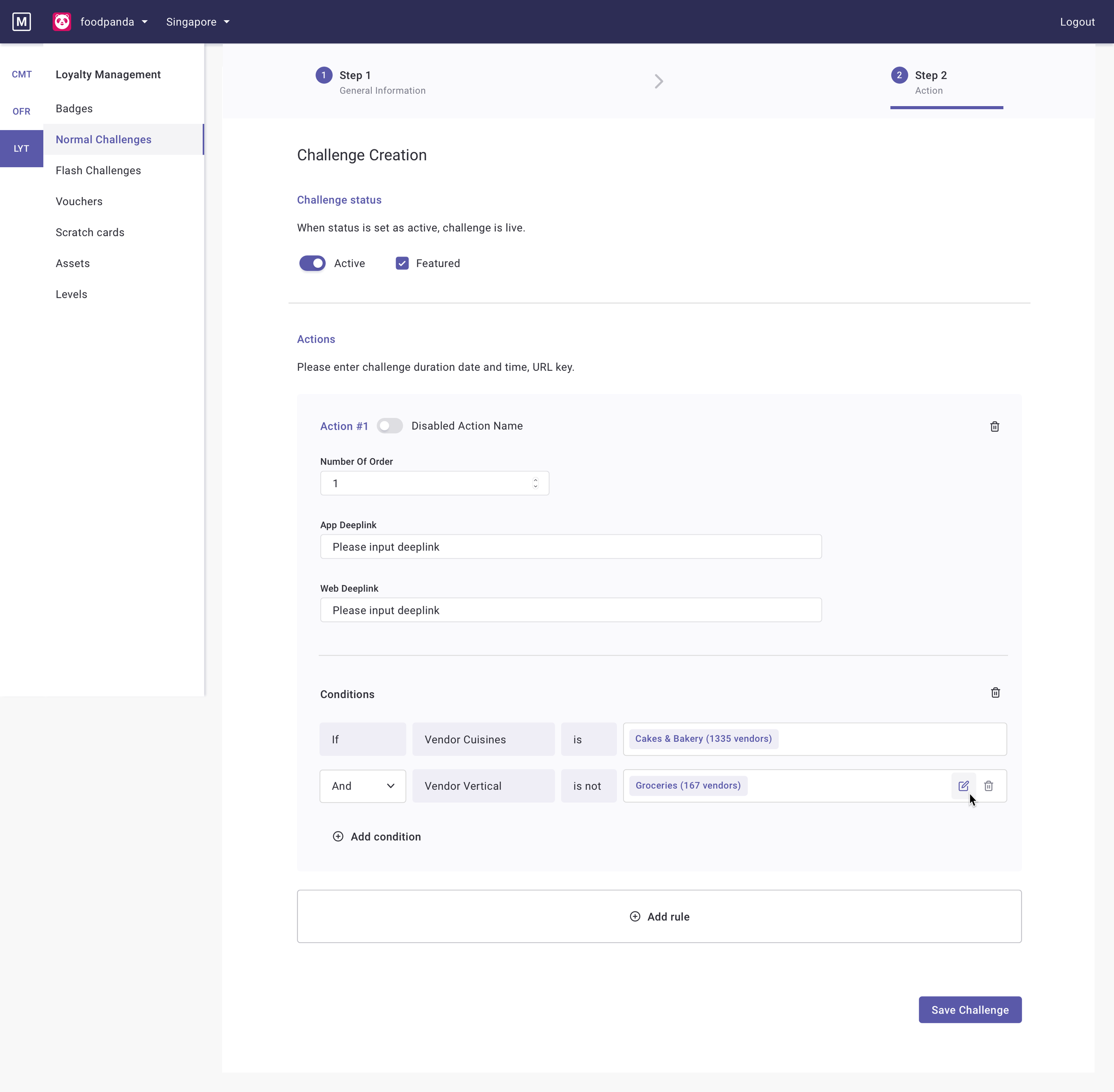
Simplified Workflows: The process for inputting information, such as creating new badges or challenges, was streamlined into a 3-step process. This makes the tool more intuitive and easier to use.
User-Friendly Language: Information is now displayed in clear, user-friendly terms rather than developer-centric language.
5
Design Handoff
To ensure a smooth transition from design to development, I created a thorough design handoff package. This included detailed specification sheets that broke down each screen into its core components.
Our design handoff was less of a formal event and more of a continuous, collaborative process. Because of the close partnership between design and engineering throughout the project, a rigid, official handover document was unnecessary. We maintained open lines of communication through weekly squad meetings and shared, always-updated Figma and Miro boards. This fluid approach meant that developers had constant visibility into the design progress and could provide feedback early and often. This eliminated the need for a time-consuming final handover, allowing us to move directly from design validation to development and ultimately deliver the solution faster.
Communication with front-end devs
I regularly update the Figma links and miroboard so that developers can see the latest updates on their own time. Major changes are also mentioned in the weekly squad meetings for feedback and visibility. UI specifications, prioritization, and functionality requirements are also well documented.
Communication with product designers of other squads
We come together to build on the design system of the tool, lots of communication and clarification are needed on the basic function of UI as we all have similar but different workflows to reach standardization. Figma and miroboard links are also shared so that we can have references and visibility to one another’s progress.
Communication with product manager
As this is mainly a UI/UX improvement, prioritisations are up to me and the devs to decide. Not only do we need to meet the agreed deadline and we are also required not to delay other feature shipments within the agreed timeline.

Final Thoughts
This project was a powerful reminder that the tools we build for our internal teams are just as critical as the products we ship to customers. It was particularly insightful to see how well designers and engineers can collaborate when there's a common goal of shipping a product without overcomplicating the process. I especially enjoyed this project because it was less focused on visual polish and more on technical, solutions-based design, testing the limits and boundaries of what we could achieve. By prioritizing user research and fostering a deeply collaborative environment, we were able to untangle a complex web of legacy systems and deliver a solution that not only improved efficiency but also boosted user confidence. It underscored the immense value of user-centered design in solving internal business challenges and creating a more effective, less frustrating work environment for everyone.