Horangi Check Details:
Proactive Cloud Security, Simplified
From alert fatigue to actionable insights: Designing a security platform that empowers users to fix what matters most.

Horangi Check Details is a design initiative to create a user-centric cloud security platform that provides real-time visibility into an organization's security and compliance posture. The goal was to transform complex cybersecurity data into a clear, actionable, and collaborative experience for security and development teams. The project involved end-to-end product design, from initial user research and problem definition to high-fidelity interactive prototyping and developer handoff. The outcome is a streamlined interface that helps users quickly identify, prioritize, and remediate cloud security vulnerabilities.
The Challenge
While Horangi's platform was powerful, the original "Check Details" page presented significant usability challenges that hindered an efficient workflow. The core of the problem stemmed from its design as a modal pop-up, which led to several key user frustrations:

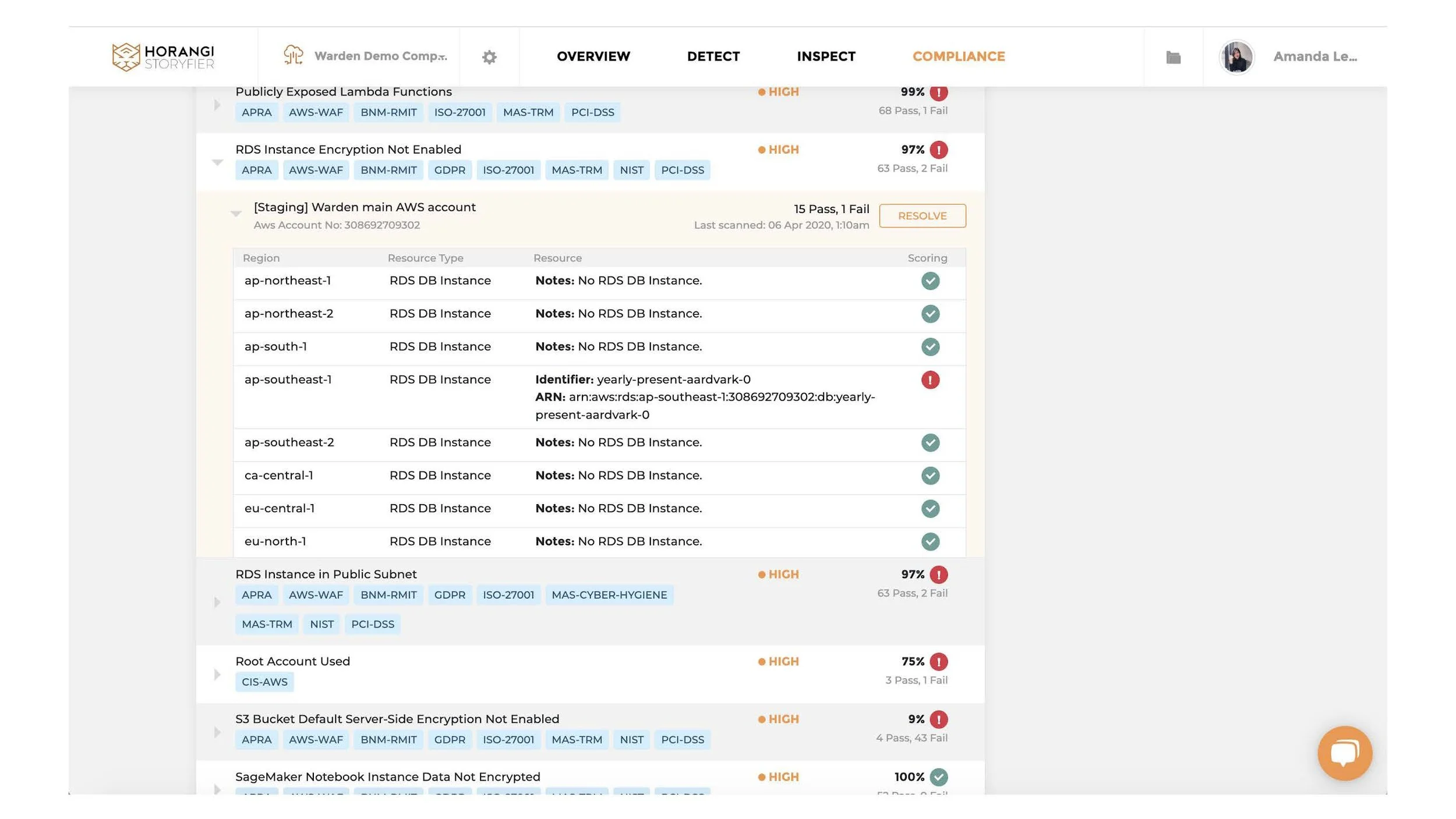
Disjointed and Inefficient Workflow: The modal-based design forced users into a fragmented process. To triage a list of security issues, a user had to click to open a modal, absorb the information, close the modal, and then find their place in the list to open the next one. This created unnecessary friction and slowed down the entire remediation process.
Complete Loss of Context: When the modal was open, it completely obscured the main list of security findings. This meant users couldn't see the broader context of other alerts, their severity, or their status. This lack of visibility made it difficult to prioritize issues on the fly or compare related findings.
Poor Information Hierarchy: The constrained space of the modal led to a cramped and poorly organized information layout. There was no clear visual separation between the issue's description, its business implication, and the recommended actions, forcing users to work harder to parse the critical information they needed.
Lack of Scalability: For security engineers and developers who needed to process dozens or even hundreds of alerts, the one-at-a-time modal workflow was simply not scalable. It created significant "click fatigue" and made the task of managing findings feel laborious and overwhelming.
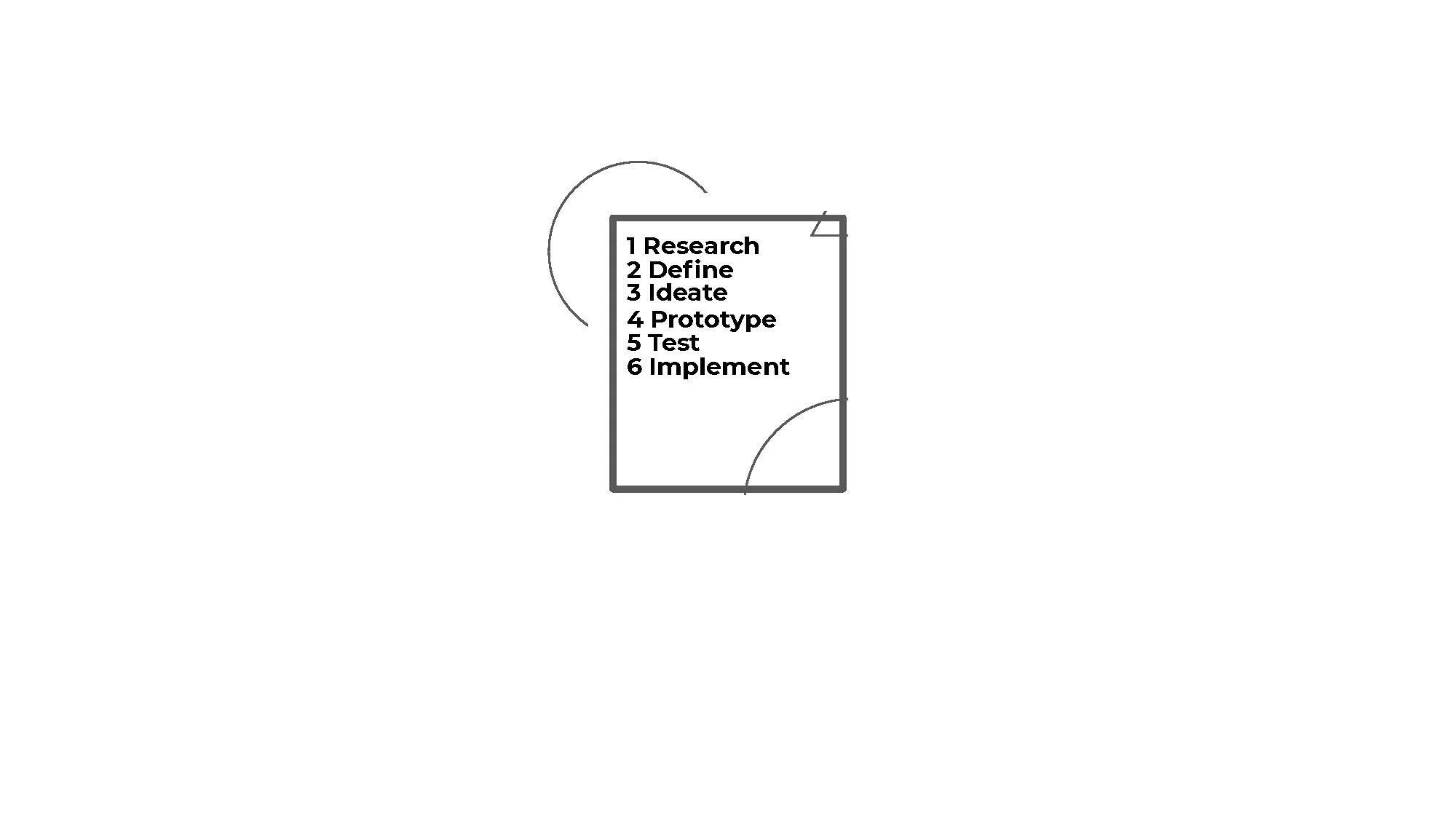
Design Exploration & Iteration
The design process was grounded in rapid prototyping and continuous user feedback to ensure the solution was both intuitive and effective.
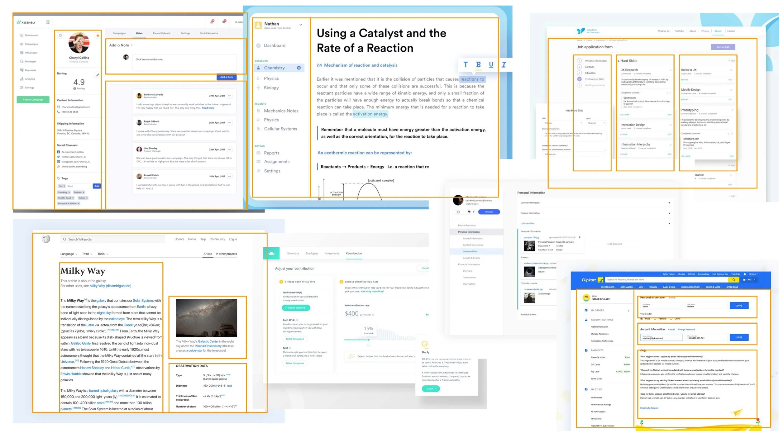
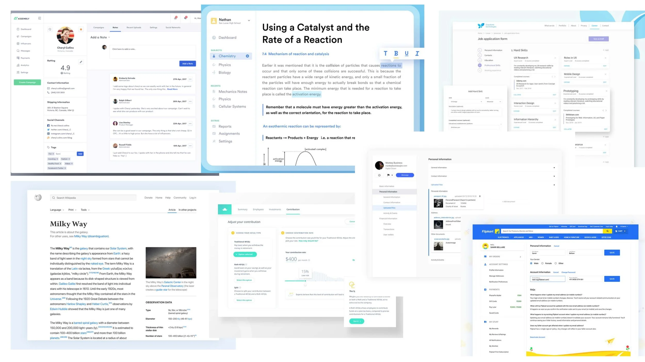
Benchmarking and Competitive Analysis: I began by benchmarking a variety of applications to analyze how they used layout, hierarchy, and spatial blocking to present complex information, which informed my approach to structuring the page.

2. Initial Wireframing & User Flows: I began by mapping out the core user journeys, from initial login to threat identification and remediation. Low-fidelity wireframes were created to establish the information architecture and explore different layouts for the main dashboard and issue-tracking pages. This helped validate the core navigation before investing in visual design.
3. Developing a Visual Hierarchy: Early user feedback revealed that a key challenge was distinguishing signal from noise. To address this, I developed a strong visual language using color, typography, and iconography to create a clear hierarchy. Critical alerts were given prominence, while informational findings were designed to be less intrusive, guiding the user's attention to what mattered most.
4. Dashboard Evolution: The main dashboard went through several iterations. An initial concept using a dense data table was quickly abandoned in favor of a more visual, card-based layout. This design introduced a prominent "Security Score" to give users an immediate sense of their overall posture, with cards summarizing key risk areas. This approach tested much better with users, who found it more scannable and less intimidating.
5. Component-Based Design System: To ensure consistency and scalability, I developed a comprehensive design system and component library. This included standardizing elements like buttons, forms, status tags, data visualizations, and the "check" card itself. This not only created a cohesive user experience but also streamlined the development process.
Key Design Decision:
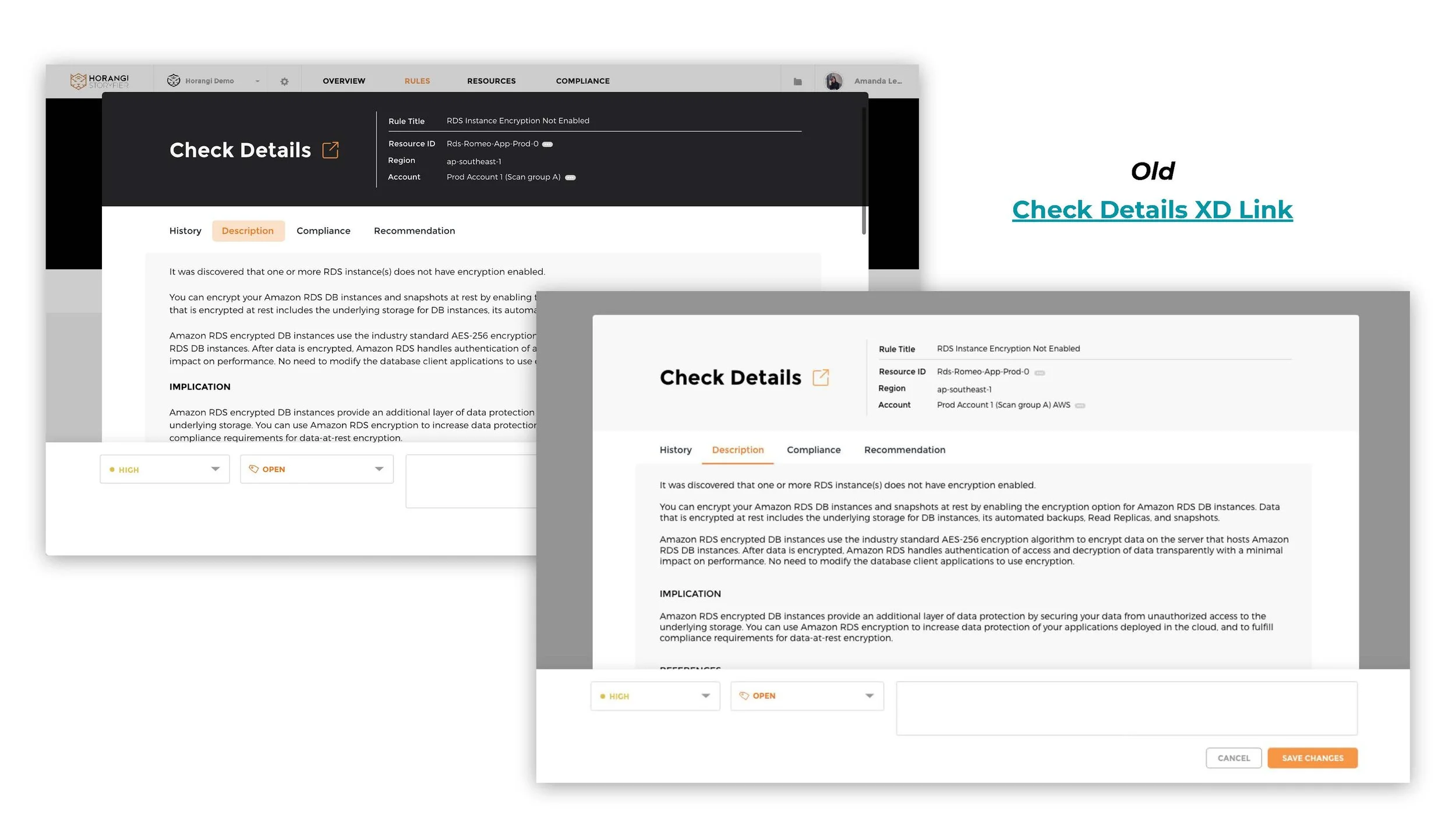
From Modal to Integrated View
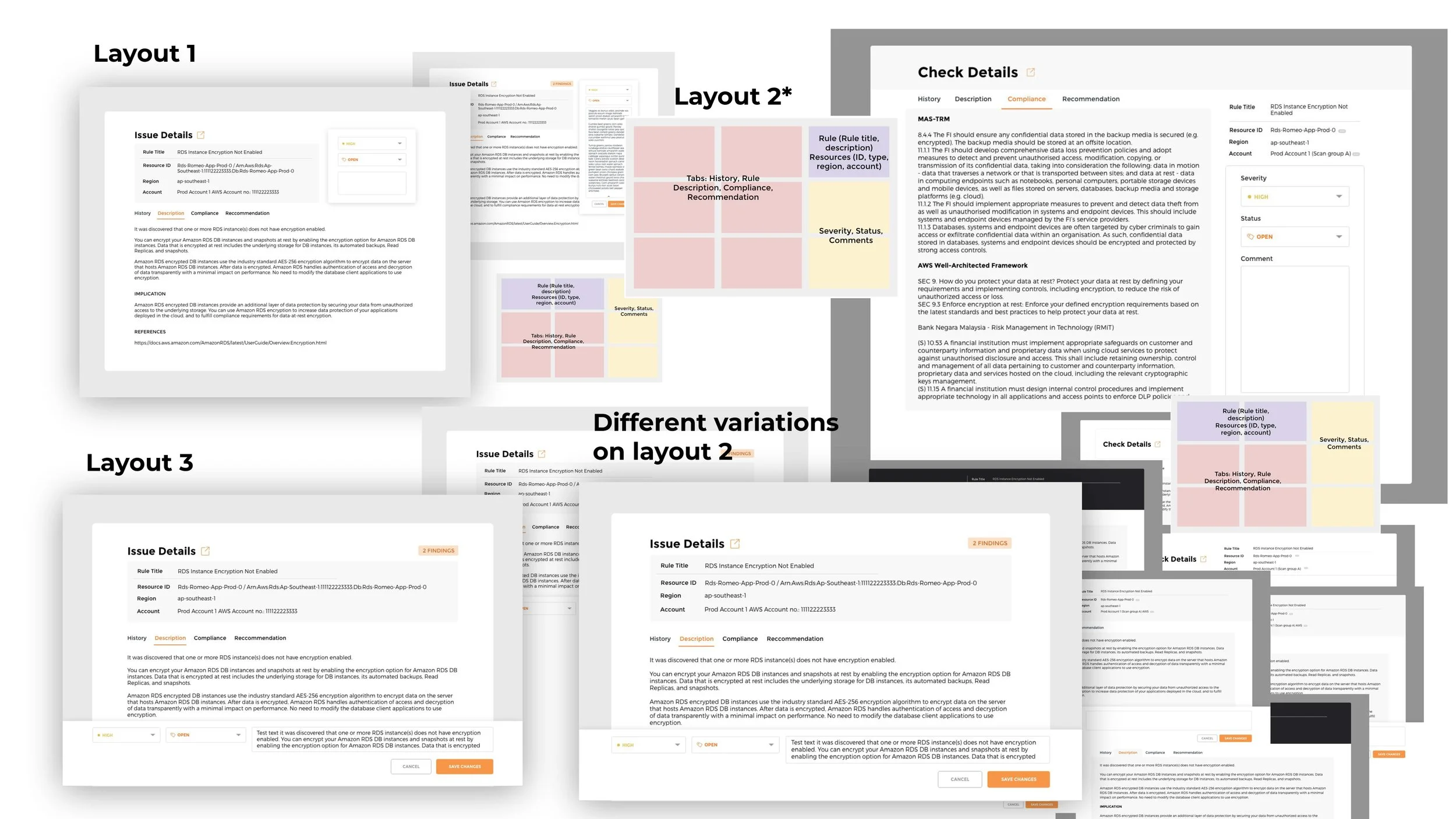
A critical design decision in this project was evolving the "Check Details" view. The initial design used a modal pop-up to display the details of a security finding. While functional, it completely obscured the main list of issues, forcing users to lose their context. To view another issue, they had to close the modal, find the next item in the list, and open a new modal.

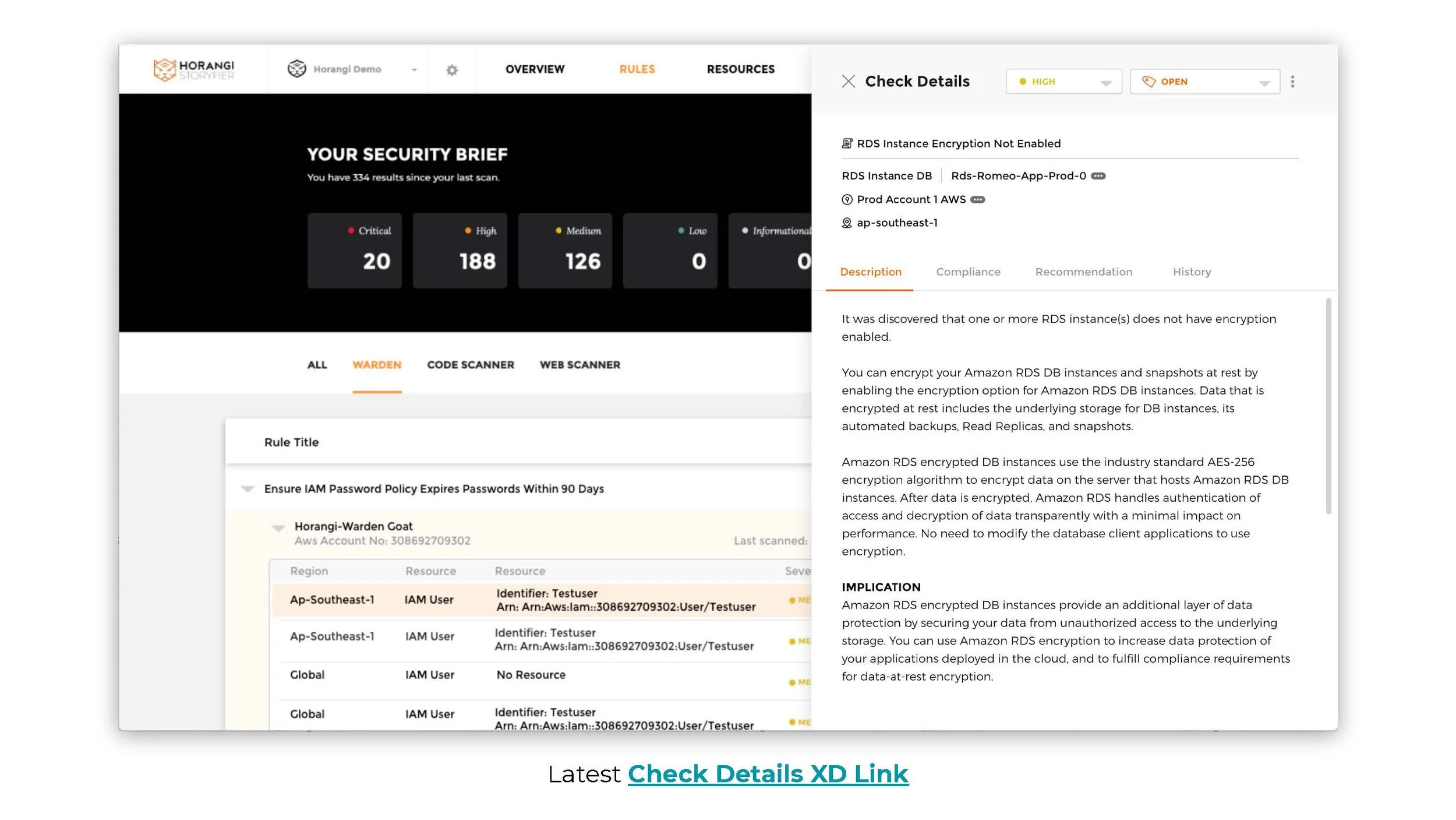
The final design replaced the modal with an integrated, two-column layout. This was a deliberate choice based on several key factors:
Improved Workflow and Context: The new layout keeps the list of security findings visible in the left column while displaying the details of the selected item in the right pane. This allows users to seamlessly navigate between different issues without losing their place, dramatically improving the efficiency of triaging multiple alerts.
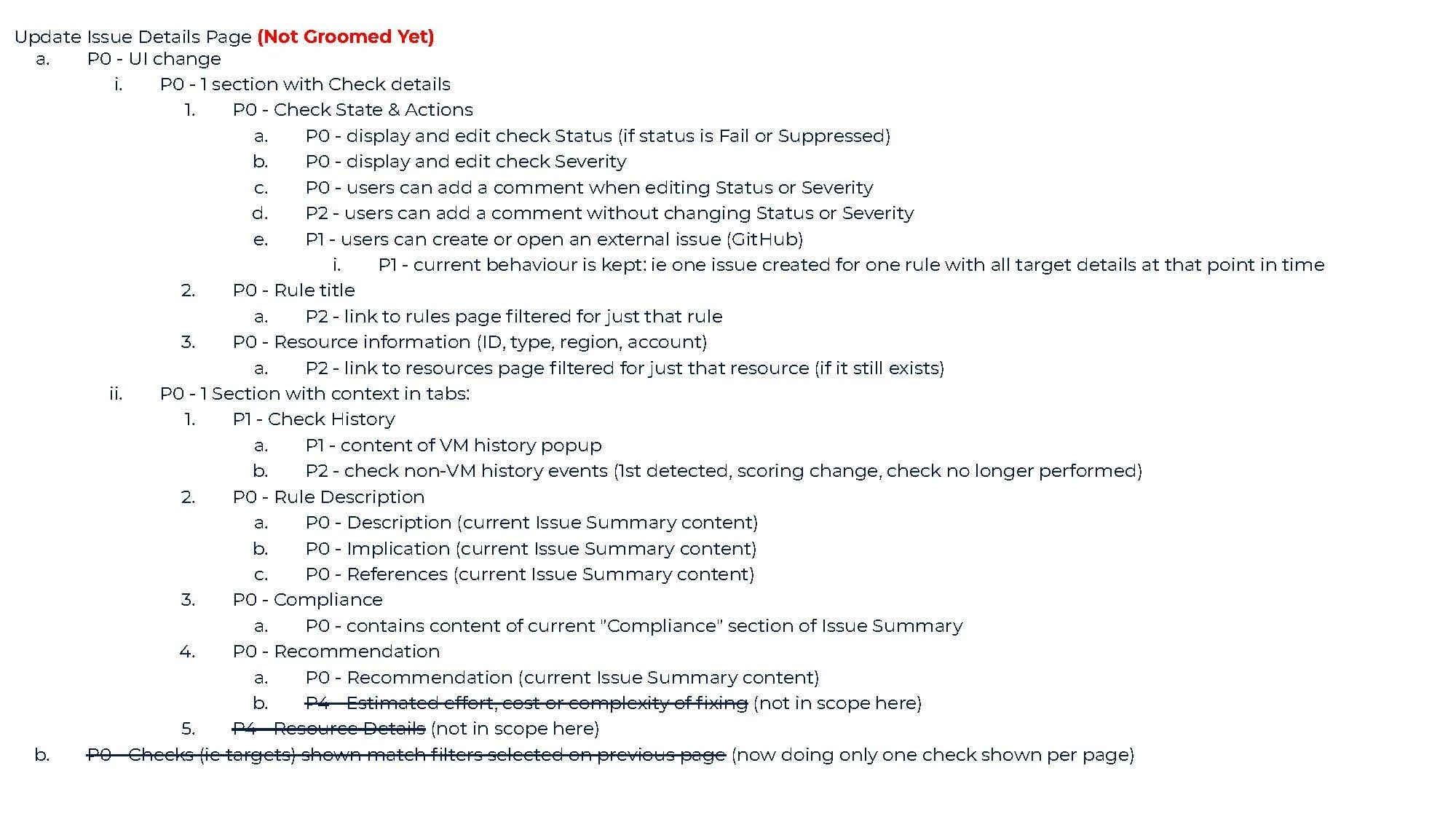
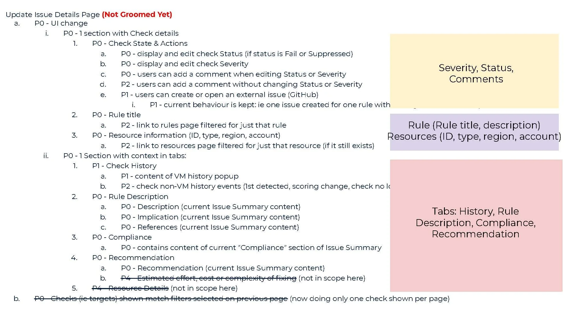
Enhanced Information Hierarchy: The integrated view allowed for a clearer presentation of information. The most critical data—the rule title, affected resource, and account—are positioned at the top of the details pane for immediate visibility. Key actions, like changing the status or severity, are also given prominence.
Better Scannability and Readability: The shift to a light-themed, full-height panel from a dark-themed modal improved overall readability, which is crucial for text-heavy technical content. The layout provides more space for detailed descriptions and recommendations, making the information less cramped and easier to digest.
Ultimately, the decision to move to an integrated view was driven by the goal of creating a more fluid and context-aware user experience, directly addressing the initial problem of inefficient and fragmented workflows.
Building the Solution:
Key Features and Benefits
Horangi Check was designed as an integrated platform to directly solve the identified user pain points. The design focused on providing context and clear, actionable steps within a collaborative environment.
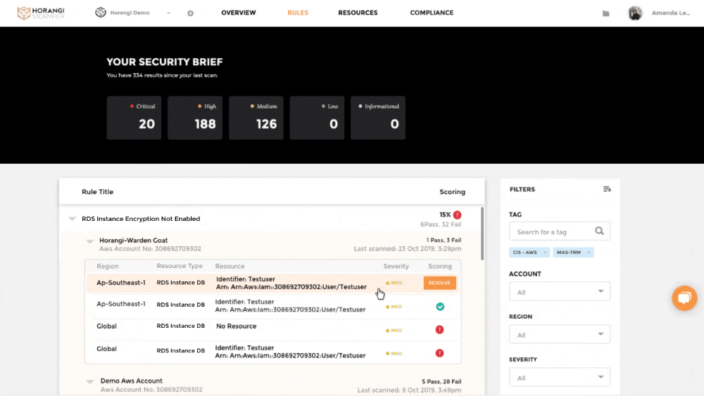
A Unified & Scannable Dashboard: To combat the lack of a unified view, the dashboard aggregates data from all connected cloud accounts. The design decision to use a card-based layout with a prominent, color-coded "Security Score" gives leaders an immediate, high-level understanding of their organization's posture, while lists of failing checks, organized by compliance standard, allow engineers to quickly drill down into specific areas.
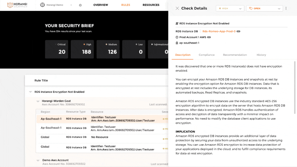
2. Detailed & Prioritized Checks: To solve the difficulty in prioritization, each finding is presented as a self-contained "check." The design for each check includes a clear title, a severity level (e.g., High, Medium, Low), a detailed description of the vulnerability, a summary of the business implication, and a concrete, step-by-step recommendation for remediation. This structure ensures that users have all the necessary information to understand the risk and act accordingly.
3. Integrated Remediation Workflow: To fix inefficient remediation workflows, the platform provides a closed-loop system for every check. Key design decisions include allowing users to directly edit the status (e.g., from 'Fail' to 'Suppressed') and severity, add comments to discuss the issue with teammates, and create external tickets in systems like GitHub. This turns a simple finding into an actionable ticket and creates a clear audit trail.
4. Context-Rich Information & Reporting: To address complex compliance reporting, the design utilizes a tabbed layout within each check. This provides layered context, separating the core Rule Description from its Implication, Compliance mappings, and Check History. This structure prevents information overload while keeping all necessary details easily accessible. It also powers the one-click report generation, as the platform has all the mapped evidence ready to be exported.
Introducing Check Details
Slide Deck


Final Thoughts
It's easy to get lost in the complexity of the data, but by focusing on the user's workflow and their need for context, we were able to make a significant impact. The shift from the isolating modal to the integrated two-pane view was more than just a layout change; it was a fundamental improvement to how users could work. Seeing that "aha" moment when users interacted with the new design and realized how much faster they could move through their tasks was incredibly rewarding. It reinforced my belief that good design isn't just about aesthetics; it's about removing friction and empowering people to do their best work.