Horangi Dashboard: Security Findings at a Glance
Transforming a static report into a dynamic command center.

This project addresses the critical inefficiencies of the current Horangi security dashboard, which is static, non-interactive, and forces users into cumbersome workflows to investigate security findings. The result is an underutilized tool that fails to provide immediate, actionable insights. The proposed solution is a complete redesign of the dashboard, transforming it into a dynamic, interactive command center. The new design will provide a unified, at-a-glance overview of an organization's security and compliance posture, with key features like interactive charts, trend analysis, and the ability to drill down into specific findings directly from the main view. This will streamline the user workflow, empower security teams to act on findings more quickly, and maximize the value of the dashboard as a central hub for security operations.
The Challenge
Users, including security operators and compliance managers, lack a centralized and efficient way to get a high-level overview of their organization's security and compliance status.

Key challenges with the current system include:
Static and Non-Interactive: The original dashboard was a static report. Users could not drill down into data, forcing them to navigate to other pages to investigate findings, leading to an inefficient workflow.
Poor Onboarding Experience: The dashboard failed to provide value for new users, offering a blank or confusing state before the first scan was completed. This created a barrier to adoption and made it difficult for users to understand the platform's potential.
Underutilized Real Estate: The static nature of the dashboard meant the main overview, a prime piece of screen real estate, was severely underused and failed to provide the dynamic insights needed for quick decision-making.
Lack of Clear Prioritization: It was difficult for users, especially executives, to answer the fundamental question: "Does something need my attention right now?" The dashboard did not effectively surface the most critical findings or at-risk areas.
Ineffective Trend Communication: The system could not clearly answer the question, "Are we improving over time?" making it hard to track remediation progress and demonstrate the value of security efforts.
Benchmarking and Insights

Executive-Level Answers: The dashboard is designed to directly help executives answer critical questions like, "Does something need my attention?" and "Which groups, accounts, or regions are at fault?"
Demonstrating Improvement: The "Findings Over Time" and "Finding Changes" modules are specifically designed to answer, "Are we improving?" by showing clear trends.
Driving Adoption: By showing value from the very first scan and providing clear, actionable data, the dashboard is a tool to help drive Warden adoption and assist decision-makers.
Actionable Insights: Beyond just presenting data, the dashboard will generate actionable insights. For example, it will highlight the most common types of vulnerabilities, identify resources that are frequently non-compliant, and suggest remediation priorities.
Product Requirements
We propose the creation of a web-based dashboard that provides a comprehensive and interactive overview of the user's security and compliance data. The dashboard will be designed with a focus on clarity, usability, and actionable insights. It will allow users to:
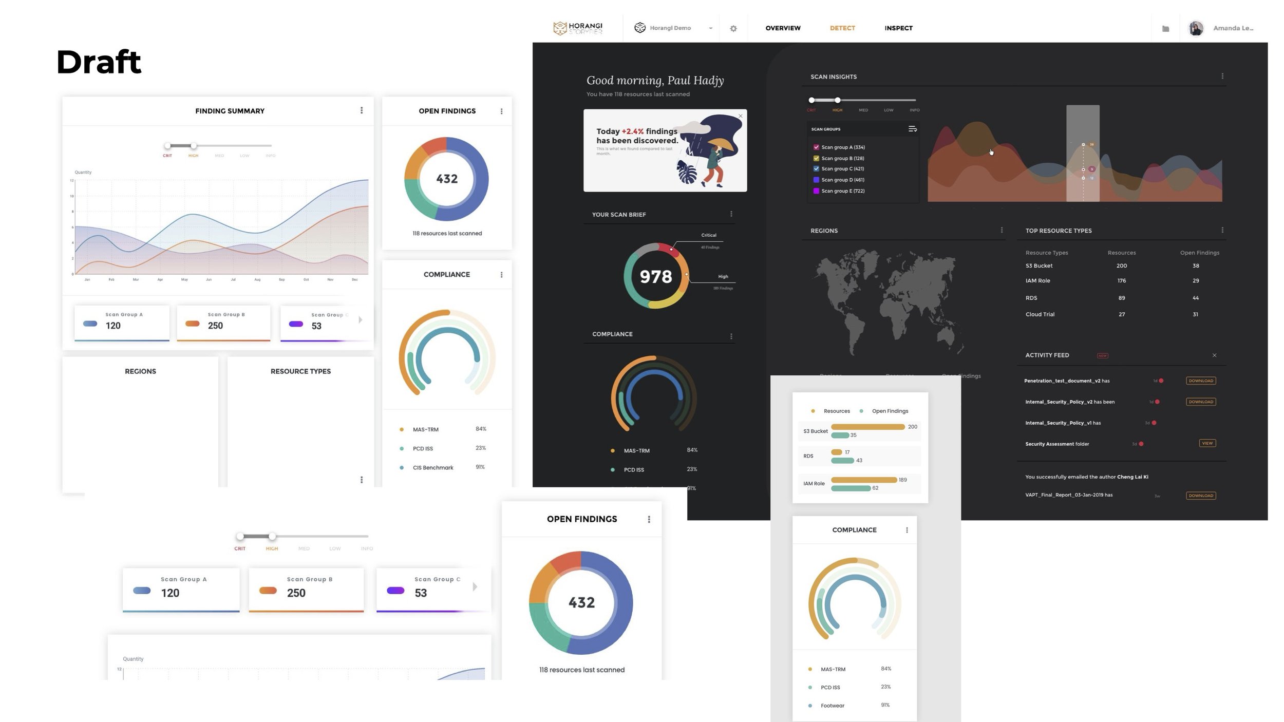
Get a High-Level Summary: Quickly see open findings by severity, overall compliance status, and key changes at a glance.
Engage with an Interactive Experience: Drill down into charts and graphs to investigate specific findings by region, resource type, or account without leaving the overview page.
Utilize Advanced Filtering: Apply persistent, global filters for severity and scan groups to customize the entire dashboard view to their specific needs.
Experience Immediate Value: Engage with a thoughtful first-time user experience that uses placeholder data and guided tours to showcase the dashboard's full potential even before the first scan is complete.
Track Progress: Clearly visualize trends over time to understand security posture improvements and the impact of remediation efforts.
Final Design Iteration
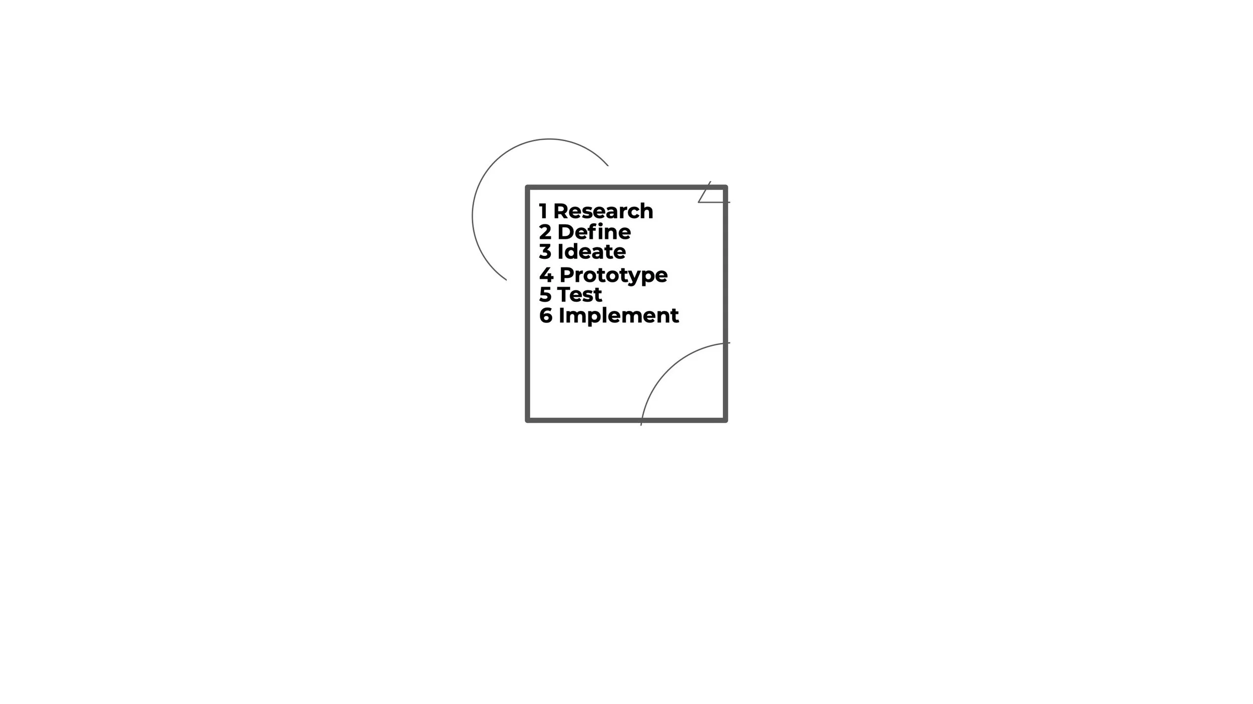
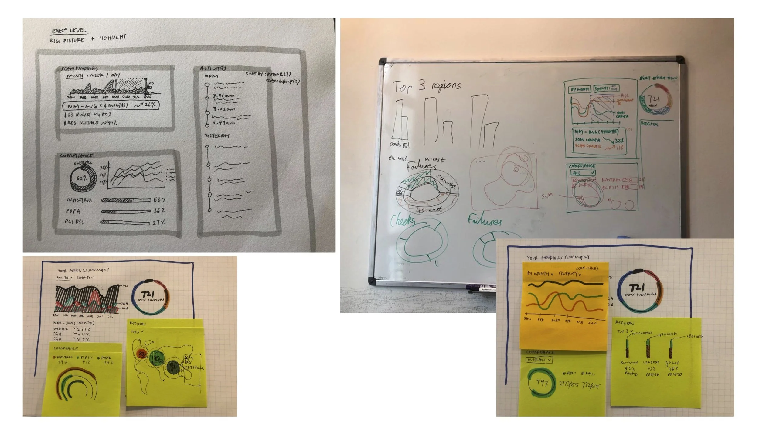
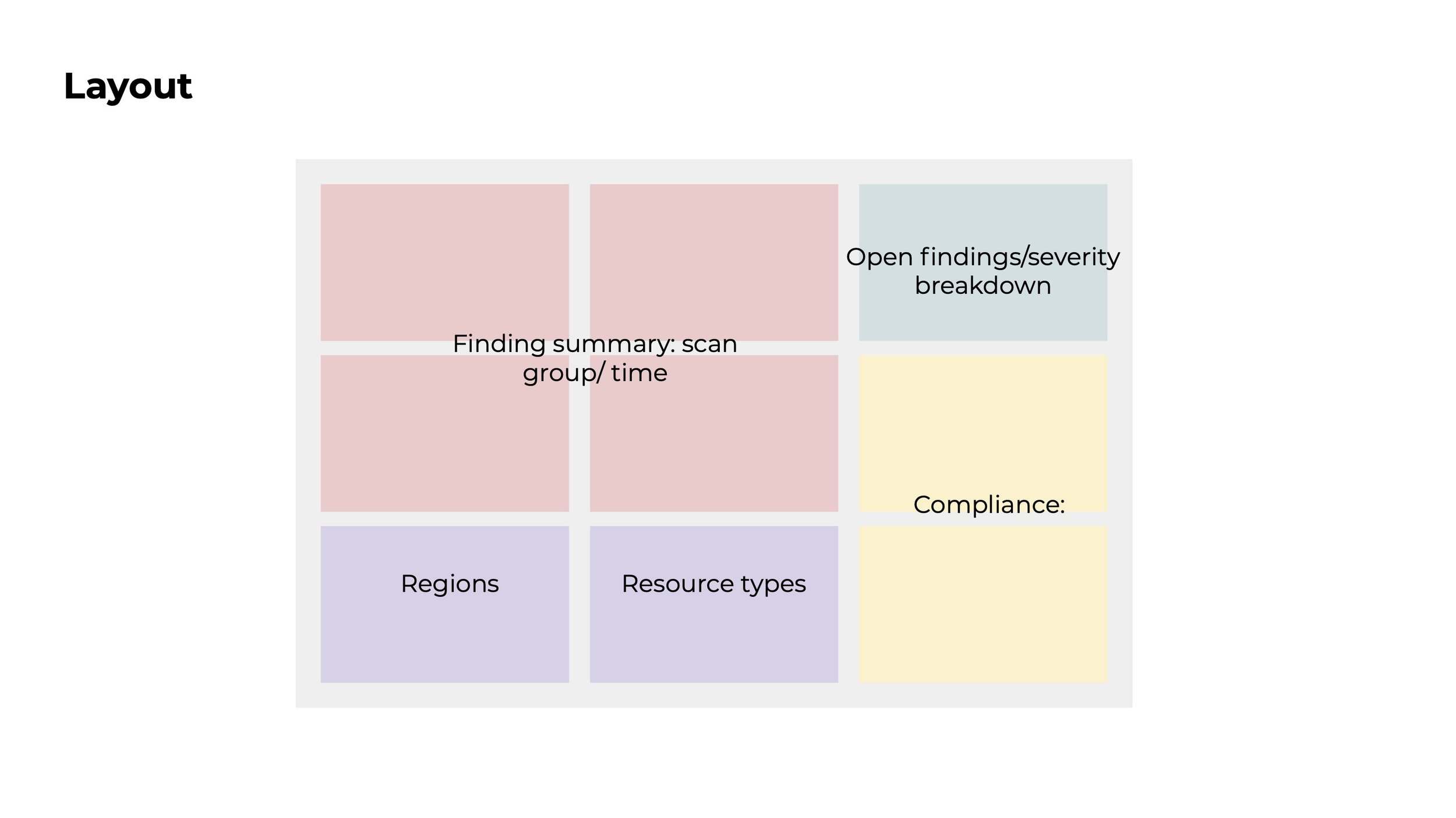
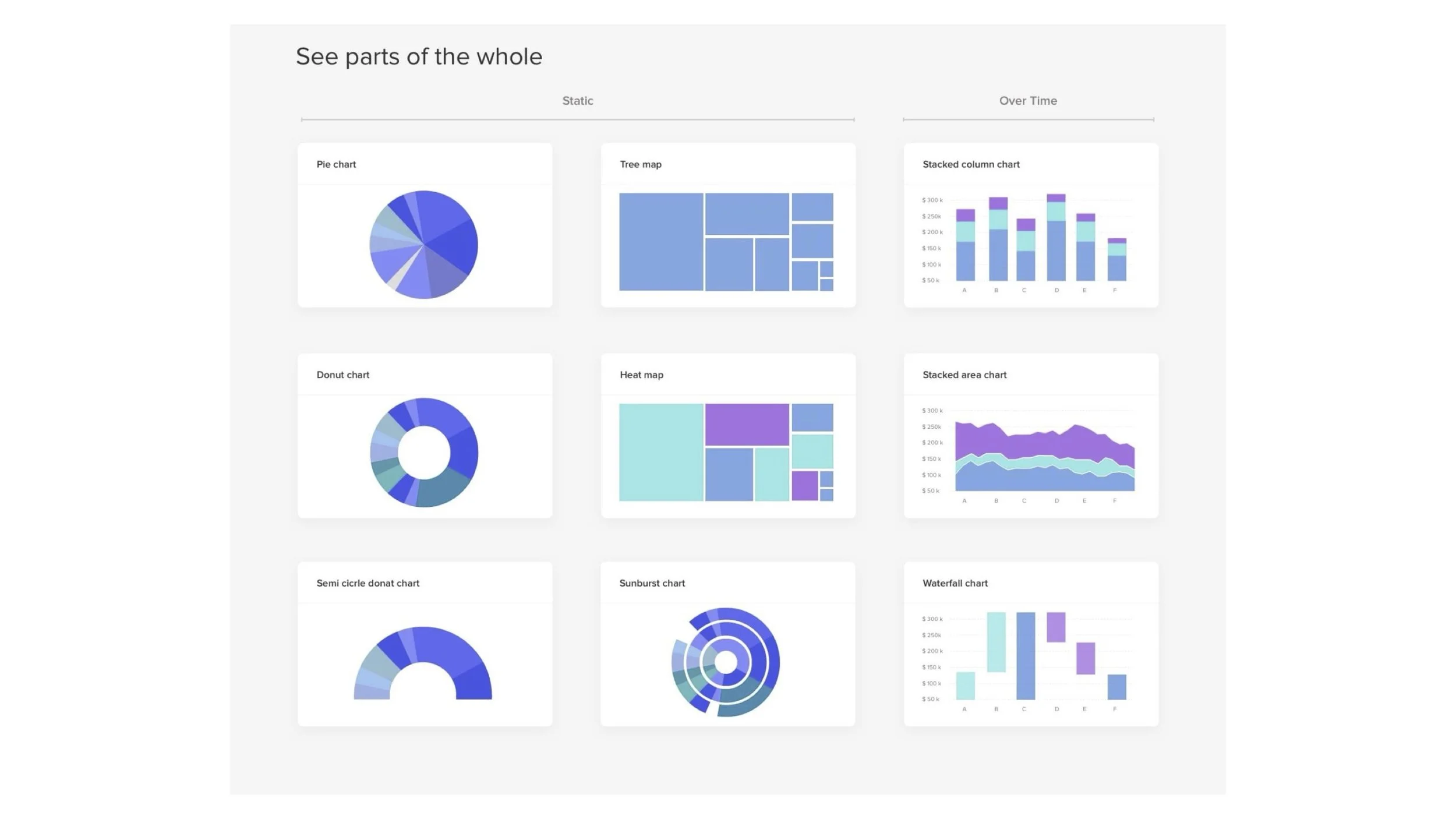
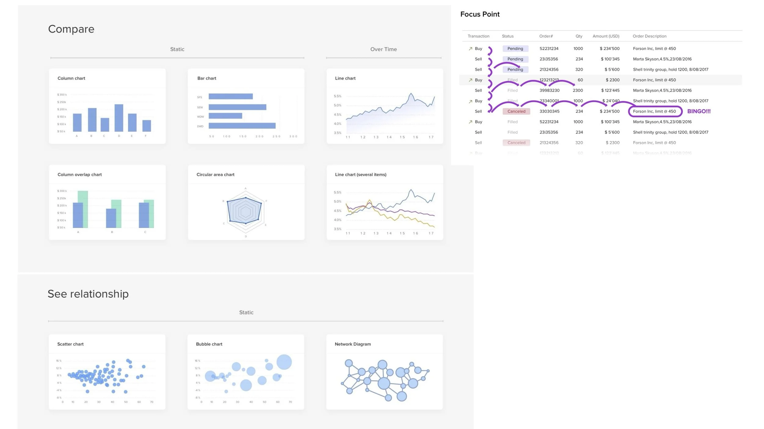
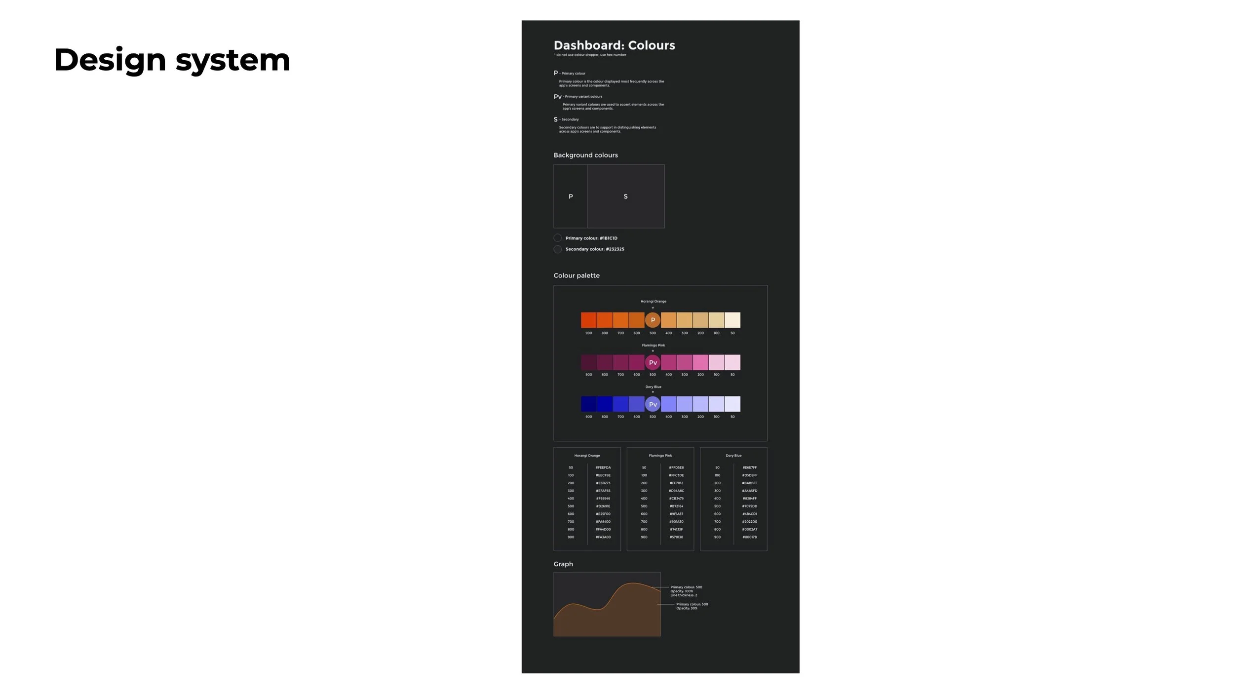
The design exploration phase was a critical part of the process, moving from low-fidelity sketches to high-fidelity, interactive prototypes. Initial concepts were brainstormed and visualized on whiteboards and sticky notes to quickly explore different layout structures and information hierarchies. We experimented with various data visualization techniques—including donut charts, stacked area charts, and heat maps—to determine the most effective ways to represent complex data like severity breakdowns and compliance statuses. This iterative process allowed us to refine the user experience, ensuring that the final design was not only visually appealing but also highly intuitive and effective at communicating key security insights at a glance. Furthermore, this phase included the creation of initial design system documentation, defining a clear color palette and a set of design principles to ensure consistency throughout the product.

Key Features and Functionality
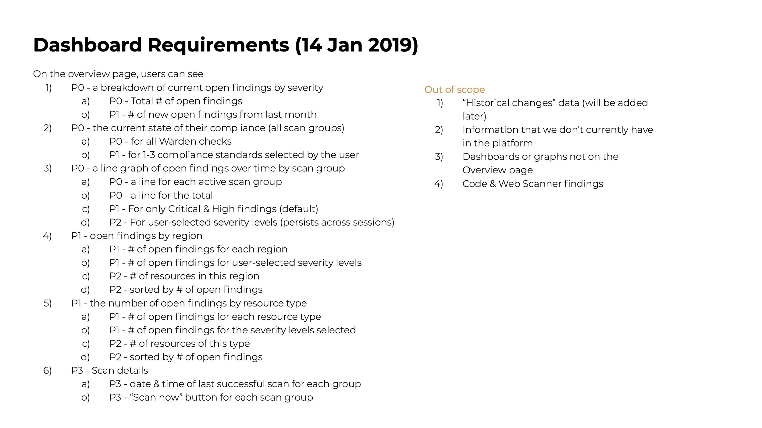
The dashboard will include the following key features, prioritized based on user needs:
First-Time User Onboarding:
A welcome banner and the use of placeholder data to demonstrate the dashboard's functionality before the first scan.
An interactive tour to guide new users through the various widgets and features.
Interactive Overview Page:
Breakdown of current open findings by severity (defaulting to Critical & High).
Total number of open findings.
Advanced Filtering Controls:
A global filter section at the top of the view.
Filters for severity and scan groups that apply to the entire right portion of the dashboard.
Finding Changes Module:
A summary of changes over a selected period, tracking new, resolved, and modified findings.
Compliance Chart:
A visual chart displaying the overall compliance score for an at-a-glance understanding of the organization's standing.
Findings by Region and Resource Type:
Interactive modules to view open findings sorted by geographical region and resource type.
Out of Scope for Initial Release
The following features will be considered for future releases but are out of scope for the initial version:
Historical changes data.
Information not currently available in the platform.
Dashboards or graphs not on the main Overview page.
Code & Web Scanner findings.
Dashboard Rethink
Slide Deck


Final Thoughts
This project was a fantastic journey in transforming a simple, static page into a truly useful tool. The biggest challenge was shifting the perspective from just displaying data to answering the crucial questions our users—especially busy executives—were asking. It became less about what we could show and more about what they needed to see to make quick, informed decisions.
Looking back, the focus on the first-time user experience was a game-changer. This redesign wasn't just a facelift; it was about fundamentally changing the dashboard's role from a passive report into an active, indispensable command center for our users' security operations.